


Coronavirus Update (live)
share_oh
4 years ago
Related Stories

DECORATING GUIDES10 Ways to Update a Victorian Living Room
Bring your period living room sensitively into the 21st century with these simple yet effective design tricks
Full Story
LIVING ROOMSGuest Picks: Update a Traditional Living Room
Give traditional style a younger look with a few well-placed pieces
Full Story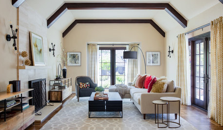
LIVING ROOMSWarm Transitional Style Updates a Casual California Living Room
A design team works with a young couple to create a light and airy living room that fits their new West Coast lifestyle
Full Story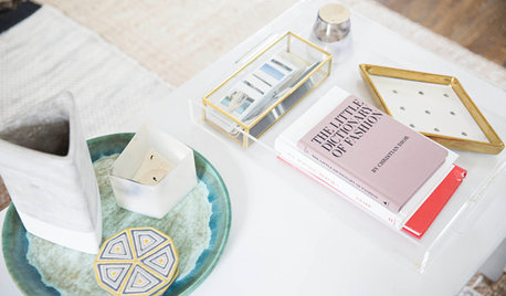
DECORATING PROJECTSRedecorating Lite: 6 Quick Updates to Liven Up Your Living Spaces
If a full redecorating project isn’t in your budget, consider these inexpensive ideas to give your room new life
Full Story
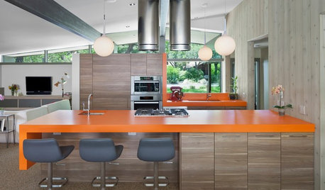
DECORATING GUIDESMidcentury Living Room and Kitchen Get a Stylish, Comfy Update
A designer keeps the cedar-paneled walls and concrete floors but updates the kitchen and decor in a 1970s Texas home
Full StoryTRANSITIONAL HOMESHouzz Tour: More Living Room and Light in a Minnesota Update
New high-contrast siding, contemporary furnishings and a 10-foot addition refresh this roomy home
Full Story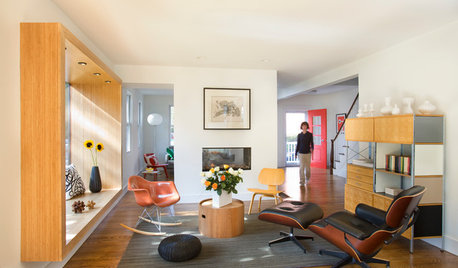
LIVING ROOMSRoom of the Day: Living Room Update for an 1800s New England House
Major renovation gives owners the open, contemporary feel they love
Full Story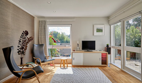
HOMES AROUND THE WORLDHouzz Tour: A 1960s House Gets an Update for 21st-Century Living
Plywood storage units add modern-day convenience, while retro colors and laminates stay true to the home’s era
Full Story
MOST POPULAR8 Ranch House Renovations Make More Room for Living
See how homeowners have updated vintage homes to preserve their charm and make them function beautifully in today’s world
Full StorySponsored
Columbus Area's Luxury Design Build Firm | 17x Best of Houzz Winner!
Related Discussions
Coronavirus - travel plans?
Q
Coronavirus #2 - how is it affecting you and your family/friends?
Q
Delaying a medical test due to coronavirus
Q
Coronavirus: should it put a remodel on hold?
Q