


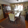
Bruce flooring? White oak? Resale? Benjamin Moore Simply White?
Elizabeth Rasmussen
5 years ago
Featured Answer
Sort by:Oldest
Comments (8)

qpjulia
5 years ago PRO
PROJohnson Flooring Co Inc
5 years agoRelated Discussions
Benjamin Moore White Sand - Help Please?
Comments (37)Which white paint has a gray and peach undertone... Anybody? Anybody? Paint colors don't really *have* undertones. Undertones are just someone's subjective opinion about what a color looks like to them under an unspecified light source. However, every color does belong to a hue family. Hue family is objective and is derived from a color's DNA - basically, we can measure color and the resulting data is what I call color DNA. We use those data values to organize color. And I can tell you there aren't that many colors of white that fit a description of gray and peachy. I listed all of them below. Peachy referring to the Yellow-Red (orange) hue family range. We have over 6,000 colors in The DNA Table -- including every color of white from every brand. For example, MAG is Joanna Gaines Magnolia Home....See MoreBenjamin Moore’s white opulence paint color
Comments (75)It has been a while since the last activity on this thread, and I felt it might be beneficial to give my updated perspective on White Opulence #879 from Benjamin Moore as a paint color for main areas. Having lived with this color for a bit longer now since my last comment, I am beginning to understand how tightly it regulates what other colors can be placed with it for anyone who cares about a homogeneous scheme and also how undeniable the pink tone can be when applied over large surface areas. White Opulence is a tint of red, but it is so light that in ample daylight or under bright white lighting it can "read" as white. In average daylight, it produces a whisper-light pink hue. The effect of this is magnified the larger the area that is covered by it. Using this color on the walls in the main space of a large, open-plan layout with high ceilings, for example, will imbue the area with a light, yet undeniable, pale pink cast in average lighting. It would be a good idea to prepare not only yourself but also any other significant users of the space of the pink tinge before selecting this color because some people truly dislike pink, and it is courteous to work with all regular users of spaces during design planning to try to ensure no one will be overly uncomfortable with the final effect. One thing that hasn't been discussed is how White Opulence can cast a peach tone under warmer lighting colors, especially in the absence of any compensating daylight, meaning nighttime in most home spaces. If peach is a color you want to avoid and you utilize warm lighting -- that is, progressively orange-tinged the further under a 4000K color temperature you go -- then this is a paint color to avoid. The general recommendation is that 4000K is quite cool for home environments, so if you don't know what color temperature your home lighting is, you can probably assume it is warmer than 4000K if you selected average bulbs from your home supplies provider. White Opulence as a red-based white was an attractive choice for my main space because I already had a red accent in a permanent finish and personally prefer the fresh look that a red-white lends versus common alternate choices for main area wall colors like yellow-based beiges or blue-based grays. The problem is that so many home goods available are manufactured in colors that go with beige and gray wall colors rather than the faint red-white of White Opulence that color coordination requires more work than may be expected. Of course, you could decorate using pure white items, but what you really need are options for whisper pink basics which are hard to find. Adding stronger pink or red items is not always the solution either because you cannot feasibly fill the room with accents; you need some basics that blend with the wall tone. Then there is the issue of coordinating White Opulence with colors for auxiliary rooms if you wish to have some variety throughout the home while still maintaining the feel that all of the home's colors work together. Most blues coordinate with White Opulence, but if you have already used red accents in rooms painted with White Opulence, then red is challenging to pair with blue in most instances unless it is a dark, cool blue like navy. Where this has been a dilemma for me has been my hallway colors connecting the main open space to the bedrooms which are all different pastels. The color plan I have will work, and I'll enjoy the variety of colors that I have been able to make flow together, but to be honest, at times I have wondered how much easier the design process might have been if I had picked plain white for the main space. White is the ultimate neutral some might say. At the very least, a basic white for the main area would have given me more freedom in selecting fabrics and other home products for the main space as well as coordinating colors for other rooms. It is all too easy to second-guess decisions that will affect your life long-term. I am using Benjamin Moore's durable Aura formula in a satin finish, so I expect the new White Opulence paint will last decades. Had I selected a plain white or yellow- or blue-based off white, I might be back on this very forum wishing I had gone with White Opulence to add appeal beyond the standard choices. I hope this is helpful to anyone still considering this color....See MoreBenjamin Moore WB Paint + Simply White vs. Chantilly Lace Trims/Doors
Comments (5)I prefer a cleaner white for trim, doors and cabinets in general and that's why I see CL as a better choice especially considering the tone of your floor. Chantilly Lace and Simpy White both technically work with Wind's Breath. There are no red flags that show up in the notations to indicate that they won't harmonize or go together. For example, I would do WB on the walls, CL on trim/doors and SW on the ceiling - it's a pretty palette. Consider the color of the cabinetry throughout the house too to help you make a decision....See MoreCloud White Benjamin Moore - Northern Exposure
Comments (28)Hi Lindsay et al - I feel like I've inadvertently become an expert on BM whites (the hard way)! In the end I couldn't stand Cloud White in my windowless bathroom. It turned out to be way too yellow next to the greige tile and under the warm halogen pot lights. (am in the process of correcting what I did in there - let's just say Steam by BM wasn't a great choice either). Howeiver, I have used Simply White in a dark hall and also in a very bright bedroom and just love it! The paint guy told me Simply White is 'half Cloud White' and I can see why. The yellow/cream undertone adds a nice 'pick up' to the wall colour while still being white. I did the baseboards and trim also in Simply White but in satin in the bedroom and it looks great. A couple of years ago I did my kitchen in Decorator's White but it turned out to look much too cool and gray next to the creamy white cabinets. My cabinets were apparently done in Oxford White but read more like Simply White to me so the DW really clashed. I went ahead and re-painted the kitchen walls in Oxford White and, while it doesn't match the lacquered OW cabinets perfectly, it looks way better than with the Decorator's White. OW is a toned down version of SW because it has a hint of gray in it. Now, I have used White Dove in my living-dining room and stairwell. It definitely leans more creamy but not in an overly yellow way. I like a more 'true white' kitchen so I didn't/wouldn't carry the White Dove into the kitchen (I also like bit of contrast bewteen my Living-Dining and the Oxford White in the kitchen. Sure hope this helps a bit!...See More PRO
PROOak & Broad
5 years agoElizabeth Rasmussen
5 years agoLisa Foreman
5 years agoSarah
4 years agocubby325
8 months ago
Related Stories
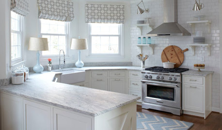
KITCHEN DESIGNHow to Keep Your White Kitchen White
Sure, white kitchens are beautiful — when they’re sparkling clean. Here’s how to keep them that way
Full Story
MOST POPULARMust-Try Color Combo: White With Warm Off-White
Avoid going too traditional and too clean by introducing an off-white palette that brings a touch of warmth and elegance
Full Story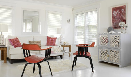
REMODELING GUIDESAre You Gutsy Enough to Paint Your Floor White?
Sleek and glossy or softened by wear, white floors charm
Full Story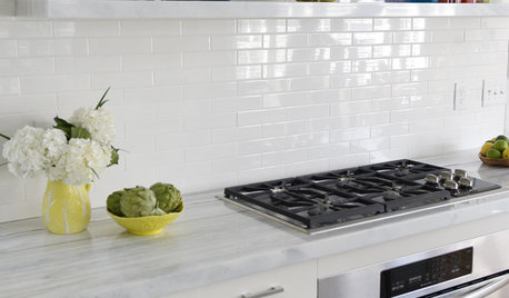
KITCHEN DESIGNWhat to Do if Your Kitchen Is Simply Too White for You
Does your all-white kitchen have you craving a little color? Here are some ways to introduce it
Full Story
LOFTSMy Houzz: White Paint and Light Floors Transform a Chicago Loft
Fresh holiday ideas add a festive touch to a couple’s renovated Scandinavian- and industrial-style home
Full Story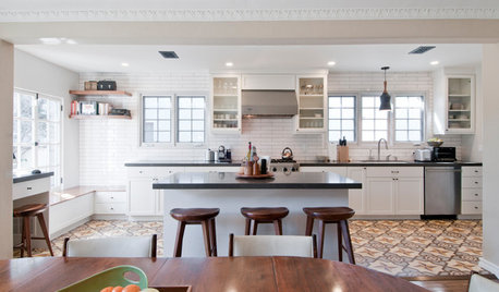
KITCHEN OF THE WEEKKitchen of the Week: Graphic Floor Tiles Accent a White Kitchen
Walls come down to open up the room and create better traffic flow
Full Story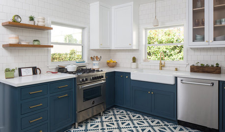
KITCHEN MAKEOVERSKitchen Gets a Crisp Makeover in Blue and White
Mosaic floor tiles, floating shelves and 2-tone cabinets bring a fresh look to a cottage kitchen in Los Angeles
Full Story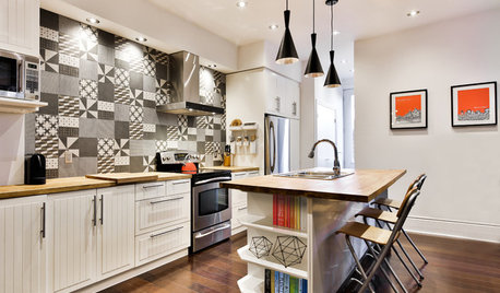
TILENew This Week: 4 Rooms With Black-and-White Tile Style
Use patterned black-and-white tile on floors and walls to bridge the gap between traditional and modern looks
Full Story
RUGSColorful Area Rugs That Pair With White Walls
Bring energy and life to a neutral space with a jolt of color on the floor
Full Story
COLORBye-Bye, Minimalist White — The New Nordic Style Is All About Color
The Scandinavian color palette is moving away from pale, cool shades with hot new hues on walls and floors
Full Story


sloyder