


Kitchen of the Week: Graphic Floor Tiles Accent a White Kitchen
Walls come down to open up the room and create better traffic flow

When one side of Kal Raustiala and Lara Stemple’s 1928 Spanish-style Los Angeles home started to sink, they jacked up the house to stabilize it. But by that time the cabinets and sink in their kitchen had already moved away from the wall, causing cracked tiles on the backsplash and countertop. They took the opportunity to redesign the space in a vintage-meets-modern style anchored by graphic Spanish-style cement floor tiles.
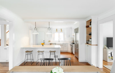
AFTER: The couple worked with Oren Levy of Luxe Remodeling to create a new, more open layout and add all-new appliances, cabinets and finishes.
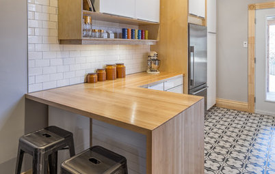
Three new custom wood windows allow more natural light inside. Graphic cement tile in light blue, brown and yellow perks up the new look. “The tiles add drama but also a good energy when you walk in,” Levy says.
The floor tiles were also an effort to link the traditional Spanish-Moorish influences and existing details of the one-level 1928 house with the more modern elements of the redesigned space. “We looked at a ton of tiles, because we knew this would be a major feature,” says Stemple, who used Houzz to gather ideas for the project. “We loved the colors, and they’re striking without being overwhelming. There’s something old-world about them, but they have a clean, modern flair.”
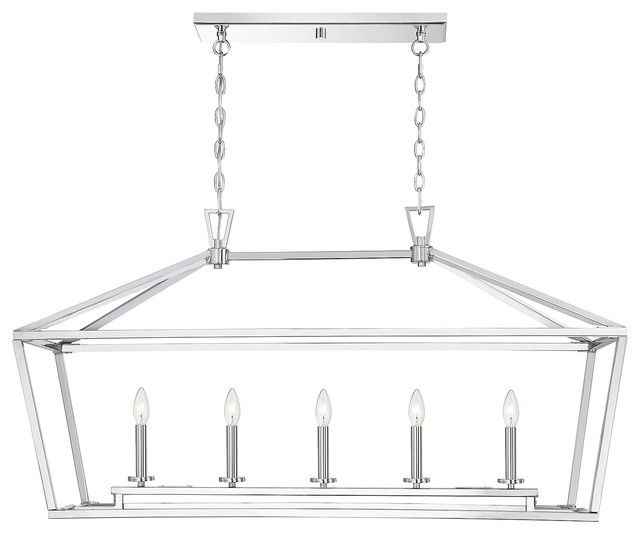
A porcelain-shade pendant with walnut and aged-brass details provides illumination over the new single-bowl sink. Flint-gray walls and a white ceiling create a neutral backdrop that allows the floor tiles and other well-selected design details to shine.
Floor tiles: cement, Granada Tile; pendant lamp: Cloak, Room & Board; faucet and sink hardware: Rohl; dishwasher: Bosch; ceiling and cabinet paint: White Dove, Benjamin Moore; wall paint: Flint, the Mercantile Color collection by Colorhouse for Rejuvenation
Three new custom wood windows allow more natural light inside. Graphic cement tile in light blue, brown and yellow perks up the new look. “The tiles add drama but also a good energy when you walk in,” Levy says.
The floor tiles were also an effort to link the traditional Spanish-Moorish influences and existing details of the one-level 1928 house with the more modern elements of the redesigned space. “We looked at a ton of tiles, because we knew this would be a major feature,” says Stemple, who used Houzz to gather ideas for the project. “We loved the colors, and they’re striking without being overwhelming. There’s something old-world about them, but they have a clean, modern flair.”
A porcelain-shade pendant with walnut and aged-brass details provides illumination over the new single-bowl sink. Flint-gray walls and a white ceiling create a neutral backdrop that allows the floor tiles and other well-selected design details to shine.
Floor tiles: cement, Granada Tile; pendant lamp: Cloak, Room & Board; faucet and sink hardware: Rohl; dishwasher: Bosch; ceiling and cabinet paint: White Dove, Benjamin Moore; wall paint: Flint, the Mercantile Color collection by Colorhouse for Rejuvenation
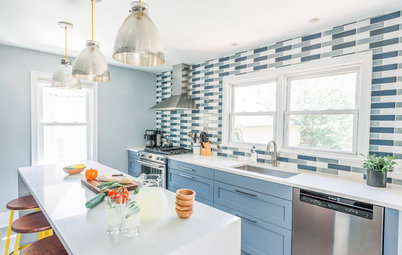
The new center island has become an active hub for the family. “We practically live at it,” Stemple says.
Custom white painted Shaker-style maple cabinets feature matte black hardware that complements the pendant over the sink. Glass fronts on the upper cabinets keep things light and airy. Gray quartz countertops replaced the worn tile. The backsplash consists of 16-by-2½-inch white tiles with gray grout.
Original crown molding frames a new opening that connects the kitchen to the adjacent dining area. “It was very important to the homeowners to salvage that original detail,” Levy says. “That molding where the wall came down was repaired and replaced, and it creates a huge focal point and beautiful detail in the dining space.”
Cabinets: custom, Northridge Cabinet Warehouse; cabinet hardware: Rejuvenation; cabinet hinges: Blum; backsplash tiles: International Tile & Stone; island stools: Rejuvenation; countertop: Caesarstone in Piatra Gray
To the left of the sink, a tall lower cabinet with dividers provides space-efficient storage for cookie sheets, cutting boards and trays. “Instead of just having dead space, we also included a top shelf in the cabinet where we can store a strainer and small trays or cutting boards,” Stemple says.
Levy removed a wall that once divided the kitchen from the dining room to create a more open plan with better traffic flow.
Levy also expanded the kitchen into a nearby breakfast area, adding 80 square feet and creating a command center with walnut shelves and a walnut bench seat.
The bench seat lifts up to reveal storage for a printer (a vent cutout prevents overheating) and files. The two drawers to the right are “homework drawers” that give the homeowners’ two children space for papers, pencils and other school supplies.
The doorway to the right leads to an updated laundry room with the same backsplash and floor tile used in the kitchen. A pocket door keeps noise at bay when needed. (See floor plans below for more detail.)
BEFORE: This floor plan of the original layout shows how walls separated the kitchen from the dining room, top, and corner breakfast area, bottom right.
AFTER: Removing the walls and expanding the layout into the former breakfast area created an airier and more open space. “It has transformed how we use the house,” Stemple says. “It makes mealtimes much easier.”
More Kitchen Stories
The 15 Most Popular Kitchen Storage Ideas on Houzz
Trending Now: The Top 10 New Kitchens on Houzz
More Resources on Houzz
Find a kitchen designer near you
Browse kitchen furniture, tile, lighting and more
More Kitchen Stories
The 15 Most Popular Kitchen Storage Ideas on Houzz
Trending Now: The Top 10 New Kitchens on Houzz
More Resources on Houzz
Find a kitchen designer near you
Browse kitchen furniture, tile, lighting and more


Kitchen at a Glance
Who lives here: Kal Raustiala and Lara Stemple and their two kids
Location: Los Angeles
Size: Before: 200 square feet (18.6 square meters); after: 280 square feet (260 square meters)
Project manager: Oren Levy of Luxe Remodeling
BEFORE: If you look closely, you can see how the countertop and cabinets in the existing kitchen had become separated from the sink wall, causing cracks in the tile. Raustiala and Stemple were also tired of the closed-off nature of the room and the poor condition of the yellow tile backsplash and worn-out cabinets. A utility box between the two windows over the sink was also a source of visual frustration.