


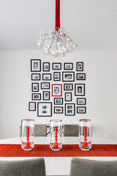
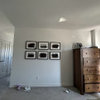
Help deciding which“size” & which color scheme gallery wall to create!
Lauren
6 years ago

Featured Answer
Sort by:Oldest
Comments (11)

havingfun
6 years ago
Mrs. S
6 years agoRelated Discussions
update on victorian color scheme and in need of more help
Comments (12)Amy, no apologies necessary! I didn't think about it twice. I know some of those colors are all wrong. As I said, we were headed in the right direction, but we chose paint colors from strips with no sample jars first (did they even have sample jars in those days?) I remember knowing, somehow, that the area above the picture molding and the ceiling should be in the same family as the wall color but lighter, so we just went one up on the color strip for each. That pink is definitely a nightmare! Anyway, back to our current scheme...I've decided (with the help of BM color consultant) to use Ivory Tusk (one above Rich Cream) on the upper walls (above picture molding) and ceilings in each of the four rooms. That should add some cohesiveness to the floor plan. It also allows for some pretty deep, saturated colors below. Sorry for the confusion about the color in the entry room - the Meadowlark was really just an experiment to see if I liked the tone on tone - I happened to have it in the house. I have BM Dried Mustard up right now and really like it so I'm planning for it to stay. In the dining room (behind the entry room) I really wanted a gray-blue (BM Feather Gray) but not with my new color scheme - color consultant suggested Fiji (an aura color with very deep, almost teal undertones) and I absolutely love it, so it's staying. I like the way the Fiji blue looks in conjunction with the orange/brown of the Dried Mustard. Then in the living/family room (adjacent to the dining room) I put up BM's Tyler Taupe - it reads as a sort of brown and provides a nice neutral backdrop to the pink (purple?!) stained glass window in that room. I had to let the Anjou Pear go - as much as I like it on its own, I didn't love it in conjunction with my other colors or the trim. My big problem now is the front parlor with the white trim. I am torn between wanting a light color, to have that tone - on -tone thing that I love going in there, and thinking a deeper tone would flow better with the colors in the other rooms. I tried Concord Ivory - way too yellow/bright. On my wall right now are 3 samples: Rich Cream (which I love but it the lightest and yellowest of the three), Handmade (aura paint - reads peachy compared to the other two but on its own, it might look good adjacent to the Dried Mustard in the next room) and Blond Wood (reads like a dark beige or light tan - darker than I wanted to go, but definitely has more of an "earthiness" and I have to admit, it seems to relate the best to the surrounding Mustard and Taupe.) Thoughts? I feel that I should be veering toward gold undertones but every time I try something with gold in it I end up with way too much yellow. I am inclined to go with the Rich Cream simply because I love how it looks in that room, irrespective of the surrounding rooms. If anyone has any other suggestions, I am willing to give them a try - as long as they come in BM sample jars, lol - I am done buying quarts! I have heard good things about Carrington Beige and Malton. Also Ladyfinger - I didn't like the way it looked with my dark wood, but might be a nice neutral against the white trim?...See MoreGlass tile backsplash - tell us which size looks more contemporary
Comments (34)In general, the 3x6 staggered subway look may be a bit old, but I think that your two choices, 3x12 and 6x12, are both up-to-date and less common. Larger tiles have a more distinctive look and provide a clean, modern aesthetic. I think the stacked look or the brick pattern would both look great. In general the large size plus the stacked look will give you a great contemporary feel. You can check out the glass tile oasis website for some cool layout ideas. That’s where I ordered my glass bathroom backsplash tile and achieved that modern look by stacking them (It was the Sea Glass Tile Series). If you hate cleaning your bathroom, use larger slabs, since they making cleaning much easier. Smaller tiles also create an optical illusion and make the room seem much larger. In your case, where you are using it for the backsplash only, I wouldn’t say that one size is more associated with bathroom décor over the other. Hope this helps!...See MoreNeed help deciding on which color to chose.
Comments (45)Hi Sheila :) I think we both registered with GW about the same time didn't we? Oh, I just looked. You registered in 2001. I registered in 2002. We've been around for awhile! :) I'm not as active here as I was during our kitchen/office remodel in 02 and the entry/guest room remodel in 04 and then big remodel...more kitchen, LR to DR, Master Bdrm and Master bath in 07. But was just in and out, reading mostly after that till DH's bathroom remodel in 2015. Nice to see your name. Hey, do you remember Claire de Luna? I haven't seen her name in a long time. I used to have her email address but lost it a few years ago in a computer crash. Thanks for the shoutout!...See MoreWhole house color scheme help
Comments (67)Couple of suggestions for sampling colors Buy a pad of 240 lb watercolor paper Prime one wall or section of wall Paint your samples on the watercolor paper Hang the watercolor paper on the primed wall and look at no more than 2 at a time. Painting samples over your existing color makes you compare the color to the existing color. Colors don't play alone, they play with the other colors in their space. If one of the other colors won't be there you don't want to see how they play together. The color in the middle of each block of color is the same color....See More
Darzy
6 years agolast modified: 6 years ago
Saypoint zone 6 CT
6 years ago- PRO
Patricia Colwell Consulting
6 years ago 
cawaps
6 years agohavingfun
6 years ago
Kaillean (zone 8, Vancouver)
6 years ago
Judy Mishkin
6 years ago
Lauren
4 years ago


Related Stories
DECLUTTERINGWhen Simplifying, Which Papers to Keep and Which to Toss?
Find out which records you can get rid of when you are decluttering or moving to a smaller home
Full Story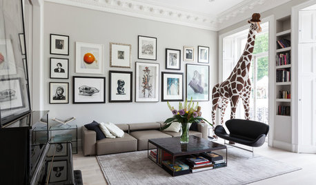
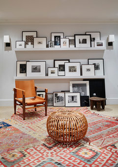
ARTAn Insider’s Guide to Creating the Perfect Gallery Wall
Bring your room to life with these expert tips for grouping artwork and photographs
Full Story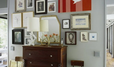
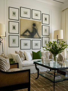
ARTA Gallery Wall for Every Personality
Eclectic, ambitious, inspired, dreamer? Which art-wall type are you?
Full Story
BATHROOM DESIGNWhich Flooring Should I Choose for My Bathroom?
Read this expert advice on 12 popular options to help you decide which bathroom flooring is right for you
Full Story
KITCHEN DESIGNHouzz Quiz: Which Kitchen Backsplash Material Is Right for You?
With so many options available, see if we can help you narrow down the selection
Full Story
DIY PROJECTSHow to Create Your Own Semicustom Media Wall
Don’t let the price of a custom built-in stop you. Put one together with ready-made pieces and a little finish help
Full Story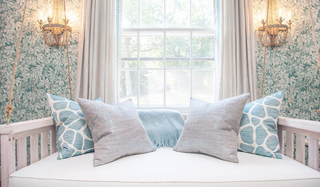
WALL TREATMENTSRemovable vs. Traditional Wallcoverings: Which Is Right for You?
Read about the pros and cons — and see great examples — of wallcovering options available for your home
Full Story
DECORATING GUIDESWhich Wallcovering Is Right for You?
Transform a Space With a Wall of Wood, Paper, Fabric, Maps and More
Full Story
DECORATING 101Interior Design Basics to Help You Create a Better Space
Let these pro tips guide you as you plan a room layout, size furniture, hang art and more
Full Story
DECORATING GUIDESWhich Rooms Get the Oscar?
On the eve of Hollywood’s night of nights, we bring you top films from the past year and their interior twins
Full Story


ingrid_vc so. CA zone 9