


Whole house color scheme help
Kris Bruesehoff
4 years ago
last modified: 4 years ago
Featured Answer
Sort by:Oldest
Comments (67)

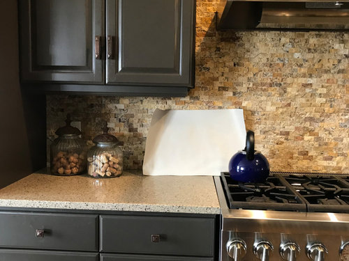
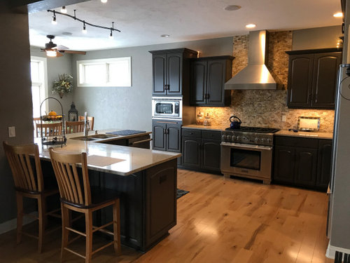
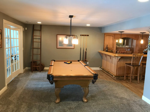
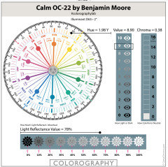
Marylee H
4 years agoMarylee H
4 years agoRelated Discussions
Online color consultant for whole house paint scheme?
Comments (8)dasiychain01- that's good to know. I was thinking of using some bloggers who I thought seemed really knowledgable about color. Figured they might actually be better than an interior designer who is probably more skilled in furniture and things (also being in the NYC area, the one's near me are $$). I asked the builder about using the BM consultant (they use Benjamin Moore paint) but they said the way they get it isn't really through a store so there's no consultant? Not sure if that sounds right. I will double check. Since it's new construction there's nothing to match, it's just picking a bunch of things that work well together....See MoreWhole house color scheme using Sherwin Williams paint
Comments (1)A local consult from a designer will be the best money you spend on the project. Colors need to be chosen in the light that they will be viewed, and with the phish all samples of the products right there in front of you. You cannot choose colors online....See MoreWhole-house color scheme using SW Passive
Comments (3)I could, but I worry in the living room with tall ceilings that it will be too cool....See MoreHELP choosing family room wall color and whole house color palette
Comments (4)Swatching colors side by side on the old color doesn't really help. You need need white poster board painted the colors you are looking at with a white edge around it. Then you move them around the room during different times of the day to see the color in the space. OR you can order from Samplize to try colors. I would try the Prussian Blue in your rooms as suggested. I think it is going to way to bright....See MoreMarylee H
4 years agoMarylee H
4 years ago
Kris Bruesehoff
4 years agoMarylee H
4 years agoKris Bruesehoff
4 years agoKris Bruesehoff
4 years agoMarylee H
4 years agoKris Bruesehoff
4 years agoKris Bruesehoff
3 years agoKris Bruesehoff
3 years agoeverdebz
3 years agoKris Bruesehoff
3 years agoKris Bruesehoff
3 years agoKris Bruesehoff
3 years agolast modified: 3 years agoKris Bruesehoff
3 years agolast modified: 3 years agoeverdebz
3 years agolast modified: 3 years agoKris Bruesehoff
3 years agoKris Bruesehoff
3 years agolast modified: 3 years agoKris Bruesehoff
3 years agoKris Bruesehoff
3 years agoKris Bruesehoff
3 years agoKris Bruesehoff
3 years agoKris Bruesehoff
3 years agoKris Bruesehoff
3 years agoKris Bruesehoff
3 years ago


Related Stories

COLORPick-a-Paint Help: How to Create a Whole-House Color Palette
Don't be daunted. With these strategies, building a cohesive palette for your entire home is less difficult than it seems
Full Story
UNIVERSAL DESIGNMy Houzz: Universal Design Helps an 8-Year-Old Feel at Home
An innovative sensory room, wide doors and hallways, and other thoughtful design moves make this Canadian home work for the whole family
Full Story
SELLING YOUR HOUSE10 Tricks to Help Your Bathroom Sell Your House
As with the kitchen, the bathroom is always a high priority for home buyers. Here’s how to showcase your bathroom so it looks its best
Full Story
SELLING YOUR HOUSE5 Savvy Fixes to Help Your Home Sell
Get the maximum return on your spruce-up dollars by putting your money in the areas buyers care most about
Full Story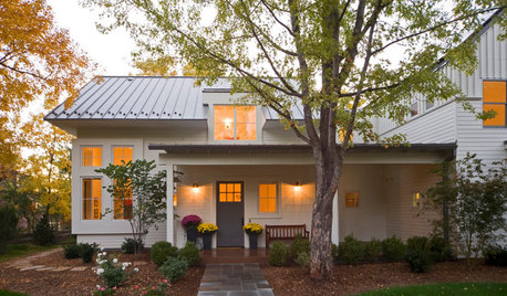
SELLING YOUR HOUSEHelp for Selling Your Home Faster — and Maybe for More
Prep your home properly before you put it on the market. Learn what tasks are worth the money and the best pros for the jobs
Full Story
EXTERIORSHelp! What Color Should I Paint My House Exterior?
Real homeowners get real help in choosing paint palettes. Bonus: 3 tips for everyone on picking exterior colors
Full Story
DECLUTTERING5 Ways to Jump-Start a Whole-House Decluttering Effort
If the piles of paperwork and jampacked closets have you feeling like a deer in the headlights, take a deep breath and a baby step
Full Story
INSPIRING GARDENSIdyllic English Gardens for the Whole Community
This award-winning 12-acre landscape for a midcentury housing complex outside London features woodlands and a lake
Full Story
LIFEDecluttering — How to Get the Help You Need
Don't worry if you can't shed stuff and organize alone; help is at your disposal
Full Story
REMODELING GUIDESWisdom to Help Your Relationship Survive a Remodel
Spend less time patching up partnerships and more time spackling and sanding with this insight from a Houzz remodeling survey
Full Story


Susan Davis