


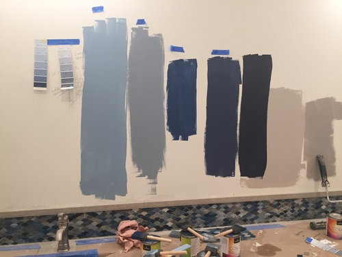
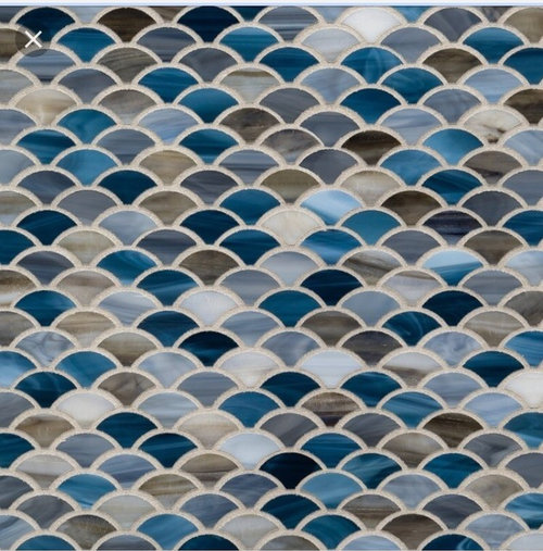
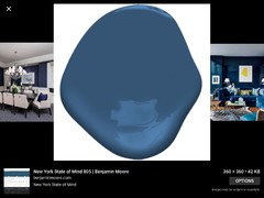
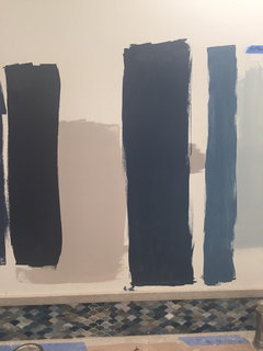
Close But Not Quite - Kensington Blue Benjamin Moore
cerileen
6 years ago
Featured Answer
Sort by:Oldest
Comments (24)

cerileen
6 years agolshack17
6 years agoRelated Discussions
Benjamin Moore Tundra, etc.
Comments (9)I wonder if Paper White would be more definitely out of range with green or yellow. I'd prefer it not to look greenish in any light. Paper White is more in the middle of the green-yellow hue family. Farther away from the green hue family compared to Tundra. So, Paper White is indeed less green. The colors of white and gray that we perceive as being most neutral, showing as having the least hue bias, belong to the yellow to green-yellow to green hue families. Whether the color looks truly neutral with no overtones or hue bias depends on the light. Hope that helps. (Whenever I make a new Colorography, I post it on Instagram. Can find them all by searching the #colorographylab hashtag)...See MoreBenjamin Moore Grey colors to complement navy blue front door
Comments (10)Great job of narrowing down the colors! Chelsea Gray HC-168 is a great neutral gray that’s popular for exteriors. Cinder AF-705 takes on a purplish hue in comparison to Chelsea Gray however can work with your navy door. Geddy Gray CW-720 is very similar to Chelsea Gray which also makes it a great, and a safe choice. Be sure to view it next to your door to ensure there’s enough contrast between the gray and the blue. Good luck!...See MoreBenjamin Moore’s white opulence paint color
Comments (75)It has been a while since the last activity on this thread, and I felt it might be beneficial to give my updated perspective on White Opulence #879 from Benjamin Moore as a paint color for main areas. Having lived with this color for a bit longer now since my last comment, I am beginning to understand how tightly it regulates what other colors can be placed with it for anyone who cares about a homogeneous scheme and also how undeniable the pink tone can be when applied over large surface areas. White Opulence is a tint of red, but it is so light that in ample daylight or under bright white lighting it can "read" as white. In average daylight, it produces a whisper-light pink hue. The effect of this is magnified the larger the area that is covered by it. Using this color on the walls in the main space of a large, open-plan layout with high ceilings, for example, will imbue the area with a light, yet undeniable, pale pink cast in average lighting. It would be a good idea to prepare not only yourself but also any other significant users of the space of the pink tinge before selecting this color because some people truly dislike pink, and it is courteous to work with all regular users of spaces during design planning to try to ensure no one will be overly uncomfortable with the final effect. One thing that hasn't been discussed is how White Opulence can cast a peach tone under warmer lighting colors, especially in the absence of any compensating daylight, meaning nighttime in most home spaces. If peach is a color you want to avoid and you utilize warm lighting -- that is, progressively orange-tinged the further under a 4000K color temperature you go -- then this is a paint color to avoid. The general recommendation is that 4000K is quite cool for home environments, so if you don't know what color temperature your home lighting is, you can probably assume it is warmer than 4000K if you selected average bulbs from your home supplies provider. White Opulence as a red-based white was an attractive choice for my main space because I already had a red accent in a permanent finish and personally prefer the fresh look that a red-white lends versus common alternate choices for main area wall colors like yellow-based beiges or blue-based grays. The problem is that so many home goods available are manufactured in colors that go with beige and gray wall colors rather than the faint red-white of White Opulence that color coordination requires more work than may be expected. Of course, you could decorate using pure white items, but what you really need are options for whisper pink basics which are hard to find. Adding stronger pink or red items is not always the solution either because you cannot feasibly fill the room with accents; you need some basics that blend with the wall tone. Then there is the issue of coordinating White Opulence with colors for auxiliary rooms if you wish to have some variety throughout the home while still maintaining the feel that all of the home's colors work together. Most blues coordinate with White Opulence, but if you have already used red accents in rooms painted with White Opulence, then red is challenging to pair with blue in most instances unless it is a dark, cool blue like navy. Where this has been a dilemma for me has been my hallway colors connecting the main open space to the bedrooms which are all different pastels. The color plan I have will work, and I'll enjoy the variety of colors that I have been able to make flow together, but to be honest, at times I have wondered how much easier the design process might have been if I had picked plain white for the main space. White is the ultimate neutral some might say. At the very least, a basic white for the main area would have given me more freedom in selecting fabrics and other home products for the main space as well as coordinating colors for other rooms. It is all too easy to second-guess decisions that will affect your life long-term. I am using Benjamin Moore's durable Aura formula in a satin finish, so I expect the new White Opulence paint will last decades. Had I selected a plain white or yellow- or blue-based off white, I might be back on this very forum wishing I had gone with White Opulence to add appeal beyond the standard choices. I hope this is helpful to anyone still considering this color....See MoreBest Benjamin Moore pale blue for north facing room?
Comments (1)B.M Crystal Blue for a brighter northern exposure (or any light blue where the undertone is teal)....See More
smitrovich
6 years ago PRO
PROFlo Mangan
6 years agocerileen
6 years agocerileen
6 years agoptreckel
6 years ago- PRO
Flo Mangan
6 years ago - PRO
Flo Mangan
6 years ago - PRO
Flo Mangan
6 years ago - PRO
Flo Mangan
6 years ago cerileen
6 years agocerileen
6 years ago- PRO
Flo Mangan
6 years ago lshack17
6 years ago
Patrick Blackmon (8a)
6 years ago- PRO
Flo Mangan
6 years ago cerileen
6 years agoloobab
6 years ago- PRO
Flo Mangan
6 years ago 
lynartist
6 years agocerileen
6 years ago
Kathi Steele
6 years ago


Related Stories

COLORBenjamin Moore Floats Breath of Fresh Air as Its Color of 2014
Touted as a new neutral, this baby blue can stand on its own or support bolder colors. Here's how to use it
Full Story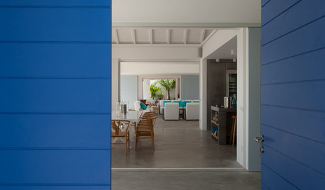
COLORBest Uses for the Saturated Blue Color of 2015
Kelly-Moore’s selection is a classic shade of blue worthy of chunky accents around the home
Full Story
BLUEColor Guide: How to Use Navy Blue
Solid, steadfast navy blue can ground a room, but it still knows how to have a good time
Full Story
COLORMore Top Paint Picks for 2014: New Greens, Blues and Neutrals
Valspar’s new colors aim to lift spirits and express creativity. Here’s how to use 9 of them in lively ways
Full Story
MOST POPULARIs This the Year Blue and Green Kitchen Cabinets Edge Out White?
Neutrals still dominate cabinet color. But some of the most popular recent kitchens on Houzz tell a different story
Full Story
DECORATING GUIDESIn the Navy: What's New With This Dark Blue
Quietly powerful and always classic, navy blue can help rooms from casual contemporary to elegant traditional make a statement
Full Story
DECORATING GUIDESBlues Blaze Into Fashion for Fall 2012
Sashaying down designer runways and sported by trendy home interiors, this cool hue is looking to be way hot this fall
Full Story
COLORPick-a-Paint Help: How to Quit Procrastinating on Color Choice
If you're up to your ears in paint chips but no further to pinning down a hue, our new 3-part series is for you
Full Story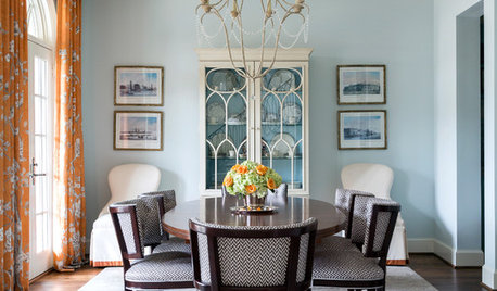
COLORDesigner Picks: 12 Soothing Light Blue Paint Colors
These sky-blue paint colors evoke a sense of calm and cheerfulness. Designers tell us why they love them
Full Story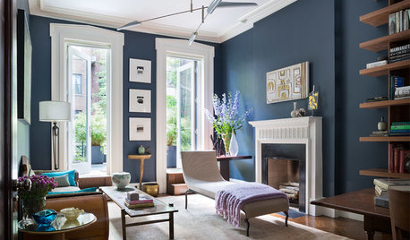
DECORATING GUIDESDesigner Picks: 9 Beautiful Saturated Blue Paints
Bold cobalt, inky indigo and moody midnight are just a few of the hues that can set a dramatic tone
Full Story


lshack17