


Blues Blaze Into Fashion for Fall 2012
Sashaying down designer runways and sported by trendy home interiors, this cool hue is looking to be way hot this fall
Jennifer Ott
September 20, 2012
San Francisco-based architectural color specialist and design writer. Jennifer's work has been featured in many print and online publications. Her recently-published book, "1000 Ideas for Color Schemes," is a beautifully illustrated and easy-to-navigate guide that takes the guesswork out of selecting the perfect color palette for your home or special event. For more information on Jennifer Ott Design, visit http://jenottdesign.com/.
San Francisco-based architectural color specialist and design writer. Jennifer's... More
Look for blue as one of the handful of colors touted as "in" this fall. Pantone, a company that develops and maintains color management systems used by designers, calls Olympian Blue (think of the blue on the Greek flag) one of this season's top hues. And fashion bloggers have been reporting seeing quite a bit of peacock blue and teal — deep, watery blues that have a touch of green in them — on the runways.
Most homeowners cannot or do not want to change the colors of their interior with every passing trend, but if you are looking for a small way to make a big change in your home, try introducing these hip blue colors into your decor.
Ideas for fall's hottest oranges
Most homeowners cannot or do not want to change the colors of their interior with every passing trend, but if you are looking for a small way to make a big change in your home, try introducing these hip blue colors into your decor.
Ideas for fall's hottest oranges

Pick up on the blue trend by incorporating one or more of these colors in your interiors, clockwise from top left: Peacock Blue GLB01, from Glidden; Caribbean Blue Water 2055-30, from Benjamin Moore; Hyper Blue SW 6965, from Sherwin-Williams; and Tidal Teal 5006-8B from Valspar.
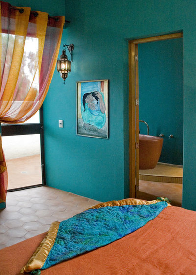
A teal accent wall in your bedroom paired with spicy oranges and yellows creates an exotic vibe reminiscent of faraway places. Just be sure to keep the floor a light, neutral color and limit the artwork and accessories to a few key pieces, to prevent the space from feeling too busy and cluttered.
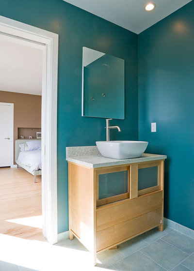
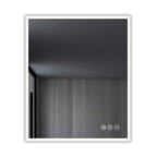
Lots of intense color can be overwhelming in a space. If you want to go bold on the walls but desire a more soothing effect, take a tip from this beautiful bathroom and keep everything else simple, light and neutral.
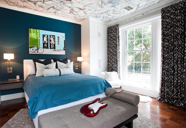
Peacock blue is striking in this bedroom against the supporting white, black, brown and gray hues.
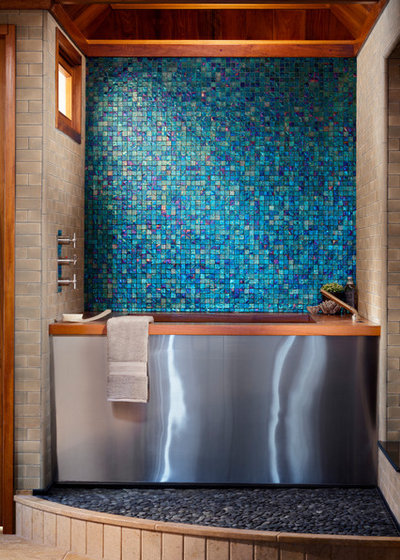
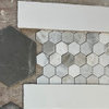
These glass mosaic tiles from Oceanside Glasstile create a gorgeous accent wall. The colors are reminiscent of cool blue Mediterranean waters, perfect for taking a long, relaxing soak. With such a strong decorative element on the wall, the room needs no other artwork or bold color to enhance it.
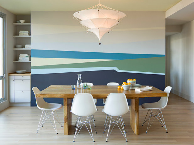
If you are concerned about investing a huge chunk of change on wall tile that you might grow tired of down the road, or simply do not have a budget that can accommodate it, try tapping into your inner abstract artist (or enlist the help of an artistic friend, or hire a pro) to paint a color-field accent wall in your favorite cool hues. This would be supereasy to change out if you desire a different look later on.
Macy's
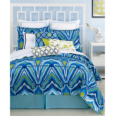
Stick to bold blue accessories for a smaller-scale approach to this trend. This bedding by Trina Turk would gussy up even the dullest of bedrooms. It's a great way to inject some color into a neutral bedroom without having to dig out your paintbrush.
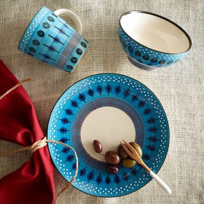
These new dishes from West Elm feature a beautiful beaded pattern in this season's hip shades of blue.
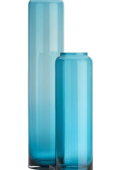
Gather a few of these vases together in a place of prominence in your home, and you have a nice spot of color. Add some yellow and green via cut flowers, and you'll instantly have a beautiful, colorful focal point.
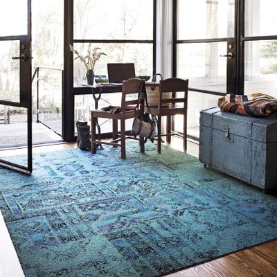
Flor took inspiration from faded, antique Persian rugs for this line of carpet tiles. The pattern is very forgiving if you happen to fall behind on your housecleaning, and the green-blue colors pair well with so many other colors, from grays to purples to greens to other blues.
Chiasso
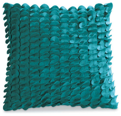
These pillows would be perfect perched atop a camel-colored sofa (or just about any other furniture with a neutral hue).
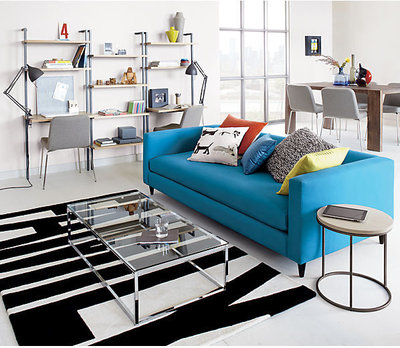
Normally I advise staying away from bold, trendy colors for items that you don't want to change out very frequently, but sometimes you fall in love with an item and find a way to make it work. This peacock-blue sofa looks great in a minimalist, modern space in which it can be the star of the show.
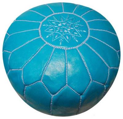
If you love this hue but don't want to commit an entire sofa to it, try thinking in terms of smaller, less expensive pieces, like this fabulous pouf from Jonathan Adler.
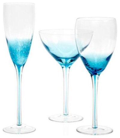
If your beverage of choice is red wine, be forewarned that it might not look so good in these blue-tinged stemware pieces, but go ahead and fill them up with your favorite white wine, champagne or sparkling water.
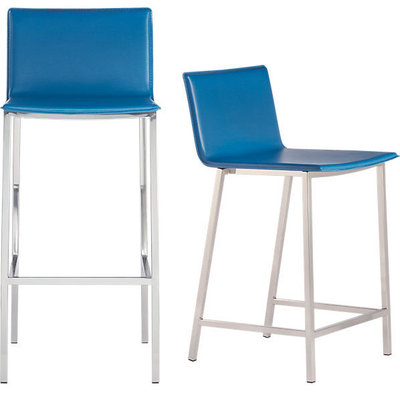
If I happened to be in the market for new counter stools, these would be at the top of my list. I love the clean lines and that gorgeous shade of blue.
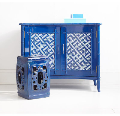
Looking for some interesting pieces to add to your living room? This handsome concave-front console and carved stool in Olympian Blue are standouts.
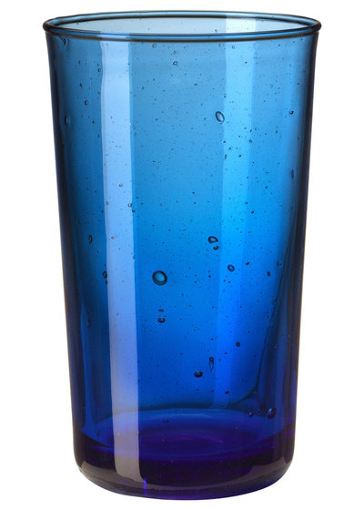
Bring Olympian Blue into your dining room without breaking the bank. This juice glass from Ikea costs just $1.49.
The Company Store
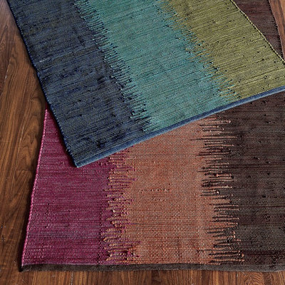
Beautiful cool colors woven together in an ombré effect make for a terrific runner. The palette complements a warm wood floor nicely, but it would also look very stylish on a gray polished concrete floor.
Tell us: What's your favorite blue hue? Have you used it to enhance your home's interior?
More ways with blue
Tell us: What's your favorite blue hue? Have you used it to enhance your home's interior?
More ways with blue
What are you working on?
Related Products
Related Stories
Organizing
How to Create a Joyful, Clutter-Free Home Office
Follow these steps to get rid of the paper piles and make room for beauty and better organization
Full Story
Remodeling Guides
15 Ways to Create Separation in an Open Floor Plan
By tidgboutique
Use these pro tips to minimize noise, delineate space and establish personal boundaries in an open layout
Full Story

White
Design Pros Share 10 Favorite Creamy White Paints
By Becky Harris
These off-white color choices include versatile tones, warming hues and pleasingly soft shades
Full Story
Entryways
4 Designer Tips for a Fashionable Entry
By tidgboutique
A pro shows how adding color, statement pieces and more to a foyer can set the right tone for the rest of the home
Full Story
Most Popular
7 Major Decorating Mistakes and How to Avoid Them
By tidgboutique
Gain confidence to start your interior design project with this advice from a professional designer
Full Story
Living Rooms
4 Must-Have Features for a Small Living Room
By tidgboutique
A designer shares important ways to live large in a tight space and make it look stylish
Full Story
Most Popular
7 Common Decorating Mistakes to Avoid
Pros share solutions to design problems they often find in people’s living spaces
Full Story
Most Popular
How to Decorate a Living Room
By tidgboutique
A designer offers tips for creating a comfortable space that reflects your style
Full Story
Budget Decorating
Where to Splurge and Where to Save When Decorating
By tidgboutique
See where it makes sense to invest in durable essentials and focal pieces, and where to economize on other things
Full Story
Lighting
Pro Tips for Lighting 10 Rooms and Outdoor Areas
Get professional advice for lighting your kitchen, bathroom, living room, office, patio and more
Full Story
If you are having trouble making your drapes and bedspread "pop" (I hate that term), it could be a couple of things. It might be the ambient light in the room. In a Northern exposure blues will feel very chilly. Try moving the bedspread to different rooms in the house and observe how the color changes. Maybe it will be as simple as switching the blue-green and green-blue.
If the white/blue on the wall has a gray undertone then these saturated green/blues probably won't light up the room. Lavender or Iris Blue might look better.
Or maybe you can do an accent wall of a stronger color. Get a piece of dry wall and some paint samples and try a few things to find what works.
Good luck.
I love the way Martyn Lawrence Bullard used the blue pillow in the center of the warm colors in the room in this photo.