


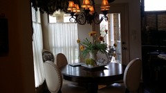
Kitchen advise please??
6 years ago
last modified: 6 years ago


Featured Answer
Sort by:Oldest
Comments (35)
 6 years ago
 6 years ago
Related Discussions
Please advise/help with Kitchen Plans – several drawings of plans
Comments (3)Regarding the refrigerator -- we have just under 33" b/w the refrigerator handle and the counter edge across from it - and it's much too shallow an aisle! We were stuck with it b/c of the numerous measuring errors on the part of our KD. While it's something we've adapted to - if someone is in the refrigerator no one can pass by - it's not what I wanted! (I was aiming for 48".) . However, it's your home and Kitchen - so it's your choice how to handle it. We're here to give you advice - with no financial benefit accruing from specific designs/appliances/etc. - and it's your choice whether to take it or not. I understand that you're used to what you have and you can't imagine anything better - but keep in mind that: Human beings are very adaptable. We can adapt to anything - good or bad - even the worst layouts! We adapt so well that we tell ourselves it's fine the way it is - we cannot imagine doing it differently or making it better. But, what if it could be better? If you ask just about anyone here who took our advice and changed their layout to make it better, they will tell you they never realized it could be so much better and wondered how they had lived with the issues for so long! (The answer is back to the adaptability of human beings!) Human beings are resistant to change. Even when something can be made better, we resist change. We like what we know and we have a hard time seeing other ways to do things - even if they could be so much better! And, as I mentioned before, we've adapted to what we have - both the good and the bad. [This is not specific to you - we are all resistant to change to some extent!] Once we get past that resistance and start opening up to new ideas, though, it can be amazing what we can come up with - and I don't mean just the people here helping you, I mean you and your family coming up with new ideas as well! So, why not at least try for something better and give others a chance to come up with a better design? If you are not open to looking at other options, then so be it - as I said before, it's your Kitchen, so you can do what you want with it. Good luck with your remodel!...See MoreKitchen window dilemma at end of project - please advise.
Comments (18)I went back and forth with my architect over this very detail when designing our house. He wanted my kitchen window to sit flush with my countertop like your inspiration pic. I liked the look of that concept but when I started thinking about the practicality of it, I decided to raise my window up a bit (or actually shorten the window). Knowing how much water splashes behind my sink at my current house, I would be constantly wiping off water from my window sill. And water would likely be splashing on the window itself leaving me to constantly clean water drops or not clean it and stare at water drops all time (the more likely scenario!). I wouldn't put a piece of wood under your window. I'd leave it so you have no trim or apron below the window. I'd use your backsplash tile to extend under the window and tie the two sides together. The tile backsplash will prevent water damage far better than sheetrock or wood. Your kitchen looks lovely! Here is one of my inspiration pics. You can see the window just ends at the sill. Nothing below it but tile....See MoreWindow Advise in our kitchen remodel - Please help!
Comments (3)I'd give up symmetry for light, so I think you should keep the window. I'd move the cooktop and hood closer to the window, then use open shelves on the other side, the same width as the window. alex9179 has a good suggestion, and you can have an appliance garage in the corner to avoid a 'cave.' I'd also suggest that the DW be moved to the left of the sink, and a dish hutch with glass at the top placed on the end, to break up the long stretch of counter. You'd then have separate prep/cooking and clean-up areas, which will make it easier for a helper to unload the DW, or gather dishes to set the table, without interfering in prep and cooking tasks....See Morekitchen counter advise please!
Comments (2)I agree with the soapstone advice. Also, maybe honed and leathered finish for AB would work....See More- 6 years ago
- 6 years ago
- 6 years ago
 6 years ago
- 6 years ago
- 6 years ago
 6 years ago
- 6 years ago
- 6 years ago
 6 years agolast modified: 6 years ago
- 6 years agolast modified: 6 years ago
- 6 years ago
- 6 years ago
 6 years agolast modified: 6 years ago
- 6 years ago
- 6 years ago
- 6 years ago
- 6 years ago
- 6 years ago
- 6 years ago
- 6 years ago
- 6 years ago
- 6 years agolast modified: 6 years ago
- 6 years ago
- 6 years ago
- 6 years agolast modified: 6 years ago
- 6 years agolast modified: 6 years ago


Related Stories

HOME OFFICESQuiet, Please! How to Cut Noise Pollution at Home
Leaf blowers, trucks or noisy neighbors driving you berserk? These sound-reduction strategies can help you hush things up
Full Story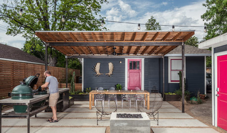
OUTDOOR KITCHENSHouzz Call: Please Show Us Your Grill Setup
Gas or charcoal? Front and center or out of the way? We want to see how you barbecue at home
Full Story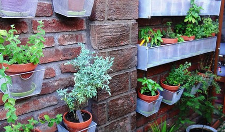
GARDENING GUIDES9 Fresh Herbs for Crowd-Pleasing Thanksgiving Dishes
Pluck these herbs from a windowsill pot or a garden for a Thanksgiving meal that sings with fresh flavor
Full Story
BATHROOM DESIGNUpload of the Day: A Mini Fridge in the Master Bathroom? Yes, Please!
Talk about convenience. Better yet, get it yourself after being inspired by this Texas bath
Full Story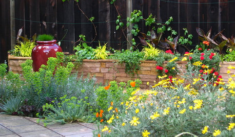
SUMMER GARDENINGHouzz Call: Please Show Us Your Summer Garden!
Share pictures of your home and yard this summer — we’d love to feature them in an upcoming story
Full Story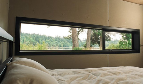
ARCHITECTUREDesign Workshop: Just a Sliver (of Window), Please
Set the right mood, focus a view or highlight architecture with long, narrow windows sited just so on a wall
Full Story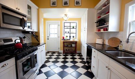
FLOORSChecks, Please! 13 Choices for Checkered Floors
Checkerboard Patterns Go From Casual to Ritzy, From Marble to Grass
Full Story
HOUSEPLANTSMother-in-Law's Tongue: Surprisingly Easy to Please
This low-maintenance, high-impact houseplant fits in with any design and can clear the air, too
Full Story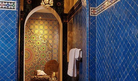
TILEMoor Tile, Please!
Add an exotic touch with Moroccan tiles in everything from intricate patterns and rich colors to subtle, luminous neutrals
Full Story
LIVING ROOMSCurtains, Please: See Our Contest Winner's Finished Dream Living Room
Check out the gorgeously designed and furnished new space now that the paint is dry and all the pieces are in place
Full Story


House Vixen