


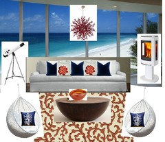
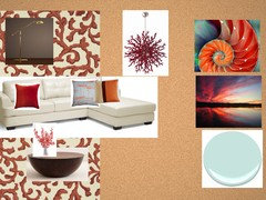
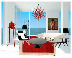
DAT #4- Beach House Style
jlc712
8 years ago


Featured Answer
Sort by:Oldest
Comments (47)

Nothing Left to Say
8 years ago
jlc712
8 years agoRelated Discussions
Pendant lighting for beach house
Comments (35)I do like the pulley too..maybe I can convince him to exchange the non working one. #4 I am afraid is on the small side but I have to go back and find the dimensions on it. just looks small to me. but i do like the nautical look it has. re. the table lighting. after spending the weekend there with ceiling fans in the adjacent room, I am really sorry we didn't just wire for a ceiling fan over the table. we wired for 2 drum/pendant type lights. I asked my husband if would want to change that out and he is not crazy abou the idea. the breeze in the family room is really nice, but the kitchen is still. still working on him. Otherwise i do like the woven or drum pendants. I was never crazy about a ceiling fan over a table but..here it would be very functional....See MoreDesign Around This #22: Background for Beach Houses
Comments (23)MrsMortarmixer asked about beach house styles on the other thread--in the context of "what style house are you designing for." Beach house architectural styles can be anything really, depending on when they were built, the owner's taste, and how much money was invested. They all tend to be designed with plenty of ocean-facing windows to capture the view. Here's a smattering of Hawaiian beach homes, from modest to extravagant and from outrageously ethnic to minimalist modern. This photo of Kiholo Bay is courtesy of TripAdvisor...See MoreThanks to jlc712's DAT, a plan is evolving, but need your HELP!
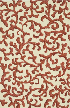
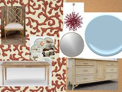
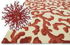
Comments (7)I get your inspiration and I think it's a great direction. However, I feel a little hamstrung as you want to add pattern, but don't want to change out the drapes or the artwork and want to keep the upholstery solid, and even the stone bowl has no color. So I guess the only way to add pattern would be to use throw pillows and maybe an afghan or throw to the sofa. I would like to see some of the color from the rug moved up into the room. I would look at the blue and red and add it somewhere else in the room at least twice to pull it in. Otherwise, I'd consider not using that rug in the living area, maybe in the dining area instead and using a neutral rug to keep it consistent with the rest of the room. I think I would prefer the latter as I like the all neutral look and I think you'll have a decent amount of pattern with the flooring and the ceiling treatment already....See MoreBuilding contemporary beach home in WA state--need window help
Comments (8)Thank you for the suggestions...we have considered changing the 3 window openings into one opening, but the plans would have to go back to engineering. That said, we certainly will do that if we can't come up with something that works for us. We don't need a lot of ventilation...in fact, the dining area can be seen on the picture I uploaded--it is located where the sliding doors is and there is a matching one across from it ( 15' away) and with both opened we would have a nice breeze--except on calm days, of course. The view is Puget Sound and our beach. I designed the floor plan with this goal: Upon opening the front door one would look directly out the windows to see the view. Do you have an aluminum window company that you recommend?...See More PRO
PROBeverlyFLADeziner
8 years agobabbs50
8 years ago- PRO
BeverlyFLADeziner
8 years agolast modified: 8 years ago palimpsest
8 years agolast modified: 8 years ago
Star Jeep
8 years agoNothing Left to Say
8 years agoNothing Left to Say
8 years agopalimpsest
8 years ago
Annie Deighnaugh
8 years agoNothing Left to Say
8 years agoUser
8 years agolast modified: 8 years agojlc712
8 years agoUser
8 years agopalimpsest
8 years agopalimpsest
8 years agoUser
8 years agoNothing Left to Say
8 years ago- PRO
BeverlyFLADeziner
8 years agolast modified: 8 years ago jlc712
8 years agoNothing Left to Say
8 years ago- PRO
BeverlyFLADeziner
8 years ago 
cawaps
8 years agoUser
8 years agoAnnie Deighnaugh
8 years agocawaps
8 years agopalimpsest
8 years ago- PRO
BeverlyFLADeziner
8 years ago 
prettybluehouse
8 years agolast modified: 8 years agoUser
8 years ago- PRO
BeverlyFLADeziner
8 years ago patrickthedestroyer
8 years agopalimpsest
8 years agocawaps
8 years agopositively_patty
8 years agolast modified: 8 years agocawaps
8 years agonosoccermom
8 years agoNothing Left to Say
8 years agolast modified: 8 years agoNothing Left to Say
8 years agopatrickthedestroyer
8 years agocawaps
8 years agonosoccermom
8 years agoAnnie Deighnaugh
8 years agocawaps
8 years ago
emmarene9
8 years ago


Related Stories
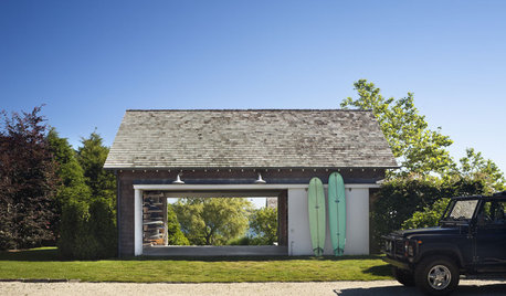
HOUZZ TOURSHouzz Tour: Style and Surprise in The Hamptons
Experience a Montauk Beach House That's All About Easy Living and Discovery
Full Story
HOUZZ TOURSMy Houzz: Beach-Chic Style for a Florida Bungalow
Blues and whites create a coastal vibe in a family’s ‘forever’ home in Tampa
Full Story
HOUZZ TOURSHouzz Tour: Rolling With the Seasons in a New York Beach House
With plush sheepskins for winter and an airy vibe for summer, this Long Island home appeals all year round
Full Story
TILENew This Week: 4 Rooms With Black-and-White Tile Style
Use patterned black-and-white tile on floors and walls to bridge the gap between traditional and modern looks
Full Story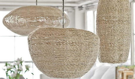
COASTAL STYLEOutfit a Beach House From Deck to Drawer Knobs
Make your livin' easy with these hand-picked products, paint colors and materials for a coastal-style getaway
Full Story
HOUZZ TOURSMy Houzz: Caribbean Beachside Style in Australia
Ditching a dated color scheme, an old deck and more, a couple renovates a four-bedroom home as an investment and vacation property
Full Story
DECORATING GUIDESSo Your Style Is: Coastal
Bright and breezy, coastal style transports you straight to the beach no matter where you call home
Full Story
HOUZZ TOURSHouzz Tour: Beach Cottage Chic in Rhode Island
A traditional coastal cottage gets a makeover with bold color punches and splashy surprise additions
Full Story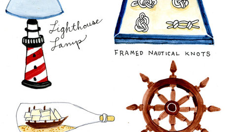
FUN HOUZZ12 Signs Your Coastal-Style Home May Have Gone Overboard
Accessories conjuring the beach often start innocently enough, but if you've framed your flip-flops, it may be time to reconsider
Full Story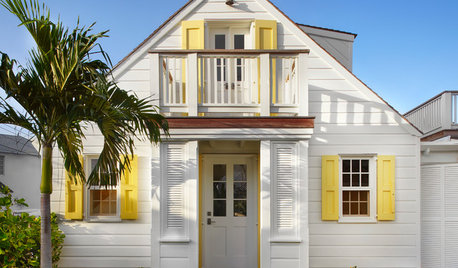
DECORATING GUIDES10 Small-Space Tips From Beach Cottages
Cozy doesn't have to feel cramped when you can trick the eye with color, height and scale
Full Story


Nothing Left to Say