


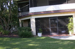
Does anyone have Benjamin Moore Affinity Color Eternity?
audreyrama
9 years ago
Featured Answer
Sort by:Oldest
Comments (10)

audreyrama
9 years agoRelated Discussions
Has anyone used Benjamin Moore Yorkshire Tan?
Comments (12)Thanks for the replies! I've been reading a LOT since finding this site and I can tell I will be addicted. I would have to classify my compulsion to constantly improve my home's aesthetics as... ILLNESS, really! At the very least - obsession. I just wish I had enough rooms & money to accommodate all my ideas. :) Ok I admit, I'm already addicted to the threads for different colors in the gallery. :*) I don't have any pics handy, but my palette is rich earth tones, and I'm partial to natural fabrics and hand-made accessories. Wood is unfortunately not white. :( It's a light-medium oak with orange undertones. *sigh* I did finally find some pictures of Yorkshire Tan in action -- and in these pics I don't think it's too dark, but these rooms also have a lot more white in them than mine does. See the "afters" here. I may need to revisit the Benjamin Moore store and check out the color(s) higher on the strip, especialyl since this room only has two windows and they get onyl indirect light after sunrise... AND because I'm not a fan of white ceilings....See MoreBenjamin Moore’s white opulence paint color
Comments (75)It has been a while since the last activity on this thread, and I felt it might be beneficial to give my updated perspective on White Opulence #879 from Benjamin Moore as a paint color for main areas. Having lived with this color for a bit longer now since my last comment, I am beginning to understand how tightly it regulates what other colors can be placed with it for anyone who cares about a homogeneous scheme and also how undeniable the pink tone can be when applied over large surface areas. White Opulence is a tint of red, but it is so light that in ample daylight or under bright white lighting it can "read" as white. In average daylight, it produces a whisper-light pink hue. The effect of this is magnified the larger the area that is covered by it. Using this color on the walls in the main space of a large, open-plan layout with high ceilings, for example, will imbue the area with a light, yet undeniable, pale pink cast in average lighting. It would be a good idea to prepare not only yourself but also any other significant users of the space of the pink tinge before selecting this color because some people truly dislike pink, and it is courteous to work with all regular users of spaces during design planning to try to ensure no one will be overly uncomfortable with the final effect. One thing that hasn't been discussed is how White Opulence can cast a peach tone under warmer lighting colors, especially in the absence of any compensating daylight, meaning nighttime in most home spaces. If peach is a color you want to avoid and you utilize warm lighting -- that is, progressively orange-tinged the further under a 4000K color temperature you go -- then this is a paint color to avoid. The general recommendation is that 4000K is quite cool for home environments, so if you don't know what color temperature your home lighting is, you can probably assume it is warmer than 4000K if you selected average bulbs from your home supplies provider. White Opulence as a red-based white was an attractive choice for my main space because I already had a red accent in a permanent finish and personally prefer the fresh look that a red-white lends versus common alternate choices for main area wall colors like yellow-based beiges or blue-based grays. The problem is that so many home goods available are manufactured in colors that go with beige and gray wall colors rather than the faint red-white of White Opulence that color coordination requires more work than may be expected. Of course, you could decorate using pure white items, but what you really need are options for whisper pink basics which are hard to find. Adding stronger pink or red items is not always the solution either because you cannot feasibly fill the room with accents; you need some basics that blend with the wall tone. Then there is the issue of coordinating White Opulence with colors for auxiliary rooms if you wish to have some variety throughout the home while still maintaining the feel that all of the home's colors work together. Most blues coordinate with White Opulence, but if you have already used red accents in rooms painted with White Opulence, then red is challenging to pair with blue in most instances unless it is a dark, cool blue like navy. Where this has been a dilemma for me has been my hallway colors connecting the main open space to the bedrooms which are all different pastels. The color plan I have will work, and I'll enjoy the variety of colors that I have been able to make flow together, but to be honest, at times I have wondered how much easier the design process might have been if I had picked plain white for the main space. White is the ultimate neutral some might say. At the very least, a basic white for the main area would have given me more freedom in selecting fabrics and other home products for the main space as well as coordinating colors for other rooms. It is all too easy to second-guess decisions that will affect your life long-term. I am using Benjamin Moore's durable Aura formula in a satin finish, so I expect the new White Opulence paint will last decades. Had I selected a plain white or yellow- or blue-based off white, I might be back on this very forum wishing I had gone with White Opulence to add appeal beyond the standard choices. I hope this is helpful to anyone still considering this color....See MoreHas anyone tried Benjamin Moore Cotton Balls?
Comments (4)I painted a dark upstairs hallway in Cotton Balls. I love it. It really warms a space that had been a cold gray white. In our low light setting it is a very soft cream. No green or gray tones. Our trim is BM White (OC 151), a fairly clean white. Perhaps if Cotton Balls was the lightest color in the space, it would read more white, less cream. Our hall light makes it very yellow. I'll try to post a picture tomorrow of how it looks in daylight....See MoreAnyone with Elmira White by Benjamin Moore?
Comments (36)It’s nearly time to place our order for cabinetry for our kitchen renovation We are considering using Elmira White on base cabinets. My challenge is the kitchen needs to keep existing warm marble flooring used throughout the residence, but the rest of the residence utilizes a cool palette with Chantilly Lace on all walls except for two highly-saturated cool hues used as accents on select areas in the main level living spaces: Big Country Blue and Cabana Green. All paint by Ben Moore. Our interior designer suggested using Elmira White cabinetry nearest the warm marble flooring paired with Decorator’s White for upper kitchen cabinetry. The sun-drenched U-shapped kitchen has a bank of southern exposure floor-to-ceiling glass sliders on the only non-cabinetry wall and connects visually to the LR/DR with stunning waterfront views on both east and south elevations. I’m much happier in cool palette spaces. I‘m struggling with using Elmira White and Decorator’s White as I feel like I’d be surrounded by warm hues. If it were not for the warm/cool conundrum, I would choose to continue with the Chantilly Lace for all cabinetry and keep everything in a cool hue palette with white marble counters and light grey veining. However, I do realize that would cause a palette disconnect with all materials in cool hues atop warm marble flooring. I’m also mindful of color flow throughout the residence. Any alternative suggestions for cabinetry in Ben Moore paint colors that would allow me to have the look and feel of a cool white kitchen yet still play nicely with the warm flooring? Wolf and Sub-Zero appliances have been ordered in brushed stainless. Note: some cabinetry sections are being done in tall verticals; those would have to be done in either the base or the upper cabinetry color—which would you suggest, the warmer or cool hue?...See Moreaudreyrama
9 years agoStasha V
8 years ago
Pat Adams
8 years agoPat Adams
8 years agomarymagee1976
7 years agoMarcella Lico
3 years agocindyancell
2 years agoPat Adams
2 years ago


Related Stories
DECORATING GUIDES7 Bedroom Styling Tricks Anyone Can Do
Short on time or money? You can spruce up your bedroom quickly and easily with these tips
Full Story
COLORBest Ways to Use the Neutral Green Color of 2015
Benjamin Moore’s Color of the Year is soft and natural
Full Story
DECORATING GUIDESColor Guide: How to Work With Bright White
There's a reason clean, crisp white is the eternal standard for walls. See how it can take your rooms from pallid to pleasing
Full Story
CURB APPEALFront and Center Color: When to Paint Your Door Yellow
Bring a burst of eternal sunshine to your home's entryway with an invigorating yellow front door
Full Story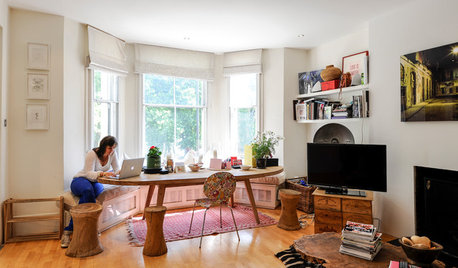
SMALL HOMESMy Houzz: Artistry and Personality Color a London Flat
A photographer’s Holland Park home does much better than just get by with a little help from friends
Full Story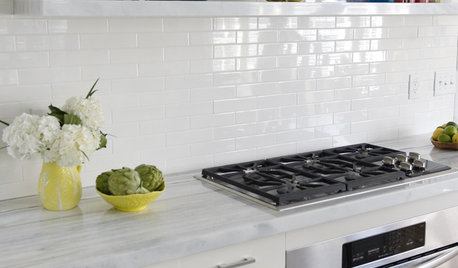
KITCHEN DESIGNWhat to Do if Your Kitchen Is Simply Too White for You
Does your all-white kitchen have you craving a little color? Here are some ways to introduce it
Full Story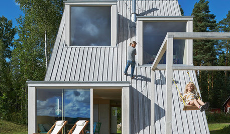
FUN HOUZZWorld of Design: 16 Fun Homes That Encourage Play
What does a fun home look like? These 16 very different properties around the world are designed with enjoyment in mind
Full Story

MOST POPULAR50 Shades of Gray
Gray is hotter than ever, thanks to a hit novel full of risks and dark secrets. Tell us: Which paint shade possesses you?
Full Story
COLORBest Ways to Use the Soft Yellow Color of 2014
You may fall for PPG Pittsburgh Paints’ Turning Oakleaf if you like your hues warm, mellow and cheery
Full StorySponsored
Central Ohio's Trusted Home Remodeler Specializing in Kitchens & Baths


Lori A. Sawaya