


Best Ways to Use the Neutral Green Color of 2015
Benjamin Moore’s Color of the Year is soft and natural
Jennifer Ott
December 7, 2014
San Francisco-based architectural color specialist and design writer. Jennifer's work has been featured in many print and online publications. Her recently-published book, "1000 Ideas for Color Schemes," is a beautifully illustrated and easy-to-navigate guide that takes the guesswork out of selecting the perfect color palette for your home or special event. For more information on Jennifer Ott Design, visit http://jenottdesign.com/.
San Francisco-based architectural color specialist and design writer. Jennifer's... More
Paint and stain manufacturer Benjamin Moore recently announced its color trends for 2015, including a Color of the Year for 2015: Guilford Green. The hue was chosen by a team of color experts who traveled through Europe to explore and document things of interest they discovered — from interesting textiles and artwork to, of course, paint colors. Several themes emerged, which led them to select the winning color stories and Guilford Green as the lead hue.
One in a series: See more companies’ featured colors of the year
One in a series: See more companies’ featured colors of the year
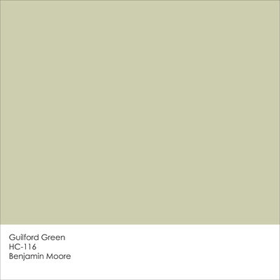
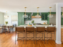
Guilford Green is a soft green that has a touch of gray and brown in it, which gives it a soothing neutral quality. According to Ellen O’Neill, creative director at Benjamin Moore, the hue represents “fresh energy and growth” and can serve as either “the hero or the highlight in any room.” Additionally it can work with a wide variety of design styles, from clean and contemporary to richly traditional.
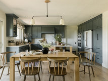
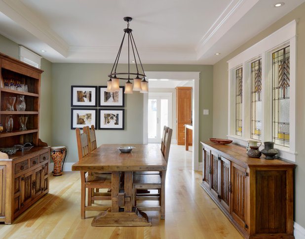
Because it has a slight grayish-brown undertone, Guilford Green plays nicely with a variety of wood tones. It neither fades away nor competes with warm woods, making it an excellent choice if you have wood floors and a roomful of wood furniture and furnishings.
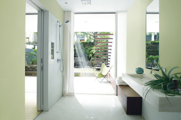
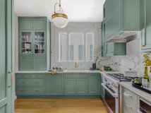
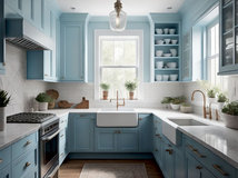
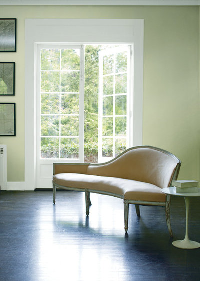
When paired with white, Guilford Green looks super fresh and crisp. For those who favor modern interiors, I’d suggest working with a palette similar to this one shown here, or you can use Guilford Green as a neutral base for other, more vibrant colors, such as bolder shades of greens or blues.
If you’ve been on the hunt for an alternative to beige, Guilford Green is an excellent option to consider. It’s a fresh neutral that wouldn’t look out of place in a transitional or traditional living room.
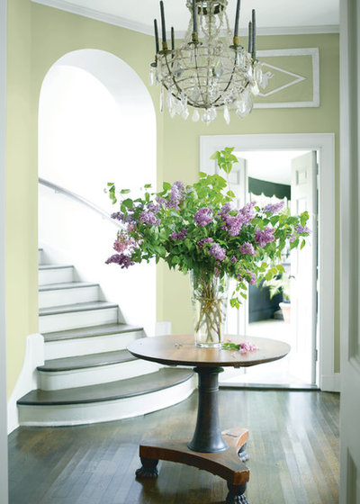
Think about layering Guilford Green with similar shades — those slightly lighter and darker — to help break up the monolithic look you can sometimes get when all the walls are painted the same color. This is especially smart in an open-plan home in which you want the entire space to feel cohesive.
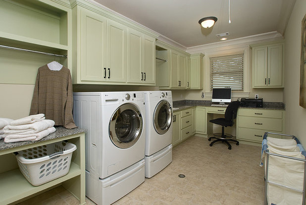
I like the choice of Guilford Green for the cabinets in this laundry room. Many laundry rooms have limited natural light, or none at all, so it’s smart to keep the color palette light. But light doesn’t have to mean white, and Guilford Green adds a nice splash of color without making the space feel dark or dreary.
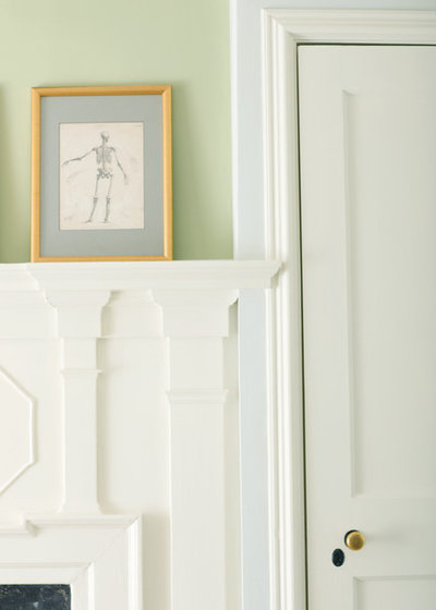
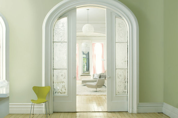
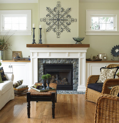
As a neutral, Guilford Green works with a variety of other hues, from warm to cool, but I’m really drawn to this pretty pairing of it with the warm white on the trim. For a similar soothing palette, try Guilford Green with Benjamin Moore’s Cloud White.
The color adds a little zing to this minimally decorated space. I think this room would feel too cold and stark if the walls were pure white. Guilford Green offers just enough color to add warmth and life to this room, without being too aggressive with color.
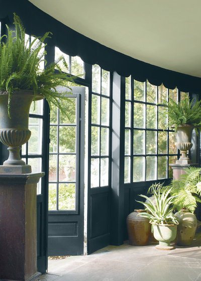
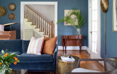
If you prefer to be surrounded by more dramatic colors, a hue like Guilford Green could work as a contrasting highlight to the bolder colors you favor. Here it’s used as a ceiling color. I like how it picks up the bits of green of the plants as well as in the landscaping just outside the windows.
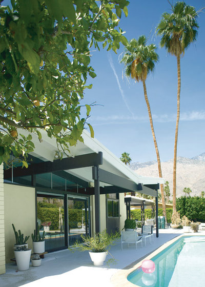
Guilford Green has actually long served as one of my go-to exterior house colors. It’s a less-expected neutral alternative to tan and gray, but it’s still mellow enough to use in large doses — as the main siding color. Because of its neutral quality, you can easily pair it with a more vibrant trim or front door color.
More: How to Use Marsala, Pantone’s 2015 Color of the Year
Tell us: Are you keen on Guilford Green?
More: How to Use Marsala, Pantone’s 2015 Color of the Year
Tell us: Are you keen on Guilford Green?
KA Builders is a dedicated and innovative remodeling company based in the heart of your city. With our years of... Read More

Related Products

With over 8 years of experience serving the Columbus and surround area, Hoffman Exteriors, is your solution for... Read More
Related Stories

Decorating Guides
Design Pros Share 10 Favorite Creamy White Paints
By Becky Harris
These off-white color choices include versatile tones, warming hues and pleasingly soft shades
Full Story

Kitchen Countertops
What Kitchen Countertop Colors Should You Choose?
By tidgboutique
Consider these popular colors and styles to get the look you want — no matter what material you use
Full Story

Colors of the Year
Pantone Picks a Peach for Its 2024 Color of the Year
By Jennifer Ott
See how to use this juicy hue to create calm yet flourishing spaces inside and outside the home
Full Story

Decorating Guides
5 Ways Designers Are Working With Rich Warm Tones Right Now
By Becky Harris
Interior designers describe their strategies for using rich warm colors to create an inviting home
Full Story

Colors of the Year
10 Paint Colors Ready to Take Over in 2024
By Jennifer Ott
Blue is huge, but dark hues and warm tones also find favor among major paint companies’ 2024 Color of the Year picks
Full Story
Decorating Guides
How to Mix Colors and Make It Work
By tidgboutique
Don’t want to confine yourself to neutrals but lack the confidence to embrace colors? Check out this pro advice
Full Story

Events
7 Color Trends for 2024 at Maison & Objet
By Claire Tardy
New harmonies and unexpected pairings at the fall 2023 trade fair set the tone for next year’s interiors
Full Story

Decorating Guides
9 Ways to Layer Warm Neutral Colors for Comfortably Refined Rooms
By Becky Harris
Design pros share advice for building an inviting palette, introducing high contrast and mixing textures
Full Story

Decorating Guides
How to Create a Cohesive Color Flow Throughout Your Home
By Erin Carlyle
Designers share eight techniques for avoiding a choppy feeling in your spaces
Full Story

Decorating Guides
How to Get Your Ceiling Paint Color Right
By tidgboutique
Here’s how to tweak the shade of your ceiling paint to get the effect you want
Full Story
Yes
I decided on a much lighter green. I mixed it myself.
I was thinking of pairing this with edgecomb grey in the extension as a kind of accent colour. It would go on the wall with the bifold windows. Not sure what colour couch to get though? Was also thinking of using like various colour greens as cushions.