


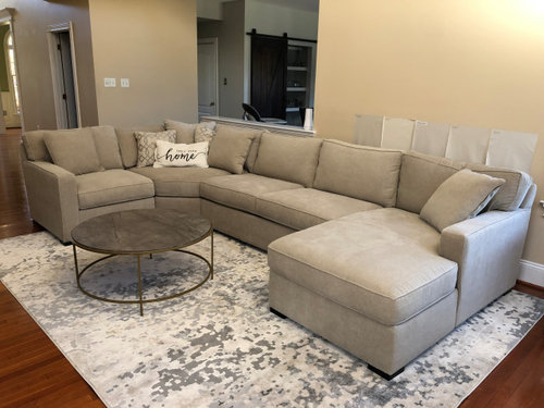
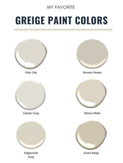
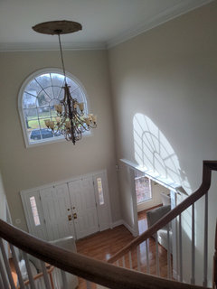
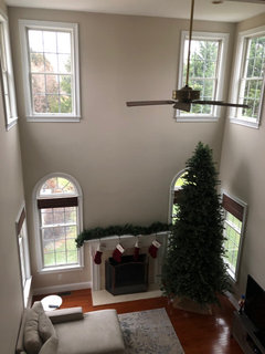
Anyone with Elmira White by Benjamin Moore?
Krysta K
2 years ago
Featured Answer
Sort by:Oldest
Comments (36)
 PRO
PROBeverlyFLADeziner
2 years ago
aok27502
2 years agolast modified: 2 years agoRelated Discussions
Anyone used Benjamin Moore's "Intense white"?
Comments (18)Well I may have to give it a try. Thanks to everyone for sharing their input. I have had such a challenge with grey paint for this room! My son wants a black white and grey theme. The silver satin I painted on the walls reads too pale and sometimes pink! He is so tired of me and my paint sample that he actually says the paint color is fine, he will live with it. Poor guy just wants his room back. When I sample it I will share results. Thanks again to everyone❤️💜💚💙...See MoreBenjamin Moore’s white opulence paint color
Comments (75)It has been a while since the last activity on this thread, and I felt it might be beneficial to give my updated perspective on White Opulence #879 from Benjamin Moore as a paint color for main areas. Having lived with this color for a bit longer now since my last comment, I am beginning to understand how tightly it regulates what other colors can be placed with it for anyone who cares about a homogeneous scheme and also how undeniable the pink tone can be when applied over large surface areas. White Opulence is a tint of red, but it is so light that in ample daylight or under bright white lighting it can "read" as white. In average daylight, it produces a whisper-light pink hue. The effect of this is magnified the larger the area that is covered by it. Using this color on the walls in the main space of a large, open-plan layout with high ceilings, for example, will imbue the area with a light, yet undeniable, pale pink cast in average lighting. It would be a good idea to prepare not only yourself but also any other significant users of the space of the pink tinge before selecting this color because some people truly dislike pink, and it is courteous to work with all regular users of spaces during design planning to try to ensure no one will be overly uncomfortable with the final effect. One thing that hasn't been discussed is how White Opulence can cast a peach tone under warmer lighting colors, especially in the absence of any compensating daylight, meaning nighttime in most home spaces. If peach is a color you want to avoid and you utilize warm lighting -- that is, progressively orange-tinged the further under a 4000K color temperature you go -- then this is a paint color to avoid. The general recommendation is that 4000K is quite cool for home environments, so if you don't know what color temperature your home lighting is, you can probably assume it is warmer than 4000K if you selected average bulbs from your home supplies provider. White Opulence as a red-based white was an attractive choice for my main space because I already had a red accent in a permanent finish and personally prefer the fresh look that a red-white lends versus common alternate choices for main area wall colors like yellow-based beiges or blue-based grays. The problem is that so many home goods available are manufactured in colors that go with beige and gray wall colors rather than the faint red-white of White Opulence that color coordination requires more work than may be expected. Of course, you could decorate using pure white items, but what you really need are options for whisper pink basics which are hard to find. Adding stronger pink or red items is not always the solution either because you cannot feasibly fill the room with accents; you need some basics that blend with the wall tone. Then there is the issue of coordinating White Opulence with colors for auxiliary rooms if you wish to have some variety throughout the home while still maintaining the feel that all of the home's colors work together. Most blues coordinate with White Opulence, but if you have already used red accents in rooms painted with White Opulence, then red is challenging to pair with blue in most instances unless it is a dark, cool blue like navy. Where this has been a dilemma for me has been my hallway colors connecting the main open space to the bedrooms which are all different pastels. The color plan I have will work, and I'll enjoy the variety of colors that I have been able to make flow together, but to be honest, at times I have wondered how much easier the design process might have been if I had picked plain white for the main space. White is the ultimate neutral some might say. At the very least, a basic white for the main area would have given me more freedom in selecting fabrics and other home products for the main space as well as coordinating colors for other rooms. It is all too easy to second-guess decisions that will affect your life long-term. I am using Benjamin Moore's durable Aura formula in a satin finish, so I expect the new White Opulence paint will last decades. Had I selected a plain white or yellow- or blue-based off white, I might be back on this very forum wishing I had gone with White Opulence to add appeal beyond the standard choices. I hope this is helpful to anyone still considering this color....See MoreBenjamin Moore Cloud White close match to Kelly Moore Pickett Fence 46
Comments (13)Patricia - I'm not looking to match an existing color in the room, rather want a Benjamin Moore paint COLOR but for Cabinet Coat (Pro. painter said to pick a color from Kelly Moore). Lori - Thank you for the detailed info. We are getting our (South Faced) kitchen cabinet painted. We have Cloud White (OC -130) on the walls, and looking for a white/off white color for the cabinets. Something that is not to stark, too yellow, or too pink! Some of the folks had suggested we match cabinets to the shutter colors (two windows in kitchen), however we prefer not to as it is an older K.M. paint color (Western Acoustic) which has a lot of yellow in it. We did swatches, and the best colors are Simply White /OC-117 and Could White/OC-130, with Simply White being the nicer of the two choices. However, since due to the base of each different paint manufacturer, paint matching can be a hit or miss, the Sales Reps (with over 20 years of experience. at K.M.) said that Pickett Fence was a close match to S.W. Main- Thank you for that info. It's extremely helpful. Will pass on the info. to our paint guy....See MoreHas anyone used Benjamin Moore’s Mayonnaise?
Comments (6)I have used Mayonnaise in my whole house and am now using it in our second home. To me it is like sunshine pouring in the room all day long. I love it. It is not yellow but when compared to some of the cold gray whites that have been popular, it may seem to be. It looks great with the same color as trim or with a more pure white....See More
H D
2 years agoMary Elizabeth
2 years ago- PRO
Patricia Colwell Consulting
2 years ago Mary Elizabeth
2 years agoKrysta K
2 years agoKrysta K
2 years agoMary Elizabeth
2 years agokandrewspa
2 years agoKrysta K
2 years agoKrysta K
2 years ago
Jennifer Hogan
2 years agolast modified: 2 years agoKrysta K
2 years agoJennifer Hogan
2 years agoJennifer Hogan
2 years agoMary Elizabeth
2 years agoKrysta K
2 years agoJennifer Hogan
2 years agoH D
2 years ago
susanlynn2012
2 years agoKrysta K
2 years agosusanlynn2012
2 years agoBrian Dowdall
2 years agoKrysta K
2 years agoKrysta K
2 years agoKrysta K
2 years agoKrysta K
2 years agoBrian Dowdall
2 years agoKrysta K
2 years agoBrian Dowdall
2 years agoKrysta K
2 years agopurpleplume
last year
Carol Frederick
last yearpurpleplume
last yearlast modified: last year


Related Stories

COLORBenjamin Moore Floats Breath of Fresh Air as Its Color of 2014
Touted as a new neutral, this baby blue can stand on its own or support bolder colors. Here's how to use it
Full Story
MOST POPULARMust-Try Color Combo: White With Warm Off-White
Avoid going too traditional and too clean by introducing an off-white palette that brings a touch of warmth and elegance
Full Story
KITCHEN DESIGNHow to Keep Your White Kitchen White
Sure, white kitchens are beautiful — when they’re sparkling clean. Here’s how to keep them that way
Full Story
DECORATING GUIDESColor Guide: How to Work With Bright White
There's a reason clean, crisp white is the eternal standard for walls. See how it can take your rooms from pallid to pleasing
Full Story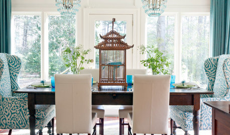
DECORATING GUIDESDecorating 101: How to Use White Right
If you’ve ever been in white-paint-swatch limbo, you know white can be tricky to work with. Here’s how to get the fresh look you’re after
Full Story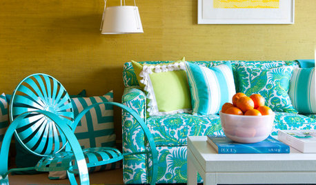
COLORBreaking the Rules: Brighten Up Without Relying on White
White doesn’t always perk up a dimly lit space. Instead, choose a color that radiates warmth
Full Story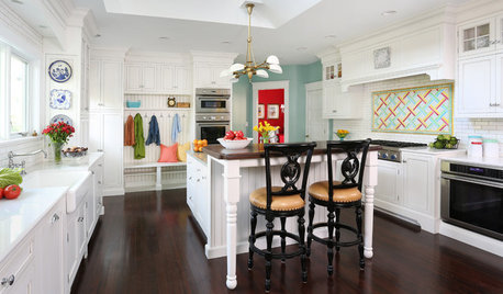
KITCHEN OF THE WEEKKitchen of the Week: Crisp White Cabinets and Room for Family
A Victorian home near Chicago gets an updated kitchen to improve brightness, beauty, function and flow
Full Story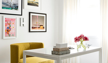
DECORATING GUIDESDesigner Secrets: 10 Pros Share Their Favorite White Paints
Decorating experts look to these hues when they want a go-to white they can count on
Full Story
COLORColor of the Year: Off-White Is On Trend for 2016
See why four paint brands have chosen a shade of white as their hot hue for the new year
Full Story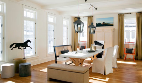
WHITEDesigner Secrets: 10 Pros Share Favorite Off-White Paints
From creamy white to barely beige, these hues will warm up your room
Full Story

Krysta KOriginal Author