


Designer Secrets: 10 Pros Share Their Favorite White Paints
Decorating experts look to these hues when they want a go-to white they can count on
Becky Harris
October 14, 2019
Houzz Contributor. Hi there! I live in a 1940s cottage in Atlanta that I'll describe as "collected."
I got into design via Landscape Architecture, which I studied at the University of Virginia.
Houzz Contributor. Hi there! I live in a 1940s cottage in Atlanta that I'll describe... More
You might think all white paints are pretty much the same, but nothing could be further from the truth. Most white paints have an undertone that can skew them cool or warm. The same white paint will look different in different parts of the world, and even at different ends of the house. A paint that pops brightly in San Francisco could look drab in New England, and vice versa.
Designers agree that you should test your paint in large swaths, to view it in different lighting at different times of the day. But that said, they usually have a few go-to shades of white up their sleeves, the ones they know won’t let them down. Ten designers shared the white paints they count on and why.
Designers agree that you should test your paint in large swaths, to view it in different lighting at different times of the day. But that said, they usually have a few go-to shades of white up their sleeves, the ones they know won’t let them down. Ten designers shared the white paints they count on and why.
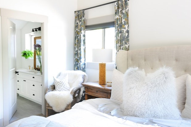
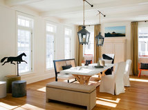
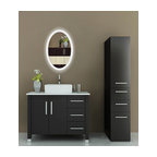
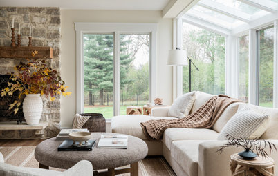
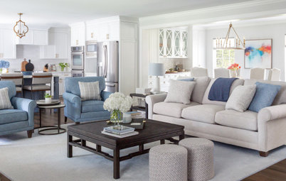
Simply White by Benjamin Moore
“Simply White is a more modern, clean white,” Ben Leavitt of Fox Design Studio says. “It is a beautiful natural shade that works well with any gray tones.”
In this space, Leavitt chose Simply White for the walls and ceilings, then painted the trim and doors in Thunder by Benjamin Moore for contrast.
Find an interior designer on Houzz
Cool December by Dunn-Edwards
“I love Cool December for the way its cool undertone works in the bright California light,” Los Angeles designer Laura Schwartz-Muller of Four Point Design + Construction says. In this portrait photographer’s office, it provides a lovely backdrop for a gallery wall.
See more of this office
“I love Cool December for the way its cool undertone works in the bright California light,” Los Angeles designer Laura Schwartz-Muller of Four Point Design + Construction says. In this portrait photographer’s office, it provides a lovely backdrop for a gallery wall.
See more of this office
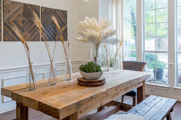
White Wisp by Benjamin Moore
“All whites have some undertone. White Wisp has a very slight gray undertone that keeps it from feeling cold or icy,” interior designer Ginger Curtis of Urbanology Designs says.
In this dining room, the paint works wonderfully with the bright Texas light and the different browns and tans in the reclaimed wood.
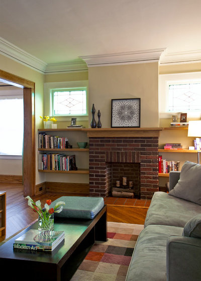
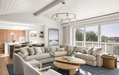
Pointing by Farrow & Ball
“Pointing is a wonderfully classic white with just a hint of warmth. I use it often because it reads as a warm white without veering yellow,” interior designer Lisa Tharp says. “It reminds me of fresh cream in early-morning light.”
Tharp is also careful about designing in a healthy and environmentally conscious way. “I like that Farrow & Ball’s line is comprised of healthier low- or no-VOC formulations, depending on sheen level,” she says.
In this library in Brookline, Massachusetts, she selected Pointing for the millwork because it offers a clean and warm counterpoint to the metallic specialty finishes on the walls and curved ceiling.
See the rest of this home
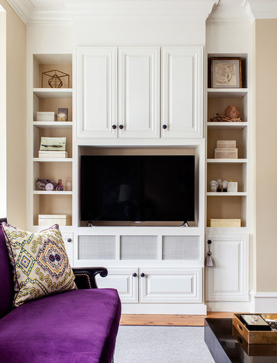
Decorator’s White by Benjamin Moore
“For white trim color, my go-to for years has been Decorator’s White,” interior designer Nikki Dalrymple of Acquire says. “It’s a true bright white that never disappoints. The undertone is so subtle that it never seems to fight with any chosen wall color.”
In this lovely living room, the white on the millwork provides a clean contrast to the creamy tan hue on the walls.
Wall paint: Monroe Bisque, Benjamin Moore
See more of this room
Imagine .01 by Colorhouse
Health and environmental consciousness is priority No. 1 for Michelle Ruber of Encircle Design and Build. Her favorite white comes from her favorite paint company, Colorhouse. “I was drawn to the company for its environmental benefits — the paint is zero-VOC and has no fumes, which is extremely important for the painters’ health and for the health of people who are living in the house during a remodel, not to mention the health of the planet,” she says. “So you have all that, plus the colors are amazing — every one of them is spot on.”
In this Portland, Oregon, vacation rental that Encircle designed and remodeled, Ruber’s spot-on choice was Colorhouse’s Imagine .01. The white brightens up the walk-out lower level and can hold its own against the city’s many gray days.
See more of this house
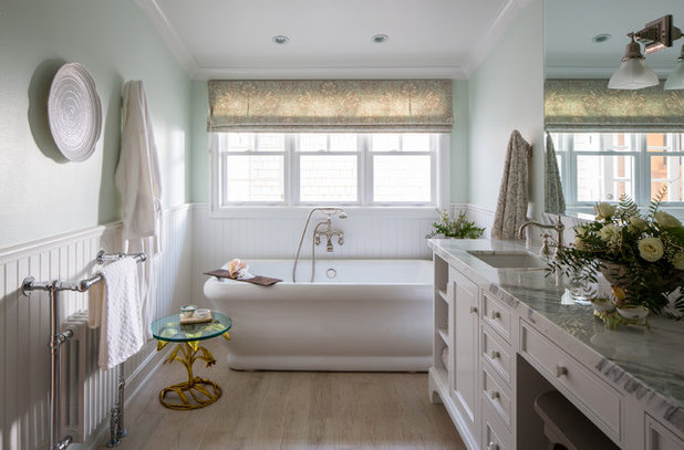
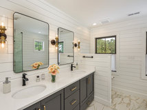
Super White by Benjamin Moore
“I love Benjamin Moore Super White. It’s a really clean, crisp white that adds a nice contrast even against other whites,” interior designer Shannon Ggem says. Here she used it on the cabinets and trimwork in an elegant master bathroom.
See more of this home
“I love Benjamin Moore Super White. It’s a really clean, crisp white that adds a nice contrast even against other whites,” interior designer Shannon Ggem says. Here she used it on the cabinets and trimwork in an elegant master bathroom.
See more of this home
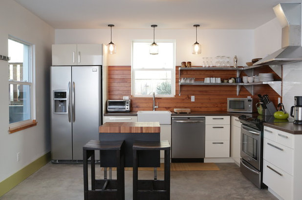
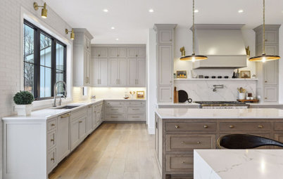
Pure White by Sherwin-Williams
“I love Sherwin Williams because they are very user-friendly and they provide large swatches to designers — not all companies do that,” Harmony Weihs of Design Harmony says. One of her go-to whites is the company’s Pure White.
She used it on these cabinets in this kitchen. “I love this white because it’s on the brighter side for a white while still being warm, which works great for all of our gray Pacific Northwest days,” she says.
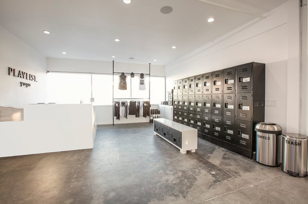
Chantilly Lace by Benjamin Moore
When she’s going for minimalist style in a design, Chantilly Lace is a no-brainer for interior designer Genna Margolis. “It reads cool and it’s clean, crisp and simple,” she says. “Sometimes when people are fearful to go too white, they wind up choosing something with a yellow undertone, and it winds up reading yellow, making the room look more rustic.”
The paint was the right choice for the peaceful, minimalistic look of this yoga studio Margolis designed.
Designer Secrets: 10 Pros Share Their Favorite Off-White Paints
Swiss Coffee by Benjamin Moore
“One of my favorite whites is Swiss Coffee,” interior designer Julie China of Idea Space Architecture + Design says. “It’s a warm white that doesn’t go too yellow or almond — it is a nice crisp white with warm undertones.”
China chose the hue for the trimwork throughout this 1920s home, seen here in the crown molding. “Swiss Coffee was a good choice for this 1920s house due to the warmer color palette and existing chestnut moldings on the first floor,” she says.
More on Houzz
Read more stories about decorating with white
Find a painting professional
Shop for home products
What are you working on?

Related Products
Related Stories
Organizing
How to Create a Joyful, Clutter-Free Home Office
Follow these steps to get rid of the paper piles and make room for beauty and better organization
Full Story
Remodeling Guides
15 Ways to Create Separation in an Open Floor Plan
By tidgboutique
Use these pro tips to minimize noise, delineate space and establish personal boundaries in an open layout
Full Story

White
Design Pros Share 10 Favorite Creamy White Paints
By Becky Harris
These off-white color choices include versatile tones, warming hues and pleasingly soft shades
Full Story
Entryways
4 Designer Tips for a Fashionable Entry
By tidgboutique
A pro shows how adding color, statement pieces and more to a foyer can set the right tone for the rest of the home
Full Story
Most Popular
7 Major Decorating Mistakes and How to Avoid Them
By tidgboutique
Gain confidence to start your interior design project with this advice from a professional designer
Full Story
Living Rooms
4 Must-Have Features for a Small Living Room
By tidgboutique
A designer shares important ways to live large in a tight space and make it look stylish
Full Story
Most Popular
7 Common Decorating Mistakes to Avoid
Pros share solutions to design problems they often find in people’s living spaces
Full Story
Most Popular
How to Decorate a Living Room
By tidgboutique
A designer offers tips for creating a comfortable space that reflects your style
Full Story
Budget Decorating
Where to Splurge and Where to Save When Decorating
By tidgboutique
See where it makes sense to invest in durable essentials and focal pieces, and where to economize on other things
Full Story
Lighting
Pro Tips for Lighting 10 Rooms and Outdoor Areas
Get professional advice for lighting your kitchen, bathroom, living room, office, patio and more
Full Story
#1 Simply White is my favorite. It is so sleek and clean! Just don't get the room dirty!
The most devilish color of all to get right is yellow. I wish Houzz would do a feature on the pros' favorite yellows.
I had my downstairs painted last week. Other than the accent wall in my den, the rest was painted Alabaster by Sherwin Williams. It is a perfect color!!!