


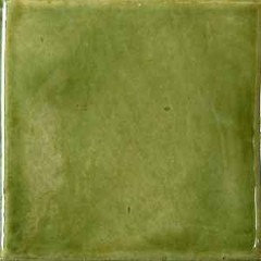
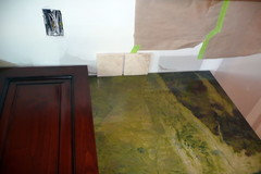
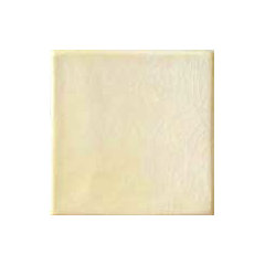
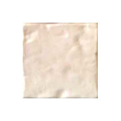
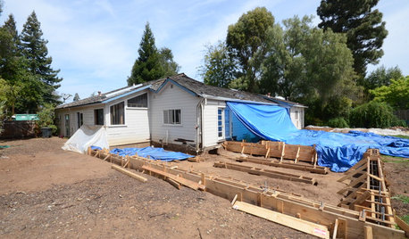
My turn for a backsplash question (+ progress pix)
Jon T
13 years ago


Featured Answer
Sort by:Oldest
Comments (59)

palimpsest
13 years agolast modified: 9 years agodianalo
13 years agolast modified: 9 years agoRelated Discussions
Teeny Master Bath - pix - need help with tile backsplash
Comments (8)Thanks LaurieC and Cat Mom. This is so helpful. We have a very small second bath (kids and guest). It is about 5x9 except near the door it is 4" wide since the chimney is in that wall. The bathroom was so bad the kids would hardly use it. We had it gutted and are about half way done getting it back together. We have been all around on a vanity. Picked out a Ronbow at first and then considered a Fairmont metro since we liked the divided drawer for the kids on the top. That Sonia is awesome but was out of our budget for this project. It turns out our contractor has cabinet maker who works for him so we are going to have something made so we can get exactly what we want and he is going to build shelves to match in the deadspace behind the door that is not useable. A copy of the the Sonia might be in order. Tile is basic porcelain (shore valadero) and we are using a mosaic glass tile (Sumi-e Sesshu Natural) for accents. Here is a question. The sink I bought is a lot deeper than yours (6 or 7 inches) but similar style. I am wondering now if I should do some sort of backsplash around the sink. We have extra tile in various sizes as we over ordered (2x2 of the shore and also an extra SQFT of the glass). The sheetrock (or what ever is called) is already in- used one type for the wet areas and something else for the areas that will not be tiled. If we want to do a back splash around the sink is the contractor going to have to change the materials? The plaster guy is coming Saturday for the non tiled areas so I guess I need to know. The GC will not be happy to hear from me on a Sat. but oh well. We are going with a 35 inch Broan Metro frameless recessed cabinet so the backspash would not be more than 6 inches maybe? I have to measure to see how low the cabinet goes. Any thoughts? I am pretty new on here so I am not sure about posting pics yet. When we did our basement I used that forum some but not to the extent I have been using this forum- way more decisions for a bathroom. I will attempt it tomorrow when I have more time. Thanks all! Here is a link that might be useful: Glass Tile...See MoreMy turn for backsplash opinions? - and sneak peek
Comments (12)kimiko232 -- I really like the cement tiles too; they are very cool. It remains to be seen if we are cool enough ourselves to pull them off. ha! Those California tiles are beautiful. I thought of diamonds but might just do running bond if I use 4x4's; there are only so many patterns you can do with square tile! One tile place showed alternating horizontal rows of rectangular and square tile, and that looked really nice, though a more modern look. WindyCityLindy -- thank you! The wood countertop is kind of an experiment. :) I figure that at least the bottom course of tiles had better not be too expensive in case we have to change it out in a few years! (not planning to though!) Ellendi -- yes, I wondered the same thing, if it would look less sterile/boring once all our junk was back on the counters. I really like blue and white (our dishes are blue willow); I think my challenge with delft would be to keep it from looking too country with the wood countertops. Otislilly -- one of the tile showrooms had row after row after row of tumbled stone, so your comment made me smile (the sales guy there said the same thing). I think I want to go a little more retro/vintage in this house. Slate could possibly work, I'll have to look. Thanks for weighing in!...See MoreBacksplash - in progress pix
Comments (25)My mom just had this granite put in her kitchen. I was worried about seeing it because they weren't sure they liked it at first but it was mostly because it didn't go with their wallpaper. When I saw it I was thrilled. It's so beautiful. I want it for my own house! They have to lose the wallpaper and the old matching balloon shades. I think that is what is bugging them also the fabricators were not too careful with their house. It upset them very much so it took the shine off the new thrill of having something new. I am hopeful when I get that wallpaper changed out it will make them happy. I can't say enough how beautiful this granite is. Their's is so pure, it doesn't have any rust splotches in it or odd discolorations. It is a very all over pattern with gorgeous colors. The background color is a beautiful off white. It makes their older cherry cabinets that have a medium stain look so upscale. I am happy that you posted BS pictures as that is a place they need to do something. I bought them some new canisters and the color of them looked so good with the granite I was thinking that a simple neutral shiny tile would be great. Not white but a really great shade in a handmade tile that will have shadowing in it. It sure did look great with those canisters if I could find that color it would be great. I'm so pleased with it. It's a truly beautiful stone the only thing is the Typhoon Bordeaux slabs I have seen here are nothing like my mom's. Be careful when you are picking out this stone as it varies tremendously. I love the way your tile looks with the stone. I have seen that tile in a salmon color combination with African Ivory granite and off white cabs, it was stunning....See MoreREDRUM Kitchen Progress - Backsplash
Comments (3)If you can put up with the extra work, it would look nice.... That was a very nice solution on the island. It looks better than if you had been able to make them fit. I love when the answer turns the problem into an asset ;)...See MoreJon T
13 years agolast modified: 9 years agomichellemarie
13 years agolast modified: 9 years agodoraville
13 years agolast modified: 9 years agoJon T
13 years agolast modified: 9 years agodianalo
13 years agolast modified: 9 years agojterrilynn
13 years agolast modified: 9 years agopinch_me
13 years agolast modified: 9 years agoJon T
13 years agolast modified: 9 years agojterrilynn
13 years agolast modified: 9 years agomichellemarie
13 years agolast modified: 9 years agodianalo
13 years agolast modified: 9 years agodoonie
13 years agolast modified: 9 years agodoonie
13 years agolast modified: 9 years agolascatx
13 years agolast modified: 9 years agohonorbiltkit
13 years agolast modified: 9 years agoJon T
13 years agolast modified: 9 years agoJon T
13 years agolast modified: 9 years agodianalo
13 years agolast modified: 9 years agodoonie
13 years agolast modified: 9 years agomythreesonsnc
13 years agolast modified: 9 years agocalimama
13 years agolast modified: 9 years agokitchendetective
13 years agolast modified: 9 years agorsvlle-nj
13 years agolast modified: 9 years agored_eared_slider86
13 years agolast modified: 9 years agoblondelle
13 years agolast modified: 9 years agoJon T
13 years agolast modified: 9 years agokitchendetective
13 years agolast modified: 9 years agoJon T
13 years agolast modified: 9 years agokitchendetective
13 years agolast modified: 9 years agokitchendetective
13 years agolast modified: 9 years agodoonie
13 years agolast modified: 9 years agoJon T
13 years agolast modified: 9 years agokitchendetective
13 years agolast modified: 9 years agodianalo
13 years agolast modified: 9 years agocpartist
13 years agolast modified: 9 years agocpartist
13 years agolast modified: 9 years agokitchendetective
13 years agolast modified: 9 years agoJon T
13 years agolast modified: 9 years agoislanddevil
13 years agolast modified: 9 years agokitchendetective
13 years agolast modified: 9 years agoJon T
13 years agolast modified: 9 years agoJon T
13 years agolast modified: 9 years agokitchendetective
13 years agolast modified: 9 years agotime4tea
13 years agolast modified: 9 years agoJon T
13 years agolast modified: 9 years agotime4tea
13 years agolast modified: 9 years agoJon T
13 years agolast modified: 9 years agotime4tea
13 years agolast modified: 9 years ago


Related Stories
REMODELING GUIDESSurvive Your Home Remodel: 11 Must-Ask Questions
Plan ahead to keep minor hassles from turning into major headaches during an extensive renovation
Full Story
FEEL-GOOD HOMEThe Question That Can Make You Love Your Home More
Change your relationship with your house for the better by focusing on the answer to something designers often ask
Full Story
MOST POPULAR8 Questions to Ask Yourself Before Meeting With Your Designer
Thinking in advance about how you use your space will get your first design consultation off to its best start
Full Story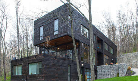
HOUZZ TOURSMy Houzz: Modernism Takes a Natural Turn in Pennsylvania
Generous wood throughout and woodsy sights outdoors soften and warm this home’s modern lines
Full Story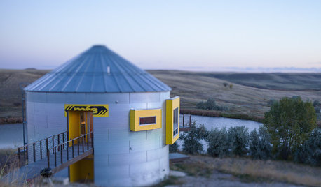
HOUZZ TOURSHouzz Tour: Prairie Grain Bin Turned Bucolic Retirement Home
An agrarian structure and a big dream combine in this one-of-a-kind home that celebrates 250 acres of Montana grasslands
Full Story
REMODELING GUIDESThe 4 Stages of a Remodel: The Midproject Crisis
Prepare for the mechanical rough-in stage, and don't worry if things don’t look like they’re progressing on the surface
Full Story
MATERIALSKitchen Ideas: How to Choose the Perfect Backsplash
Backsplashes not only protect your walls, they also add color, pattern and texture. Find out which material is right for you
Full Story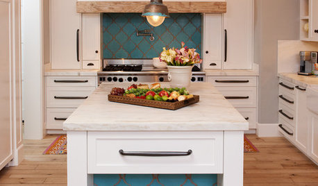
KITCHEN DESIGN10 Gorgeous Backsplash Alternatives to Subway Tile
Artistic installations, back-painted glass and pivoting windows prove there are backsplash possibilities beyond the platform
Full Story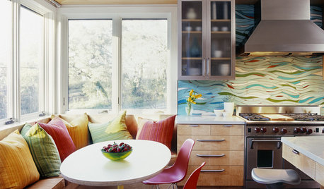
KITCHEN DESIGNKitchen of the Week: Exquisite Artistic Backsplash
Rippling colored glass forms an imaginative wall, while a clever layout embraces practicality in this stunning Texas kitchen
Full Story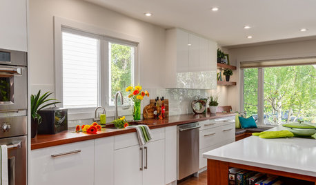
KITCHEN DESIGNThe Best Backsplashes to Pair With Wood Counters
Simplify your decision-making with these ideas for materials that work well with wood counters
Full Story


angieszen