


Help break the tie from the Kitchen Forum Please
beekeeperswife
14 years ago
Featured Answer
Sort by:Oldest
Comments (62)

DLM2000-GW
14 years ago
gayle0000
14 years agoRelated Discussions
Please help! I need to break my lease
Comments (2)well, kicking the ball against a wall is not "having nowhere else to go." Little kids kicking the ball on the ground back and force to one another, or riding trike and squealing--those actually, depending on one's personality, could be pleasant noises to hear outside one's home. And I think you need *first* to tell your landlord of the problem. Documentation (setting up a video camera, or something) might provide him w/ a tool to use against the other tenants. So, if you can, try to get video of the problems, and put that on a disk. Or take a snapshot of the motorcycle, and print it out (or get a print made, if you use film). Write a letter to the landlord detailing these problems. Tell him the time of day the kids play, and request that he come and see it for himself. Tell him you fear that these other tenants will act against you if they suspect you have complained, and request that he investigate these things directly himself, so that the complaints can be clearly seen to be coming from him, independent of you. Then ask if you can move to another unit. Then you have to give him time to fix it, if you want to break the lease without being forced to pay the rent until he finds a new tenant. Your landlord certain doesn't want someone kicking a ball against his wall, so he needs to know. And does he know about the problem w/ the breakers? In order to have any legal leg to stand on, you have to give him a chance to fix these problems....See MoreNew to forum and layout help please.
Comments (23)I know its been a while since I last posted. Here is an update on where we are on our redesign. After much go arounds with layouts we still aren't happy with any path forward. We have decided to revisit the idea of getting rid of the formal DR. Not sure if this is going to be cost prohibitive, but maybe its worth looking into further. If we swap the kitchen and DR as someone had once suggested this would open up the entire hearth dining and kitchen area into one large room. I fear this might create a bowling-alley feel as it would be ~50' long by 12' wide. hopefully the hearth room furniture, the dining table and peninsula will break it up enough. This plan involves the following: - Remove wall between kitchen and DR. - Replace DR picture window with walk-out Patio doors - Relocate picture window from DR to in front of table (replacing smaller window) - remove or shift down window that currently reside over sink. - Move/shift opening from currently living room to create additional wall space needed for fridge/panty All of this is going to require masonary and hvac work on 3 rooms in addition to the additional electrical/plumbing/flooring etc that wasn't originally in the budget when we were just considering the kitchen alone. I have a KD looking over our plans at the moment, we'll see if we get sticker shock, but I thought I'd bounce this update off of everyone here. Thanks!...See Morenew build and new to forum...please help!
Comments (1)Congratulations on getting your new build underway. I'm not an expert, but am doing my second kitchen and have gleaned a lot of good info here over 7 yrs. I'm happy to offer my opinion on some things you're questioning. I would do a hood vent instead of a microwave. It's so much easier to do it while you're building instead of trying to retrofit. If you've been on GW for a while you've likely read many of the practical reasons for good ventilation. I know some spaces are so small (apartment/condo kitchens, etc) that micro hoods are the best choice, but I think having it as a focal point in the kitchen is not desirable. If you don't want to give up cab space, there are some small but efficient countertop models you could set right on the counter beside the fridge. I also worried about going to the ceiling w/ cabinets but my vote is to do it. I don't think you'll find it overwhelms the space. I would not go with all glass uppers unless you want to showcase everything in your upper cabinets. I think a touch of glass with nicely displayed dish ware or decorative items gives the feeling of lightness more than a wall full of what most of us typically keep on hand for practical purposes in our top cabs. Lastly, I am a big fan of SW Dover White. It has covered almost all the walls in my open plan home and I've liked it in every season and every light....See MoreCountertop tie-breaker. Please help us!
Comments (49)As if you need more people to weigh in but yes, after seeing your two mock-ups, neither seems quite right. I'd recommend Colonial Cream granite (I'm biased though I am soo in love with it myself). Here's a pic... it's lightly veined like the WM but still has some variation like the AW but not nearly as busy. That aside, I am recommending it b/c it has both beige and grey (and white) in it which would probably complement the warm of the stone in your fireplace very well. (Ugh - I can't get flickr to let me copy the html code to paste the picture here - the link will have to do... sorry) There's this one and below is another photo of it on my flickr page: http://www.flickr.com/photos/31942081@N02/6084630930/in/photostream/ Here is a link that might be useful: Colonial Dream/Cream Granite...See Moresquirrelheaven
14 years agosweeby
14 years agokarinl
14 years agoUser
14 years agosquirrelheaven
14 years agoakrogirl
14 years agoweav_2007
14 years ago
jenswrens
14 years agosharon_midtn
14 years agomom2reese
14 years agobiochem101
14 years agobeekeeperswife
14 years agoUser
14 years agoUser
14 years agojejvtr
14 years ago
msrose
14 years ago
Oakley
14 years agoyborgal
14 years agomjsee
14 years agoUser
14 years agobeekeeperswife
14 years agotrk65
14 years agomrsmarv
14 years agoantiquesilver
14 years agokiko_gw
14 years agobungalow_house
14 years agok9arlene
14 years agorucnmom
14 years agokarinl
14 years ago
susanlynn2012
14 years ago
debo_2006
14 years agoles917
14 years agoUser
14 years agosharon_midtn
14 years agobeekeeperswife
14 years agoUser
14 years agosusanlynn2012
14 years agok9arlene
14 years agokarinl
14 years agobeekeeperswife
14 years agoUser
14 years agotfm1134
14 years agopmartin
14 years agosusanlynn2012
14 years agocompumom
14 years agooopsie913
14 years agooopsie913
14 years agomsrose
14 years ago
Related Stories

COLORPaint-Picking Help and Secrets From a Color Expert
Advice for wall and trim colors, what to always do before committing and the one paint feature you should completely ignore
Full Story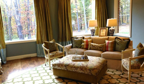
LIVING ROOMSA Living Room Miracle With $1,000 and a Little Help From Houzzers
Frustrated with competing focal points, Kimberlee Dray took her dilemma to the people and got her problem solved
Full Story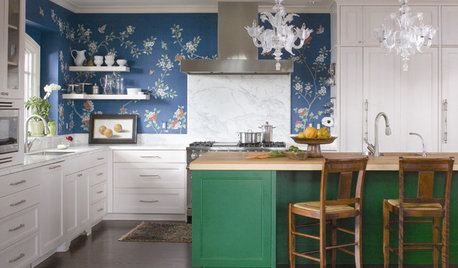
DECORATING GUIDES7 Design Rules and Why You Should Break Them
Think tile is only for kitchens and bathrooms? Art should hang at eye level? Time to consider breaking these old rules
Full Story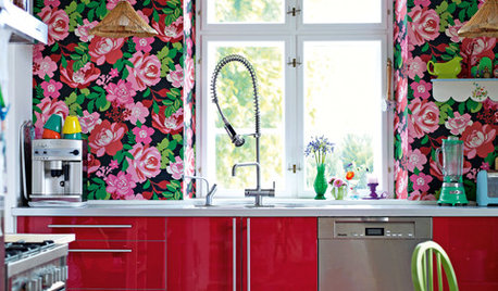
KITCHEN DESIGN14 Indie Kitchen Designs That Stand Out From the Pack
Bored with white, cream and 50 shades of gray? Break out of the box with a daring kitchen that highlights your own style
Full Story
MOST POPULAR7 Ways to Design Your Kitchen to Help You Lose Weight
In his new book, Slim by Design, eating-behavior expert Brian Wansink shows us how to get our kitchens working better
Full Story
DECORATING GUIDESFeel Free to Break Some Decorating Rules
Ditch the dogma about color, style and matching, and watch your rooms come alive
Full Story
GREEN BUILDINGThe Big Freeze: Inventors Break New Ground to Keep Things Cool
Old-fashioned fridges can be energy guzzlers, but there are more eco-friendly ways of keeping food fresh, as these global innovations show
Full Story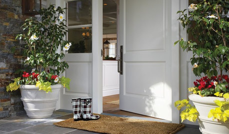
MOST POPULARThe Polite House: On ‘No Shoes’ Rules and Breaking Up With Contractors
Emily Post’s great-great-granddaughter gives us advice on no-shoes policies and how to graciously decline a contractor’s bid
Full Story
SELLING YOUR HOUSE10 Tricks to Help Your Bathroom Sell Your House
As with the kitchen, the bathroom is always a high priority for home buyers. Here’s how to showcase your bathroom so it looks its best
Full Story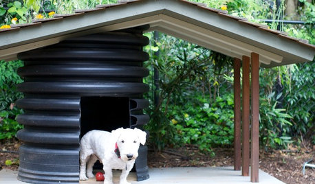
PETSHow to Help Your Dog Be a Good Neighbor
Good fences certainly help, but be sure to introduce your pup to the neighbors and check in from time to time
Full Story

magothyrivergirl