


Thoughts On Dark Grey Kitchen Cabinets?
clwguy
13 years ago
Sort by:Oldest
Comments (32)
Related Stories
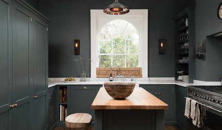
KITCHEN OF THE WEEKDark Gray Sophistication in a Shaker-Style Kitchen
Rich paint used throughout this compact London space helps create a kitchen that’s contemporary and inviting
Full StoryBEFORE AND AFTERSGray Cabinets Update a Texas Kitchen
Julie Shannon spent 3 years planning her kitchen update, choosing a gray palette and finding the materials for a transitional style
Full Story
KITCHEN DESIGNCabinet Colors for Dark Appliances
See how to make your black kitchen appliances blend in and look great
Full Story
MOST POPULAR50 Shades of Gray
Gray is hotter than ever, thanks to a hit novel full of risks and dark secrets. Tell us: Which paint shade possesses you?
Full Story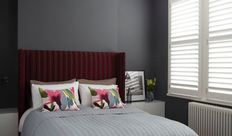
COLORDreaming in Color: 8 Gorgeous Gray Bedrooms
With this versatile hue, you can go dark and bold or slip into something more soothing
Full Story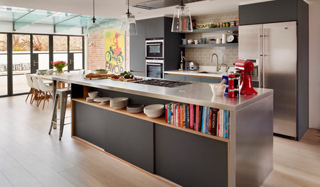
KITCHEN DESIGNKitchen of the Week: Industrial Design’s Softer Side
Dark gray cabinets and stainless steel mix with warm oak accents in a bright, family-friendly London kitchen
Full Story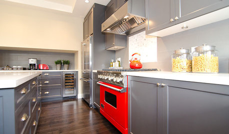
COLORCooking With Color: When to Use Gray in the Kitchen
Try out Trout or shake up some Martini Shaker gray for a neutral-based kitchen that whispers of sophistication
Full Story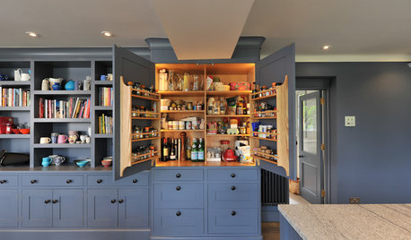
KITCHEN CABINETSColorful Cabinetry in an English Farmhouse Kitchen
Knocking rooms together opens up a family’s living space and makes way for this inviting handmade kitchen in blue and gray
Full Story
BEFORE AND AFTERSReader Project: California Kitchen Joins the Dark Side
Dark cabinets and countertops replace peeling and cracking all-white versions in this sleek update
Full Story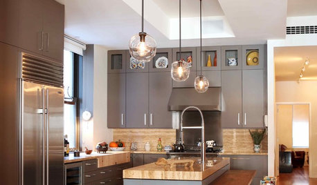
KITCHEN DESIGNObsessed With Gray in the Kitchen
See How to Use This Sexy Neutral to Heat Up Your Cookspace
Full Story


rococogurl
rj56
Related Discussions
Dark Gray Kitchen Cabinets/Can't use Impervo?
Q
The goal was not a dark kitchen- and now I am trying grey samples
Q
White cabinets, dark grey countertops - what color sink?
Q
Amazing Gray vs Mindful Gray for kitchen Cabinets
Q
dianalo
rhome410
pricklypearcactus
plllog
wizardnm
kitchenkelly
pcweary
sparklekitty
jumab
rosie
beekeeperswife
shannonplus2
caryscott
clwguyOriginal Author
rhome410
positano
clwguyOriginal Author
plllog
pricklypearcactus
lala girl
hellonasty
cirone
boxerpups
clwguyOriginal Author
dianalo
oldbat2be
growlery
lau123rie456wise
allison0704
marcydc