


Color Psychology
oceanna
16 years ago
Sort by:Oldest
Comments (28)
Related Stories

COLORTake a Slice From Psychology to Use Orange Better
Get the scoop on this attention-seeking hue and learn how it can bring a refreshing zing to your interiors — and your spirit
Full Story
COLORColor Magic: Tap Into Psychology to Better Use Blue at Home
OK, it's backed more by science than magic. But see how expert research can help you create powerful, even bewitching, interior effects
Full Story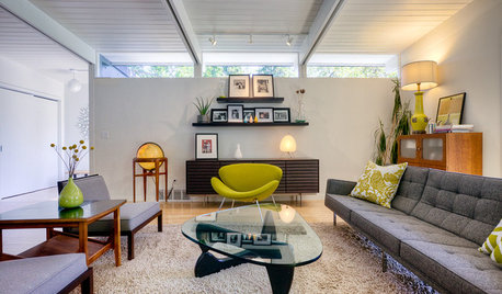
MOST POPULARWhy We Love Midcentury Modern Design
There's a method to all this 'Mad Men'-ness — just look to psychology, tough times and, believe it or not, Apple
Full Story
HOLIDAYSSet the Scene for a Stress-Free Holiday Visit
Put your guests at ease and take the pressure off hosting by prepping your space with psychology in mind
Full Story
SHOP HOUZZShop Houzz: The Theory of Red
Color psychology suggests that red stirs up passion, power and excitement
Full Story0

MAN SPACESWhy Men Really Do Need a Cave
Don't dismiss cars, bars and the kegerator — a man space of some kind is important for emotional well-being at home
Full Story
LIFETracing the Deep Roots of Design
Are our design choices hardwired? Consider the lasting appeal of forms from the hunter-gatherer life
Full Story
FEEL-GOOD HOME9 Smells You Actually Want in Your Home
Boost memory, enhance sleep, lower anxiety ... these scents do way more than just smell good
Full Story
HOME TECHWhy Your Home Office Should Be in the Backyard
Superman needs a fortress of solitude. And so do you
Full StorySponsored


hoyamom
rilie
Related Discussions
Color Phobia -- Help me PLEASE! Pics
Q
Warm versus cool decor - your experience?
Q
Pantone's Color of the Year: Honeysuckle
Q
I'm struggling for a Master Paint color too (pic)
Q
patricianat
susanlynn2012
kittycat76
johnmari
brutuses
patricianat
oceannaOriginal Author
brutuses
johnmari
oceannaOriginal Author
johnmari
mahatmacat1
brutuses
brutuses
mpwdmom
oceannaOriginal Author
oceannaOriginal Author
susanlynn2012
patricianat
oceannaOriginal Author
chicoryflower
brutuses
brutuses
mahatmacat1
susanlynn2012
kabergs