


Pantone's Color of the Year: Honeysuckle
B H
13 years ago
Sort by:Oldest
Comments (50)
Related Stories
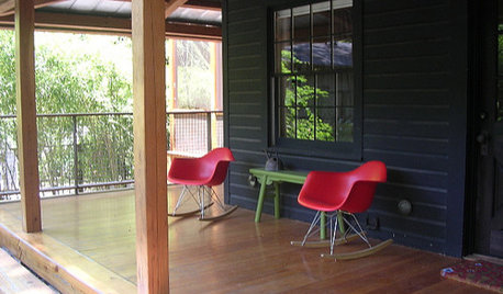
PINKHoneysuckle: Inspired by Pantone's Color of the Year
13 ways homes can wear this confident shade of pink, Pantone's color of 2011
Full Story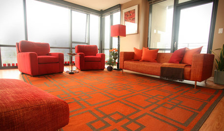
DECORATING GUIDESTangerine Tango: 4 Ways to Use Pantone's Color of the Year
Don't let this bold hue scare you — try warming up any room with this cheerful red-orange color of 2012
Full Story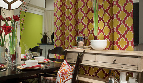
Honeysuckle - Las Vegas Market 2013
A showcase of noteworthy products against the backdrop of a recent Pantone color pick
Full Story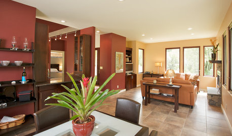
COLORHow to Use Marsala, Pantone’s 2015 Color of the Year
Pantone digs deep and goes earthy with its selection. Here are ways to make it work in your home
Full Story
SHOP HOUZZShop Houzz: Bring Serenity Home With Pantone’s Color of the Year
Peace and tranquility will be right at hand with this lovely sky blue hue
Full Story0
COLORBest Ways to Use Radiant Orchid, Pantone's Color of 2014
Learn how to work in this bold fuchsia-pink-purple successfully around the home, and give it a yay or nay in the Houzz poll
Full Story
COLORPantone Unearths Emerald as Its 2013 Color of the Year
Whether you dig a natural version or go for one with polish, Pantone is predicting you'll treasure emerald green at home over the next year
Full Story
SHOP HOUZZShop Houzz: In the Pink With Pantone’s Rose Quartz
Get tickled pink with one of Pantone’s Colors of the Year for 2016
Full Story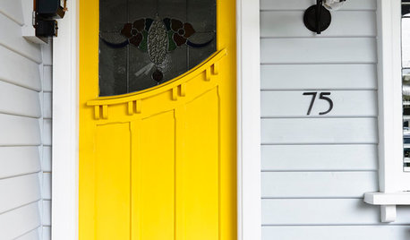
COLORSay Hello to Minion Yellow, Pantone’s Newest (and Happiest) Color
This Hollywood-inspired shade is anything but despicable. Here’s how to work the cheerful and cheeky color into your home
Full Story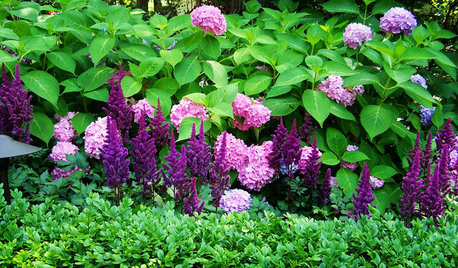
FLOWERS9 Plants That Channel Pantone’s Color of 2014
Try these pinkish-purple wonders to be right on trend — or just for their own captivating beauty
Full Story


juliekcmo
B HOriginal Author
Related Discussions
Silestone, Caesarstone, and House Premium Quartz
Q
Pantone of the year 14'
Q
2012 Pantone Color of the Year is...
Q
Pantone color of the year 2017
Q
Lori A. Sawaya
rmkitchen
kitchendetective
Bumblebeez SC Zone 7
tinam61
theroselvr
awm03
B HOriginal Author
User
tinam61
Bumblebeez SC Zone 7
B HOriginal Author
stinky-gardener
dianalo
Ideefixe
Bumblebeez SC Zone 7
rosie
stinky-gardener
runninginplace
Lori A. Sawaya
amysrq
love-my-lilhome
palimpsest
franksmom_2010
dianalo
B HOriginal Author
User
lizziebethtx
teacats
palimpsest
Lori A. Sawaya
palimpsest
B HOriginal Author
bird_lover6
palimpsest
Diane Smith at Walter E. Smithe Furniture
B HOriginal Author
Diane Smith at Walter E. Smithe Furniture
B HOriginal Author
Bumblebeez SC Zone 7
Oakley
kitchendetective
oceanna
franksmom_2010
patty_cakes
palimpsest
franksmom_2010
oceanna