


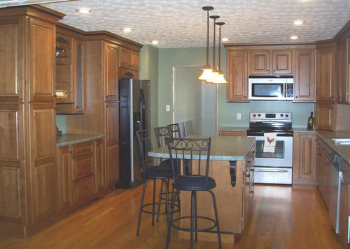
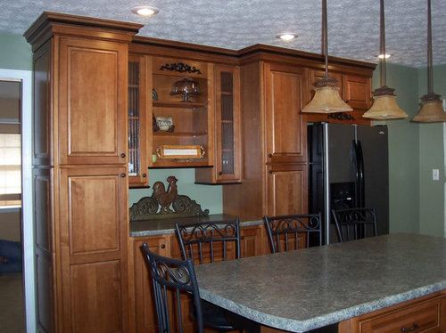
endlessly looking at backsplash options
regmoses
12 years ago


Sort by:Oldest
Comments (45)
Related Stories
COLORFUL HOMESHouzz Tour: Color Brings Endless Summer to a Santa Monica Home
An interior designer gives her older house a casual cottage feel with vibrant hues and vintage pieces
Full Story
KITCHEN BACKSPLASHESKitchen Confidential: 8 Options for Your Range Backsplash
Find the perfect style and material for your backsplash focal point
Full Story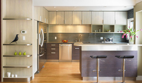
KITCHEN CABINETSGet the Look of Wood Cabinets for Less
No need to snub plastic laminate as wood’s inferior cousin. Today’s options are stylish and durable — not to mention money saving
Full Story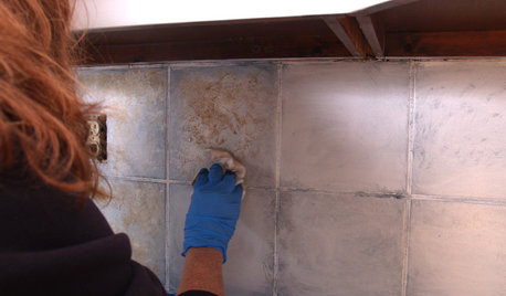
DIY PROJECTSDIY Backsplash Makeover: Get a New Tile Look for Less Than $50
Give old tile a painted faux-stone facade for a brand-new look at a superaffordable price
Full Story
KITCHEN DESIGNHouzz Quiz: Which Kitchen Backsplash Material Is Right for You?
With so many options available, see if we can help you narrow down the selection
Full Story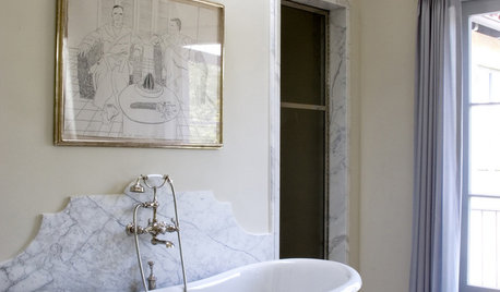
MATERIALS10 Modern Marble Looks
Marble has broken free of the standard kitchen countertop slab and is showing up on bathtub backsplashes, modern dining tables and more
Full Story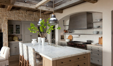
KITCHEN DESIGNHouzz Quiz: What Kitchen Countertop Is Right For You?
The options for kitchen countertops can seem endless. Take our quiz to help you narrow down your selection
Full Story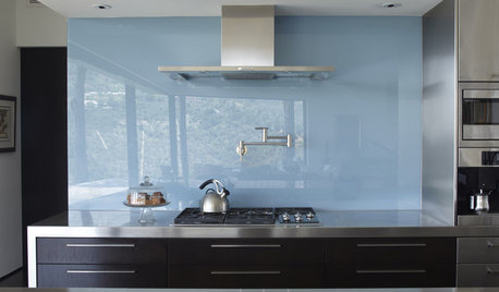
KITCHEN DESIGNThe Future of Backsplashes
Grout is out. Continuous sheets of glass, stone, metal and porcelain are saving cleaning time and offering more looks than ever
Full Story
BUDGET DECORATING8 Cost-Effective Ways to Get a High-End Look
Don’t discount that expensive material yet. By using a small amount in a strategic way, you can get a luxurious look without the expense
Full Story
BATHROOM DESIGNSweet Retreats: The Latest Looks for the Bath
You asked for it; you got it: Here’s how designers are incorporating the latest looks into smaller master-bath designs
Full StorySponsored
Central Ohio's Trusted Home Remodeler Specializing in Kitchens & Baths


blfenton
lolauren
Related Discussions
Vertical Backsplash? A Backsplash Regret?
Q
Granite Backsplash with Tile BS or just Tile Backsplash???
Q
Backsplash? No backsplash?
Q
BackSplash Options?!
Q
Kode
advanced
remodelfla
regmosesOriginal Author
lavender_lass
regina_phalange
blfenton
Kode
aliris19
regmosesOriginal Author
Kode
ptamom
Kode
blfenton
ellendi
brianadarnell
formerlyflorantha
phoggie
ellendi
ptamom
dianalo
regmosesOriginal Author
aliris19
ptamom
irishcreamgirl
ash6181
Kode
Kode
peach32
Kode
regmosesOriginal Author
regmosesOriginal Author
Lauren Wollmershauser
blfenton
BalTra
lovingstuff
ptamom
brianadarnell
ash6181
peach32
elle3
jterrilynn
talkstoself