


Finalizing layout for modern kitchen
jplouis
10 years ago

Featured Answer
Sort by:Oldest
Comments (7)

ControlfreakECS
10 years ago
blfenton
10 years agoRelated Discussions
Last (?) kitchen layout - any final input greatly appreciated!
Comments (23)I don't know how this would look, but what if you removed the soffit and the cabs on the sink wall? Switch the sink wall cabinet to the range wall--you have 23" between corner and window. That might provide more balance to that wall--there's something about it that looks off to me. I think it's all the height and bulk in the middle of the wall and the unevenly-spaced windows. Or could the stove and window be shifted down and that wall be made more symmetrical without the soffit? I'm not sure about keeping the single cabinet over the DW, but I think two shelves for mugs and coffee supplies could work. Then that corner becomes a coffee corner. How tall will the crown be on your cabinets? When I add 36" base cabs + 18" between counter and bottom of upper cabs + 48" upper cabinets, I get 102", the height of your ceilings. I think those 48" uppers aren't allowing for crown. I am concerned that all your wall cabinets will look very tall and skinny and not really hold much. I can't believe how many times I edited this post! I must need a nap! This post was edited by may_flowers on Tue, Feb 11, 14 at 20:35...See MoreFinally, final kitchen layout w/ pics.
Comments (6)I did some tweaking of your design to show you other options - e.g., moving the DW. It turns out the sink is almost centered on the island when you put enough prep workspace on the side opposite the DW - so if you don't like that, then consider eliminating the seat on the end and moving everything over. That would also give you even more prep space - although I think you have enough now (approx 45"). Regarding the pantry, I presented 4 options - they each have pluses and minuses (I think I like Option #1 using Zelmar's pantry the best). I switched the pantry and the refrigerator b/c the island was a "barrier island' b/w the Prep Zone on the island and the Refrigerator. By moving the refrigerator, the island is no longer a "barrier" to the refrigerator. Ideally, the island would not be a barrier to either the refrigerator or the pantry, but if has to be one, generally it's better to have the refrigerator in the more accessible location (i.e, not "barriered") In addition, you now have separate floor space for the Prep Zone, Cooking Zone, and Cleanup Zone and someone working at the cooktop won't run the risk of backing in to an open DW door (and stumbling) while holding a pot of boiling water (or other hot pot/pan). On the cooktop wall, I tried to make it symmetrical since it appears that's what you want (or at least your KD wants!) Note the 12" cabinet b/w the 24" Easy Reach and the 48" cabinet on the cooktop run. I think a 36"x24" Easy Reach would probably be better, but if you cannot get it or prefer the 12" cabinet, I suggest using a pullout cabinet instead of a standard cabinet. Here's a link to one of Rev-A-Shelf's versions (others make them as well): Cabinet Pullout Hood Organizer with Wood Adjustable Shelves Wall Accessories (12" Wide) Some options for the cabinets flanking the cooktop: * Two 24" cabinets on left + hood + two 24" cabinets on right (both with12" doors) + 12" cabinet + 24" easy Reach with 12" cabinet door * 18" cabinet + 30" + hood + 30" + 30" (18+12) + 24" Easy Reach w/12" door * 12" cabinet + 36" + hood + 36" + 24" + 24" Easy Reach w/12" door Before I discuss the pantry options, here's the layout: Zone map: So, about those Pantry Options (see picture below)... Option 1 (in the main layout). Either the 30" standard pullout your KD is probably planning from the looks of it or a cabinet w/drawers on the bottom and shelves above. Zelmar has such a pantry (so do at least two other GWer, but I can't remember which ones right now!) Unfortunately, Zelmar's pictures are no longer available, but I had saved one for future inspiration - I've posted it at the end. [Zelmar, if you're reading this - I hope it's OK with you! Let me......See Moresmall kitchen - finalizing layout once and for all
Comments (14)Lavender Lass - Thanks for chiming in, at work no less. This cheap-o free and easy design software doesn't allow me to play with the hardware placement. The PLAN is to have long horizontal pulls across the uppers and lowers both. With small ones where they make sense. In fact, my top contender is the one shown with the green cabinets in the OP. And, yes, the doors will open the opposite directions at several key points than is shown in my renderings... To both LL and RoRO, and anyone else chiming in for that matter!, I had a big long post a while back about what to do with uppers with the backsplash window. That conversation convinced me to rethink the plan to bump up the cabinets or have glass cabinets on that wall to embrace the illusion of the backsplash window. I'm trying to make myself to not go backwards and do another circle on the issue. We'll see how that goes! We'll have somewhere between 17-20" between counter and upper cabinets and I'll go with a lower profile sink of some kind. I'm short so I don't want the uppers too high (plus we have short ceilings), but I totally get the point you are making. It's tricky to find the right answers for this BS window. For sure, whatever I do will have drawbacks and not please everyone... We put the BS window in when we were doing the outside for an energy audit program 2 years ago and had to guess at everything as we had no kitchen plans. Now I just have to make it work... Roho, thanks for the enthusiasm! I'm needing a little love right now! LOL Just to be clear, do you like the original layout or the revised options to include uppers on the range wall, minimize sink size, add more drawers, etc? Are you saying the counters stained or the sinks with the zero radius? I'm not sure I am understanding... For the fridge, I"m not sold on french doors- just the bottom freezer drawer. If I could find a 30-33" option that had the interior options we wanted in a CD, I'd go for it. Just haven't found it yet... We'll do some kind of paneling around the peninsula seating. Undecided about how that is going to end up looking, but it will look finished. We'll probably leave the wall part (bump out) drywall for now and consider various options down the road, including paneling or wallpaper or tile. We might look at something we can include into the hallway there. But, that's getting ahead of myself with finishes and materials and I have got to make myself stay on layout! LOL I'm glad to hear you liked your 12" pantries. Mine won't be in such a convenient place, but it's something! If we end up finding a place to put one of those neat ones tucked into drywall, it will probably end up much more narrow as the only place for it would be on the LR wall next to the peninsula and I don't want it interfering with the walkway/sense of feeling open. I should post some of my "during" pictures someday. It's been quite a journey so far! For pendants at the peninsula counter, all I want is something shiny to cast sparkley light. It won't work well for task lighting, so we'll have another row of can lights down the peninsula on the working side of the kitchen, I think. I just want 2-3 little mini-pendants in clear glass or crystal that won't really catch the eye much until they are on at night, acting more as accent lighting. The light I showed a pic of will be the drum pendant over the DR table area. I met with some lighting consultants this weekend, and also posted on GW's lighting forum. So, hopefully that is getting close to nailed down......See MoreTiny Kitchen Layout - final countdown
Comments (19)Well, we're coming along nicely. I'll get some pix posted as soon as it's a little further on; with the old kitchen still in situ it's kind of hard to get pictures that capture the full impact of what they're doing, so I'll wait until I can take some pictures that have the "wow" factor :) The wall between kitchen and diner is now COMPLETELY gone and, despite my trepidation, it's going to be absolutely wonderful to have it as an open space. The whole house feels twice the size, it improves the vista from the front and it's going to be a wonderful family space - we're thrilled! We've hit the first couple of "oh phooey" compromises that our 2nd-hand cabinets situation generates: because of the previous handles placement, one of the cabinets next to the stove will have to open the "wrong" way. I think I can tweak the other side (one of the new cabinets) by turning it into a pullout (which I was considering doing anyway) and I can live with it, but it is a minor annoyance. However, we knew there would be little things along the way that we would have to deal with and, regardless, it's still SO much nicer than what we had that I can't really complain (well, I could, I suppose, but I'm not going to... or not much, anyway!! :) My faucet still hasn't turned up, so I'm anticipating a bit of a battle on that - it's the first time I've EVER had a problem on Ebay and I'm not quite sure how to proceed, but I'll figure it out in due course. In the meantime, I think I have another faucet picked and (shhhhh - don't tell anybody!) I think I actually prefer it for the revised and now open layout... ;) Biggest challenge now is backsplash and paint - I STILL can't seem to settle on anything! More tile-shopping tomorrow and Wednesday - have to at least get stuff ordrered so it's ready to install when they get to it! Anyway, just an update. We're getting there!...See More
sochi
10 years agojplouis
10 years ago
robo (z6a)
10 years agojplouis
10 years ago


Related Stories
KITCHEN DESIGNKitchen Layouts: A Vote for the Good Old Galley
Less popular now, the galley kitchen is still a great layout for cooking
Full Story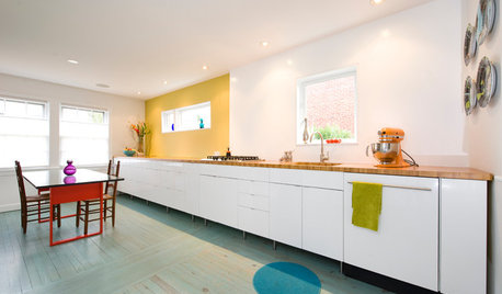
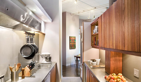
KITCHEN DESIGNKitchen of the Week: Grandma's Kitchen Gets a Modern Twist
Colorful, modern styling replaces old linoleum and an inefficient layout in this architect's inherited house in Washington, D.C.
Full Story
KITCHEN OF THE WEEKKitchen of the Week: An Awkward Layout Makes Way for Modern Living
An improved plan and a fresh new look update this family kitchen for daily life and entertaining
Full Story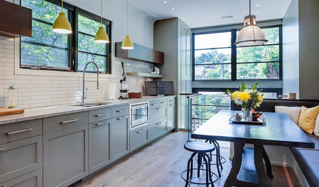
KITCHEN DESIGNKitchen of the Week: More Light, Better Layout for a Canadian Victorian
Stripped to the studs, this Toronto kitchen is now brighter and more functional, with a gorgeous wide-open view
Full Story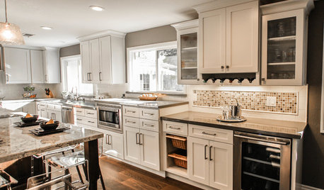
KITCHEN OF THE WEEKKitchen of the Week: More Storage and a Better Layout
A California couple create a user-friendly and stylish kitchen that works for their always-on-the-go family
Full Story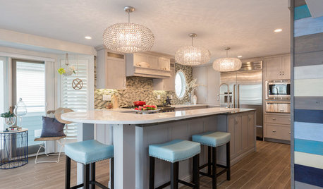
KITCHEN OF THE WEEKKitchen of the Week: Beachy Good Looks and a Layout for Fun
A New Hampshire summer home’s kitchen gets an update with a hardworking island, better flow and coastal colors
Full StoryHOUZZ TOURSHouzz Tour: Pros Solve a Head-Scratching Layout in Boulder
A haphazardly planned and built 1905 Colorado home gets a major overhaul to gain more bedrooms, bathrooms and a chef's dream kitchen
Full Story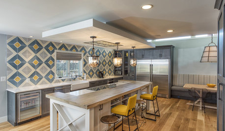
KITCHEN DESIGNKitchen of the Week: Tile Sets the Tone in a Modern Farmhouse Kitchen
A boldly graphic wall and soft blue cabinets create a colorful focal point in this spacious new Washington, D.C.-area kitchen
Full Story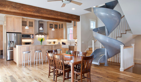
DINING ROOMSNew This Week: 6 Modern Dining Zones in Homes Big and Small
Look to splashy accent walls, right-sized tables and indoor slides to make the most of your open layout
Full Story
KITCHEN APPLIANCESFind the Right Oven Arrangement for Your Kitchen
Have all the options for ovens, with or without cooktops and drawers, left you steamed? This guide will help you simmer down
Full Story
robo (z6a)