Thought I would post my "choose a color for the kitchen stories" as like many have agonized over color choice and I never saw this shade mentioned on the Web, also my mistakes might let others know they are not alone.
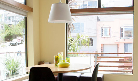
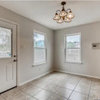
From looking at other peoples' pictures, just note (as best as I can describe it) that Song of Summer on my kitchen walls (dark side of the house with shady natural light) is what I would call a lemon cream or light butter, although in other lights in looks more warm light gold. Not super-lemony, it is a very neutral color, almost blending against my cream cabinets. Definitely a pale lite yellow, but not cool, more like creamy straw or light yellow falling leaves. But not "gold" either. Doesn't look like much on the paint chip, but on the wall it comes alive.
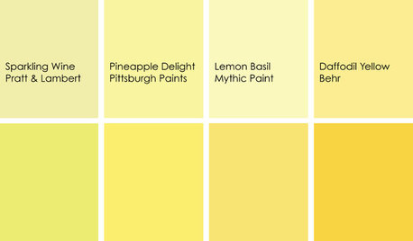
My mistake: I have done some painting and stick with Behr, which I have not had major issues with. My tiny kitchen had been done up to look "New England cottage" with cream beadboard panels and a rough textured ceiling, which was fine except for the semi-gloss, deep grey-blue paint on the walls. On the shade side of the house with no lights, it just looked like a dark hole. In trying to warm things up I first chose Behr "Lemon Poundcake" as looking from left to right at Behr's yellows, they seem to go from adding red to green (just like altering an image in Photoshop) and I didn't want a really cool, lemon-lime yellow. Did test painting too.
Whoops. Lemon Poundcake is a light yellow, but on my walls I felt like I was trapped in a bowl of cake batter, or egg yolks. It is very pretty but not for me. Back to the color charts - two chips over to the right (adding more green) and also moved up (lighter), and gave "Song of Summer" a try (besides, it is a step up from the bright "Lemon Drop" which I really like and would have used, but I am being cautious - I might like a bright yellow for a while but after sitting around in it thought it might get on my nerves (- might use Lemon Drop for a bedroom tho, or study.)
I'm happy with Song of Summer and it looks like I added a foot of space to this small kitchen. Wasn't easy picking a color when this side of the house is dark and coolish, plus whatever I picked had to work with the light brown laminate floor and these sort of taupe-grey backsplash tiles that are already there. Had it narrowed to a light olive or yellow originally. Even though I used Behr Ultra with primer there are 6 coats of semigloss on the wall at this point, just to cover the marine blue, which was scuffed with sandpaper before painting. I used the small, hand-held "Point and Paint" pad which seems like any other paint pad and you most certainly do have to tape key areas with this "as seen on TV" hyped product (purchased cheap at Ross). Actually, the most helpful tool I used were these cheap small trim pads I got at the Dollar Tree, since I was working in small, awkward spaces over fixed shelving, they were very useful for cutting in the corners, and smoothing out the semi-gloss paint.
Now to wait for things to cure and paint the ceiling...btw it turns out the Behr Ultra was remarkably low-odor, I could have primed but hate the smell of primer. So I just used more paint, but it is a small space so I didn't have to buy more than a gallon.
Hope this helps someone looking for a light yellow Behr paint, if they don't want something as warm gold as "Cornsilk" and want a more light butter/lemon effect without looking greenish. My end effect was a pale yellow/tan/cream kitchen, very neutral, that can be brightened or warmed with accessories as desired - the colors work with lots of other colors. And I'm relieved it wasn't a color disaster (had some missteps like leaving the tape too long, and it pulled some paint and I have to retouch, but nothing too bad!)


always1stepbehind
stone_gardenOriginal Author
Related Discussions
Any opinions on behr premium plus ultra paint?
Q
Interior Paint color for resale
Q
"Warm" Mediterranean white paint color for interior?
Q
Interior Paint-The gray color i chose looks like it's blue, advice pls
Q
HU-320281631