


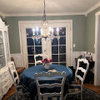
Desperate, Last Minute, Paint Help
jaymielo
15 years ago


Featured Answer
Sort by:Oldest
Comments (33)

User
15 years agogk5040
15 years agoRelated Discussions
Help! Derailed by last-minute range hood snag!
Comments (7)There are too many variaables that only your code inspector can green light. In general though, all hoods and inserts have minimum and maximum height distances from the surface that they cover. And width too. Your contractsr and inspector are gonna have to put their heads together on site. But, it's probably best to dance with the one who brung ya as it's already on site. But, given the chance to change, I probably would as the size you've given doesn't seem to provide adequate coverage to your cooking surface below. And it just barely provides enough CFM. Where is your KD in all of this? That's who should have read all the specs and planned something code compliant. And who should have told you that you can't have what you want because it's not functional....See MoreLast Minute changes..sorry long post!
Comments (15)Both cabinet pictures are beautiful. I wouldn't worry too much about the darkness of the cabinets, as long as you love it. I renovated a kitchen in our last house and originally decided to go with off-white/cream, because of the light in the kitchen (not much) and because I thought it would be too formal. I just could not seem to make the choice however, and kept returning to the dark wood (we used cherry, it looked very similar to the cabinet color that you love). So, I decided to go for it, along with the Absolute Black granite. To calm my fears about a "dark" kitchen, I used a wall of glass front cabinets and made sure we had high quality halogen lights, both recessed in the ceiling, and under the cabinets (all on dimmers). These decisions made a big difference. In the end, we did the right thing-I LOVED how it all turned out and the feel of the kitchen was friendly, warm and comfortable. Our GC told us at the end of the reno that it was his favorite kitchen he has ever done, and he renos about 25 kitchens a year. Quite the compliment! So, my short answer after this long response is choose what you love-it feels right for a reason. Good luck and post more pix when you can....See MoreLast minute bath redo-help with color
Comments (5)Who knew you could paint tile? (obviously several others besides me. LOL) Just back from the hardware store. Blue is going to be painted white. I'll prime the walls white, see how it looks. If I think I'll like it, I'll just paint white (Ive never had a white room) and accessorize with brighter colors. If I don't think I'll like the white, I'll prime grey over that and see what color strikes me when BM opens tomorrow. Mildred, I've got to get this room finished by tomorrow night, since I'm having company tuesday and then out of town for the rest of the week. We'll tear all the tile out in the spring, so as tempting as it is, no sense doing it twice. Thanks all for the advice...I had no idea. :/...See MoreHelp!! Last minute doubts on cabinet glaze color
Comments (15)I thought I posted a final response after we placed the cabinet order, but I'm not seeing it here. Didn't mean to be rude; thanks Deedles and SaraKat for chiming in. I did wind up ordering the cabinets with the Van Dyke Glaze. I really like the glazed look and the cabinet maker does a very "clean" glaze, a small amount in the beading and the seams. I'm deliberately trying to go a little off the beaten path with elements I love, and I've always longed for glazed cabinets. I do hope I don't tire of it quickly! 7 more weeks to go until they arrive.......See Moreorganic_smallhome
15 years agojaymielo
15 years ago
IdaClaire
15 years agotxgal06
15 years agojaymielo
15 years agomlraff53
15 years agolindybarts
15 years agojaymielo
15 years agojaymielo
15 years agottodd
15 years agolindybarts
15 years agojaymielo
15 years agogk5040
15 years agotxgal06
15 years agojaymielo
15 years agotracey_b
15 years agojaymielo
15 years agotracey_b
15 years agojaymielo
15 years agotracey_b
15 years agobodiCA
15 years agobodiCA
15 years agojaymielo
15 years agobodiCA
15 years agosdionnemoore
15 years agojaymielo
15 years agolindybarts
15 years agojaymielo
15 years agobodiCA
15 years agoaberfitchboy
9 years ago


Related Stories
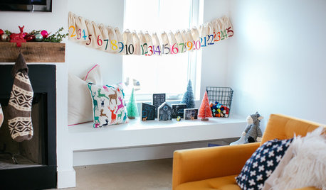
CHRISTMASLast-Minute Holiday: Quick Ways to Personalize Your Decor and Gifts
See how to put on a finishing flourish with a simple stick of chalk and how to put together a kit for an adorable edible snowman
Full Story
FEEL-GOOD HOME10-Minute Updates to Freshen Up Your Home
When life is hectic and time is limited, these speedy styling tricks can make a big difference
Full Story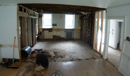
REMODELING GUIDESWatch an Entire Kitchen Remodel in 3½ Minutes
Zip through from the gutting phase to the gorgeous result, thanks to the magic of time-lapse video
Full Story
CHRISTMAS4 Rustic, Romantic Christmas Ornaments to Craft in Minutes
Make these deceptively easy paper ornaments with the kids or savor some solo crafting time
Full Story
ARCHITECTUREHouse-Hunting Help: If You Could Pick Your Home Style ...
Love an open layout? Steer clear of Victorians. Hate stairs? Sidle up to a ranch. Whatever home you're looking for, this guide can help
Full Story
SELLING YOUR HOUSE10 Low-Cost Tweaks to Help Your Home Sell
Put these inexpensive but invaluable fixes on your to-do list before you put your home on the market
Full Story
LIFE12 House-Hunting Tips to Help You Make the Right Choice
Stay organized and focused on your quest for a new home, to make the search easier and avoid surprises later
Full Story
ORGANIZINGGet the Organizing Help You Need (Finally!)
Imagine having your closet whipped into shape by someone else. That’s the power of working with a pro
Full Story
DIY PROJECTSMake a Beautiful and Long-Lasting Driftwood Centerpiece
Add succulents to found wood for an easy arrangement that looks straight from a designer florist's shelf
Full Story
ORGANIZINGDo It for the Kids! A Few Routines Help a Home Run More Smoothly
Not a Naturally Organized person? These tips can help you tackle the onslaught of papers, meals, laundry — and even help you find your keys
Full StorySponsored
Professional Remodelers in Franklin County Specializing Kitchen & Bath

tracey_b