


Stage My Kitchen?
15 years ago
Sort by:Oldest
Comments (37)
Related Stories
SELLING YOUR HOUSEHow to Stage Your Kitchen for a Home Sale
Attract buyers with a kitchen that’s clean, bright and welcoming — no expensive overhaul required
Full Story
KITCHEN DESIGNKitchen of the Week: A Seattle Family Kitchen Takes Center Stage
A major home renovation allows a couple to create an open and user-friendly kitchen that sits in the middle of everything
Full Story
SHOP HOUZZShop Houzz: Staging the Perfect Kitchen
Maximize your home’s value with a picture-perfect kitchen
Full Story0

SELLING YOUR HOUSESave Money on Home Staging and Still Sell Faster
Spend only where it matters on home staging to keep money in your pocket and buyers lined up
Full Story
SELLING YOUR HOUSEHome Staging to Sell: The Latest Techniques That Really Work
Get up to speed on the best ways to appeal to potential buyers through accessories, furniture, colors and more
Full Story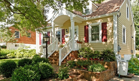
SELLING YOUR HOUSESell Your Home Fast: 21 Staging Tips
Successful staging is key to selling your home quickly and at the best price. From cleaning to styling, these tips can help
Full Story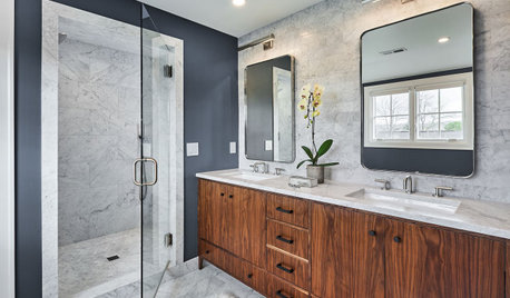
REMODELING GUIDESThe 4 Stages of a Remodel: The Midproject Crisis
Prepare for the mechanical rough-in stage, and don't worry if things don’t look like they’re progressing on the surface
Full StoryDECORATING GUIDESStaging vs. Decorating: What's the Difference?
Unlike decorating, staging your home isn't about personal style — it's about creating ambiance and appeal for buyers
Full Story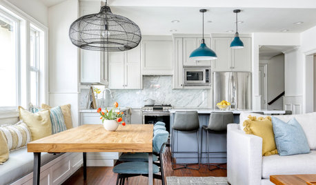
REMODELING GUIDESThe 4 Stages of a Remodel: The Renewal of Vows
In this stage, you’ll reconnect with your original vision of your home and finally start seeing it come together
Full Story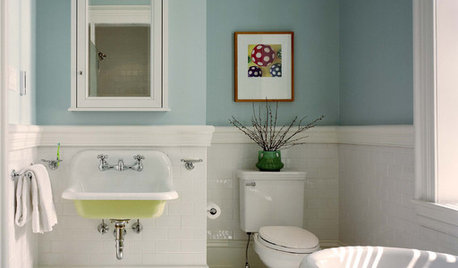
SELLING YOUR HOUSE6 Tips for Staging Historic Homes
Putting a period home on the market requires a unique level of attention to detail. Here's how to preserve its historic appeal
Full Story


mostone
terezosa / terriks
Related Discussions
Recessed LIghting for Kitchen
Q
? new cabinets and dish drawer
Q
Gas shut off valve placement
Q
Layout Gurus, I need help!
Q
User
Happyladi
theroselvr
scdeb424
cearbhaill (zone 6b Eastern Kentucky)
disneyrshOriginal Author
solie
thatgirl2478
kgsd
User
theroselvr
joyy
paulines
maryann0625
Happyladi
Nancy in Mich
Happyladi
lkplatow
thatgirl2478
disneyrshOriginal Author
terezosa / terriks
pink_overalls
User
jakkom
spacific
disneyrshOriginal Author
freezetag
spacific
camlan
theroselvr
paulines
C Marlin
sheilajoyce_gw
sparksals
disneyrshOriginal Author