SHOP PRODUCTS
Houzz Logo Print
threeapples

Anyone want to give wall color advice for my bedroom?

threeapples
11 years ago

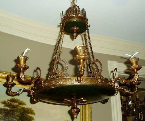
The master bedroom is entered off the upstairs hallway, which will be painted Farrow and Ball Hardwick White. The bedroom is a good size, has a little vestibule off the hallway, and leads to our master bathroom, which might be painted FB Shaded White. The woodwork in the master bedroom is BM China White. I'm including some images of the ceiling light fixture and the ceiling treatment. If it matters, we have a black marble bolection moulding fireplace mantel in there, too. We like darker colors for our bedroom and, since the room has three large windows, I think it will be ok.

So, I'm thinking FB Green Smoke, Picture Gallery Red, FB Brinjal, or Glidden Burnt Bark.

We don't have our furniture yet, but it will likely be cherry or mahogany in a colonial or Chippendale style.

The floors are a dark stained red oak.

Comments (96)

  • msrose
    11 years ago

    I'm really enjoying this thread and can't wait to see what you choose, but I have to ask if you know what the current blue is on your walls.

  • palimpsest
    11 years ago

    It's just primed drywall

  • Related Discussions

    Want to help me choose accessories for blank slate bedroom(s)?

    Q

    Comments (5)
    whenicit, Thanks, but I need LOTS of help! The other advantage to the 2nd layout in BR1 is that the headboard is rather high and if I put it along the wall, it won't block the windows which would probably be better. I'll see about adding seating when I get the beds assembled. We may have room and it would give me a project to scour antique shops. That is what I'm planning on doing for a nightstand in the second bedroom. A little shabby/chic, beachy. I was going to look through some "Real Simple" magazines for inspiration. I'm not sure exactly what I want yet, but I though a "weathered" table, perhaps in a fun color, would go nicely with the iron bed. ajsmama, Thank you for the suggestion on BR1. I agree that swaping the nightstand is much better. On BR2, I think I could move the dresser closer to the door. The only think I actually don't like about the dresser in that position in general is that I'm not fond of the look of it from the side, but no mater how far forward or backward it is, I'm going to have that problem... Thanks for all you help! Jaymie
    ...See More

    Need advice on color for bedroom

    Q

    Comments (5)
    I painted an upstairs bedroom in SW Awesome Violet. It is a perfect color--not too girly and not too dark. Here's what I discovered while sleeping that room while my master bedroom was being built downstairs. It's a wonderful, restful color for sleeping. Green, navy, white, gold, merlot are all colors that work with it. I'd take a photo, but since i moved my bed out, it is in disarray with boxes scattered around that I'm sorting through. [Here's a Houzz link to the color.[(https://www.houzz.com/photos/master-suite-remodel-traditional-bedroom-boston-phvw-vp~3812819) [Another.[(https://www.houzz.com/photos/davis-island-traditional-bedroom-tampa-phvw-vp~1810988)
    ...See More

    Need bedroom wall color advice

    Q

    Comments (5)
    What mood do you want to set? Master bedrooms are all about pleasing yourself and partner (if necessary). Your bed is neutral enough to work in many colourways,many styles and it sounds like the room has few challenges. Yay! As suggested, share pics of rooms you love. Or hate. That will get you the most useful ideas.
    ...See More

    Advice on how to warm up my master bedroom

    Q

    Comments (2)
    I think you can take inspiration form your artwork. The copper brown and the gold both make for nice warm counterpoints to the blue. You could pull those in through throw pillows, curtains, artwork over the bed, or maybe with different lamps.
    ...See More
  • threeapples
    Original Author
    11 years ago

    Yes, the primed drywall looks blue in these photos, but not so much in real life.

    That Adelphi paper is stunning.

    Now that I think about it I don't want pink drapes in the master bedroom--I think I'd rather a deeper color. I may do pink drapes in the family room (shaded white walls) or in the dining room (pink ground walls).

  • Florid75
    11 years ago

    Coffee color is a great choice.....

  • palimpsest
    11 years ago

    {{!gwi}}
    {{!gwi}}
    {{!gwi}}
    {{!gwi}}

    You could go tone-on-tone-on-tone, or tone-on-tone with white. You could actually do this with any deep toned wall color if you find the right fabric and paint combination.

  • palimpsest
    11 years ago

    Or if you did something like Plaster Lion:
    {{!gwi}}

    You could do tone on tone with plain or patterned fabric and with grey, white or gold trim (to pick up the gold fixture)

    {{!gwi}}
    {{!gwi}}

    {{!gwi}}

    {{!gwi}}

  • threeapples
    Original Author
    11 years ago

    I like those last options better.

  • threeapples
    Original Author
    11 years ago

    Here are two coats of vineyard, holly hedge, and plaster lion.

  • threeapples
    Original Author
    11 years ago

    A few more photos

  • pirula
    11 years ago

    Holly Hedge! Holly Hedge!

    Plaster Lion is also gorgeous, but as much as I love gray, I'm not sure that I would like being in a room surrounded by that dark of a gray.

    I much prefer Brinjal to Vineyard.

    Besides, the Holly Hedge is just gorgeous! Do you like it?

  • palimpsest
    11 years ago

    I think any of them work, in the first picture although the Vineyard really needs a primer about the color of Plaster Lion underneath it.

    I don't think the Vineyard will complement mahogany furniture though.

    I am partial to the Holly Hedge. I think it will look more like the first picture than the second. Plaster Lion is nice, too.

  • threeapples
    Original Author
    11 years ago

    I don't like Vineyard. After these photos I added a 3rd coat to all and will see if that changes anything.
    I'm not sure. I generally gravitate toward colors like Plaster Lion and really like it. I don't like how Holly Hedge looks in the 2nd photo-- it's too bright.

  • pirula
    11 years ago

    it is a lot brighter and not as nice in second picture. But is that a flash shining on it? And if you do a flat or even eggshell finish, you won't have any glare to take away from its saturation.

  • threeapples
    Original Author
    11 years ago

    I didn't use a flash, but the sun came out and I thought it was a good idea to snap a quick picture to see what it will look like on a sunny day. There is no electrical lighting in the room yet though.
    These are satin finish. I'd do flat.

  • pirula
    11 years ago

    Flat will make a big difference.

    Sounds to me like you love the Plaster Lion, and it is beautiful. So go with that!

  • threeapples
    Original Author
    11 years ago

    I do like plaster lion better. I'll post another photo (gonna have my husband take a photo of the dry 3rd coat).

  • threeapples
    Original Author
    11 years ago

    Three coats dry

  • lascatx
    11 years ago

    I like both Plaster Lion and Holly Hedge and have been going back and forth between them as I scroll through. Vineyard is just not a color I would put in my bedroom. I like more soothing and restful colors for my bedroom -- not that it couldn't look great. I was favoring Plaster Lion in the sunny photo, but maybe Holly Hedge in the last one with shadows. I think it might be a question of what I found in fabrics at this point -- possibly which wood you are favoring for furniture -- neither of which helps make progress right now.

  • theclose
    11 years ago

    I love the holly hedge. Beautiful and rich. But this is your room. If you love plaster lion, go for it. It will look great!

  • palimpsest
    11 years ago

    In either case I would get the electrician to change the outlets and switches to black.
    The green will self intensify so to speak. Either green or grey is nice. Don't be shocked though the room will get darker and darker as the paint goes up.

  • pirula
    11 years ago

    jeez. good point on the outlets.......

  • Monica1119
    11 years ago

    Your house is nice. If i were you, i would like to choose light yellow

  • threeapples
    Original Author
    11 years ago

    Monica, its funny you should say that because I was looking for a place to put a very pale creamy yellow yesterday. We like our bedroom dark, however, so it won't work in there.
    Thanks for the compliment. :)

  • natebear zone 10B
    11 years ago

    I was ready to say Plaster Lion until I saw the last picture of the swatches with the carpeting. The Holly Hedge is divine!

  • lyfia
    11 years ago

    In the last pic you posted I don't care for the gray - it doesn't seem to work too well with the floor and the trim color. Just seems more off than the green which goes really well with them. Must be competing undertones.

    edit: BTW I was refering to the gray as in the large swatch on the right and the green as the large middle swatch. That is how they show on my monitor. Don't care for the other colors very much. Red just seems to vibrant and not very relaxing for a bedroom.

    This post was edited by lyfia on Thu, Apr 11, 13 at 10:59

  • threeapples
    Original Author
    11 years ago

    Carpeting? We don't have any carpeting in there. We have very dusty hardwood floors and a piece of RAM board I used to stand on while I painted the samples.

    I'm just not loving the Holly Hedge. It seems to "clear" of a color for me--does that make sense? Maybe I should paint a much larger sample of both colors?

  • kitchendetective
    11 years ago

    Yes, that makes sense. It's too saturated for you. Have lived with a dark and desaturated bedroom color before?

    There should be roisin paper protecting those floors from dust, scratches and paint until the last possible moment. Is is just pulled back so that you can visualize color with the floor?

  • threeapples
    Original Author
    11 years ago

    No, there is no roisin paper protecting the floors! The marble floors and limestone are protected, as are the floors my husband installed in the basement, but the wood is generally uncovered except for heavy traffic areas. It irritates me, too.

    Our current house has a very deep midnight blue bedroom and we really like it. I don't know what is going on with the Holly Hedge that makes me not love it. Not sure what I should do, but I have to decide really soon and this is hard!

  • pirula
    11 years ago

    I think you have decided? Plaster Lion?

    (and yes, it's always hard to choose wall colors, so many options)....

  • threeapples
    Original Author
    11 years ago

    I'm wondering now about Inkwell or Burnt Umber, both FPE. Any thoughts?

  • palimpsest
    11 years ago

    If you do either of those, and don't do them in the FPE, I would not recommend flat. (FPE doesn't seem to come in dead flat).

    I used Benjamin Moore Black Jack, which is as dark as the Burnt Umber or Inkwell, and first had it done in flat. It marked and burnished a fair amount and a rub from your knuckle would leave a faint white line on it. Any marks had to be removed with a very damp, lint-free cloth (and dabbed, not rubbed). The BM matte. which had a very slight sheen( and I think, a much higher price,) faired better.

    One the whole room is done you can get away with a slight sheen because the reflectance value is low. It will never look too good in pictures because of the flash, unless you light the room up like a movie set, but it looks good in real life.

  • threeapples
    Original Author
    11 years ago

    So why aren't we discussing Studio Green (FB) instead of Holly Hedge, by the way?

  • palimpsest
    11 years ago

    For me, because Studio Green or similar is the "go to" color for front doors and lower story shutters around me, and I associate it with an "exterior" paint color.

  • patty_cakes
    11 years ago

    Pal is right re:dark colors burnishing, and it doesn't take much to leave a mark. A chair back even slightly touching a wall will leave a mark almost instantly. Personally I like a glossy dark color, so would use a semi or maybe even a laquer. If you do decide to go that route read this first.

    I'm mulling over having my DR painted dark gray to black using a laquer paint. Like you, I love dark saturated 'neutrals', but I'm not particularly fond of colors per se, unless ivory/bisque could be considered colors.

    Here is a link that might be useful: this

  • lascatx
    11 years ago

    Perhaps the Holly Hedge is too similar to the dark blue you have now? Dark green is mostly dark blue, but Plaster Lion in something different entirely. That makes it a new room in a new house. The name sounds cold, but the color seems warm and comforting -- like a soft blanket or favorite sweater -- and that suits a bedroom just fine.

    My guess is that if Holly Hedge doesn't seem right to you now, you won't love it on all four walls.

    This post was edited by lascatx on Fri, Apr 12, 13 at 8:17

  • patty_cakes
    11 years ago

    Again just my 2 cents, but colors similar to Vineyard and Holly Hedge have already been 'around the block' and to my mind's eye, seem dead, as in dated. Although I have nothing *against* dated, in a new home it just seems the use of something more updated would be appropriate.

    I am by no means a trend follower, and even though the grays are hot at the moment, feel Plaster Lion, because of it's depth, will remain strong, though not necessarily popular, which to me is a good thing. I have no desire for my home to be just another of those filled w/trendy colors/stuff. ;o)

  • threeapples
    Original Author
    11 years ago

    Patty cakes--that's a great link, thanks very much. I also really LOVE lacquered walls, but our painter has never done this and I don't think I want him to experiment in our bedroom. I am not sure we want to put the money into hiring someone else to emark on this pricey technique now either, unfortunately. Gloss finish paint won't give the same effect, will it?

    I can't really put my finger on why I don't love Holly Hedge. I want to love it because Palimpsest and my husband (and many of you) love it, but somehow I am not drawn to it. I see what you mean about it being dated, though I bet others will say it's classic and, in some ways, it is.

    I'm going to give it a go on a large area of the room and do the same for Plaster Lion and see what we think. I'll post pictures. :)

  • palimpsest
    11 years ago

    I don't think this house will provide much context for "dated" vs. "current" because this is a revival style house and of a higher caliber than most builds when it comes to the revival details. The colors are appropriate in a historical context (at least the Holly Hedge and Plaster Lion are...I don't think they were capable of producing a red of this sort for wall paint in the period). Authenticity trumps "dated" because it's already based on something "dated".

  • kitchendetective
    11 years ago

    Why are essentially only three colors under consideration?

  • threeapples
    Original Author
    11 years ago

    Kitchendetective, I am incredibly overwhelmed choosing the remaining details for our house (several key light fixtures, a few more paint colors, etc.) and I can't handle giving myself 50 choices for the bedroom. I'm just getting tired of my indecisiveness!

    Palimpsest, you're right, it is already "dated," but I do understand what Patty Cakes meant. I wish I knew where at Mount Vernon Plaster Lion was used--it'd be so interesting to learn.

  • palimpsest
    11 years ago

    I think it is based upon an object at Mount Vernon and not a room color. If you read the description of the fandeck, you can kind of tell which colors are room colors and which are "inspired by" colors. The room colors are mostly greens or blue-greens with white trim or white with green or blue-green trim, it seems.

    Actually I think you arrived at these three (or five, including the Burnt Umber and Inkwell) by a certain process of elimination of what was going on in other rooms and by wanting a saturated color. That leaves Blue, Red or Yellow as the primaries and you used a Dark Blue elsewhere, --or Green or a Neutral which is Brown or Black. I don't think you want a chrome yellow bedroom, or hazard orange bedroom so you are considering all the reasonable options available.

  • kitchendetective
    11 years ago

    So Hague Blue in Modern Emulsion is out because it's not period, not clear, too much of a combination? OTOH it could work with Chippendale and mahogany. The redpurplebrownbrickpelt seem to be ruled out by the woods, and you don't seem keen on the period green.

  • threeapples
    Original Author
    11 years ago

    We actually have Hague Blue all over our basement (my husband loves it). It's a huge space though and I don't want more of that color elsewhere. I also don't want to repeat it as a bedroom color (our current bedroom is very similar).

    Yes, the wood will complicate things. :/

    Last time I was in Mount Vernon (I was a kid) I remember thinking the rooms were painted "neon." Obviously they were not neon, but growing up in a house painted beige and some mauve, the colors were shocking to my preteen self.

  • Vertise
    11 years ago

    Whatever you do, pick something that will be a flattering backdrop for you! Colors you look good in ;)

  • threeapples
    Original Author
    11 years ago

    I'm blonde, fair, and have green eyes. Should have chosen pink or navy I guess.

  • pirula
    11 years ago

    which takes us back to palimpest's delightful dark green and pink scheme.

  • threeapples
    Original Author
    11 years ago

    I was painting up a larger sample of Holly Hedge on our master bedroom wall and, for some reason, it really grew on me and I now am certain I love it. So, Holly Hedge it is. Now I need to decide on the finish (can't do full gloss or lacquer because our painter hasn't done this before and I don't want to pay someone else). So, what do I do? I'm going to order directly from FPE but don't know what finish.

  • palimpsest
    11 years ago

    The matte will probably be best. I would also do tinted primer to have a dark undercoat. I remember you saying you had a bit of patchiness with the Hague Blue.

  • threeapples
    Original Author
    11 years ago

    Just ordered the matte--they said it has a 3-5"% sheen I think. Now I need to decide the color in my husband's closet (entered through our bedroom) and our bathroom. I'll post photos of the bathroom later this evening.

  • Eurry77
    11 years ago

    Hello,
    You got very good windows in your bedroom. Your bedroom would look very beautiful if it is painted in pink and one in blue or any other matching color. Opposite the windows you can hang any canvass prints of photographs of the family or any scenery. That would look awesome. Great quality canvas prints could be obtained from magnipic.com.