


Greige paint color question
chloenkitty
10 years ago
Featured Answer
Sort by:Oldest
Comments (72)

Sueb20
10 years ago
juliekcmo
10 years agoRelated Discussions
Greige experts/fans:Why do my greige paint colors look icky at ni
Comments (4)patty cakes-I went through so many samples and spent so much money. When I saw a huge portion of my wall painted with camouflage I thought it looked great! Silver, gold, black, and white frames all looked lovely with the color. It's gray yet green and also a bit "warm". It just looks yucky at night in my dining room so perhaps it's just the type of lighting. Anyhow, my point is that I thought I did a great job of weeding out the one's I din't like. Oh well Palimpsest-you're right about lighting! Camouflage looks pea green in my kitchen which has recessed halogen lighting, and looks more gray/green in the other rooms (well at night it looks muddy in my dining room). Changing out the light in my sons room was what I was thinking I should try so thank you for confirming that!...See MoreBeige or greige paint color without green undertones suggestions
Comments (7)I like Bittersweet Stem and may need to get a sample of that. The others look too yellow for my liking, I am trying to get rid of the Restrained Gold look. Any thoughts on Balanced Beige, Pavilion Beige or others like that?...See MoreGreige is the question.. Need houzz help with paint color..
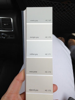
Comments (13)Geige is an incredibly broad term. It is like saying green. Lime Green or Forest Green, Teal or Emerald. Here is a list of a variety of Greige colors by Benjamin Moore Abalone Ashford Greige Ashley Gray Balboa Mist Broxburn Greige Collingwood Edgecomb Gray Gettysburg Gray Mineral Mortar Pale Oak Revere Pewter Shale Go into your local Benjamin Moore dealer and ask for paper samples of all of these colors. Pick a few dozen more that are in the same families. Take your samples outside on a sunny day, lay your flooring, countertop and cabinet samples on a white sheet and lay the paper samples of each of the above colors next to the samples. Note what you like and don't like. If you can find the right color you can always pick something a bit lighter or darker, but getting the rigjht mix of brown and gray and the right undertone is something that you will need to do with your samples. If you can come close and say, I like this a lot, but it seems just a bit too blue we will be able to offer a lot more assistance....See MoreGreige paint color
Comments (4)Any preference in terms of paint brand? Which colours have you sampled? What exposures do you have? What type of lighting? You don't want beige but usually a greige is a colour that looks either gray or beige, depending on the light. I have Benjamin Moore Silver Satin on one floor and it looks grey in one room and beige in another. Perhaps greige isn't the best colour for your house. What type of flooring and hard finishes do you have? Have you considered getting an on-site colour consultation? That can save a lot of time and money....See Morechloenkitty
10 years ago
tibbrix
10 years agotibbrix
10 years agotibbrix
10 years agotibbrix
10 years agochloenkitty
10 years ago PRO
PROBeverlyFLADeziner
10 years agotibbrix
10 years agonini804
10 years agoartemiss
10 years ago
Mick Mick
10 years ago
msrose
10 years agoscanmike
10 years agoMick Mick
10 years agochloenkitty
10 years ago
Amy
9 years ago
Tracy Guhr
9 years agolast modified: 9 years agoUser
9 years ago
amykath
9 years agoUser
9 years agohbussema
9 years agolascatx
9 years agohbussema
9 years agolascatx
9 years agolast modified: 9 years agoamykath
9 years agoamykath
9 years agoamykath
9 years agolascatx
9 years agolast modified: 9 years agoamykath
9 years agoamykath
9 years agolascatx
9 years agoamykath
9 years agoartydecor
9 years agoUser
9 years agolast modified: 9 years agofuzzypawsnewpad
9 years agoTracy Guhr
9 years agopocopson
9 years agoRachel
8 years agopocopson
8 years ago
Kerstin Alston
7 years agoamykath
7 years agolascatx
7 years ago
hooked123
7 years agoemb1218
7 years agovjwilkinson
6 years agolast modified: 6 years agoJen
5 years agoHU-176623926
5 years ago


Related Stories
GRAYGoing Greige: Tips for Choosing This All-Around Neutral
Here are some ways to highlight and complement your home with this elegant hybrid of gray and beige
Full Story
5 Questions for Design Stars
Houzz Members Need Your Help With This Week's Design Dilemmas!
Full Story0
EXTERIORSCurb Appeal Feeling a Little Off? Some Questions to Consider
Color, scale, proportion, trim ... 14 things to think about if your exterior is bugging you
Full Story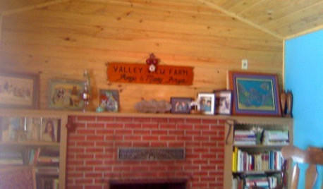
Design Dilemmas: 4 Questions for Houzzers
Brick Fireplaces, Historic Homes, and Tropical Living Room Decor, Oh My!
Full Story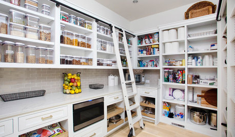
KITCHEN DESIGN9 Questions to Ask When Planning a Kitchen Pantry
Avoid blunders and get the storage space and layout you need by asking these questions before you begin
Full Story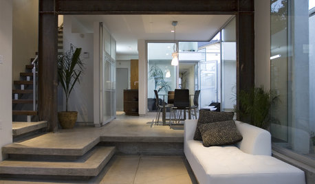
GREEN BUILDINGConsidering Concrete Floors? 3 Green-Minded Questions to Ask
Learn what’s in your concrete and about sustainability to make a healthy choice for your home and the earth
Full Story

FEEL-GOOD HOMEThe Question That Can Make You Love Your Home More
Change your relationship with your house for the better by focusing on the answer to something designers often ask
Full Story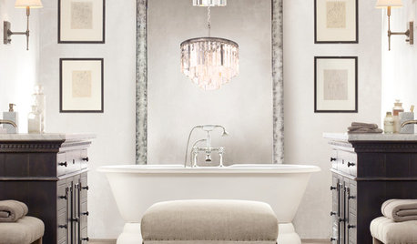
LIGHTING5 Questions to Ask for the Best Room Lighting
Get your overhead, task and accent lighting right for decorative beauty, less eyestrain and a focus exactly where you want
Full Story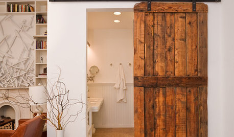
DOORS5 Questions to Ask Before Installing a Barn Door
Find out whether that barn door you love is the right solution for your space
Full Story


Tracy Guhr