


Need Your Help with Farrow and Ball Paint Color Sequence
marthavila
12 years ago
Sort by:Oldest
Comments (5)
Related Stories

COLORPick-a-Paint Help: How to Quit Procrastinating on Color Choice
If you're up to your ears in paint chips but no further to pinning down a hue, our new 3-part series is for you
Full Story
COLORPaint-Picking Help and Secrets From a Color Expert
Advice for wall and trim colors, what to always do before committing and the one paint feature you should completely ignore
Full Story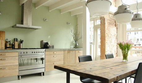
COLOR4 Cool Paint Colors Touted for 2014 — and How to Use Them
Muted but complex, these hues from Farrow & Ball can stand on their own or play supporting roles
Full Story
COLORHow to Choose a Paint Color
Designers offer tips for examining your closet, memories and daily life to find the right paint colors for your home
Full Story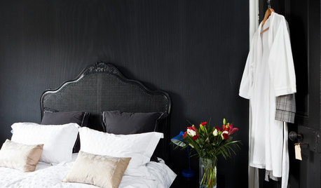
BEDROOMS10 Ways to Use Black on Bedroom Walls
Dark walls help create focal points, contrast, glamour — even a cozy feel
Full Story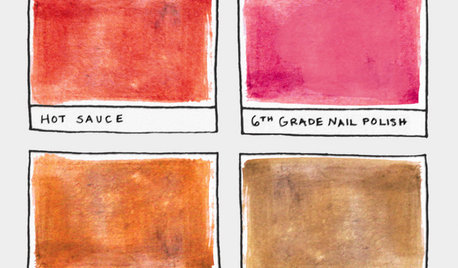
FUN HOUZZ16 Creative Paint Color Names We Haven't Seen — Yet
Someday, the namers of new paint colors will finally run out of ideas. We're here to help
Full Story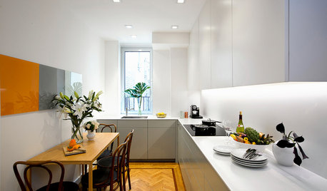
SMALL KITCHENSKitchen of the Week: Space-Saving Tricks Open Up a New York Galley
A raised ceiling, smaller appliances and white paint help bring airiness to a once-cramped Manhattan space
Full Story
KITCHEN DESIGNPalatable Palettes: 8 Great Kitchen Color Schemes
Warm and appetizing or cool and relaxing? These 8 paint palettes can help you choose the best colors for your kitchen
Full Story
COLORMore Top Paint Picks for 2014: New Greens, Blues and Neutrals
Valspar’s new colors aim to lift spirits and express creativity. Here’s how to use 9 of them in lively ways
Full Story
HOUZZ QUIZHouzz Quiz: What Color Should You Paint Your House?
Is white right? Maybe dark blue-gray? Take our quiz to find out which color is best for you and your home
Full Story


mtnrdredux_gw
marthavilaOriginal Author
Related Discussions
Farrow & Ball paint - color match possible?
Q
Keeping Vintage Cabinets:Farrow & Ball Paint? Need Frig & Hood
Q
Need Wallpaper Help! Just found Farrow&Ball
Q
Input needed on having Farrow and Ball paint mixed by Benjamin Moore
Q
marthavilaOriginal Author
francoise47
mtnrdredux_gw