


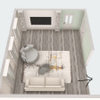
Should I repaint this one wall?
ingrid_vc so. CA zone 9
15 years ago
Sort by:Oldest
Comments (52)
Related Stories
GREAT HOME PROJECTSReady to Repaint Your Home’s Exterior? Get Project Details Here
Boost curb appeal and prevent underlying damage by patching and repainting your home’s outer layer
Full Story
TRIMShutter Cutouts: A Window to One's Soul?
To settle on the perfect shape for this simple detail, follow your heart — or diamond, or maple leaf
Full Story
REMODELING GUIDESDesign Dilemma: How Do I Modernize My Cedar Walls?
8 Ways to Give Wood Walls a More Contemporary Look
Full Story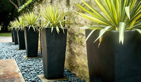
CONTAINER GARDENSWant Compelling Garden Minimalism? Think One Plant, One Pot
Highlight a show-worthy stunner or elevate a pedestrian plant by giving it a solo starring role in the garden
Full Story
REMODELING GUIDESOne Guy Found a $175,000 Comic in His Wall. What Has Your Home Hidden?
Have you found a treasure, large or small, when remodeling your house? We want to see it!
Full Story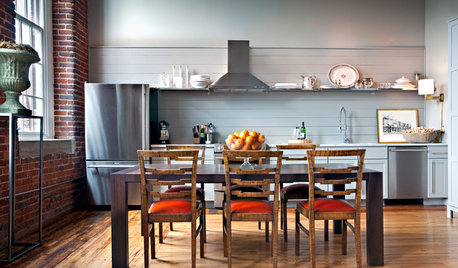
KITCHEN LAYOUTSWays to Fall in Love With a One-Wall Kitchen
You can get more living space — without losing functionality — by grouping your appliances and cabinets on a single wall
Full Story
COLORWhy You Should Paint Your Walls More Than One Color
Using multiple colors can define zones, highlight features or just add that special something
Full Story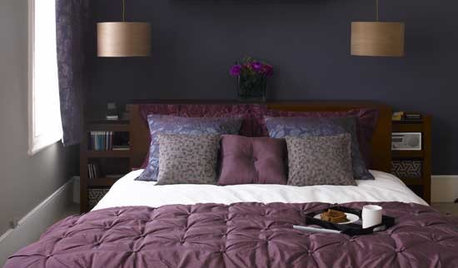
BEDROOMSMake Over Your Bedroom With One Wall of Color
Go serene or high energy with a single bedroom wall in a color you love. These 9 rooms show how it's done
Full Story
HOUSEPLANTSOne Pot, One Big Shot of the Tropics
Give your rooms exotic flair in a single stroke. Tall Kentia palm fits the tropical bill beautifully
Full StorySponsored
Custom Craftsmanship & Construction Solutions in Franklin County


oceanna
kellyeng
Related Discussions
What color(s) should I repaint this bedroom?
Q
Sherwin Williams made an error with paint color mix/Should I repaint?
Q
Bathroom walls same color as vanity, should I repaint walls???
Q
Should I repaint all trim in the kitchen and walls?
Q
kellyeng
dilly_dally
sable_ca
haley_comet
Janice
Janice
cat_tail
User
parma42
andee_gw
optionalnecessity
graywings123
sergeantcuff
Kathleen McGuire
nanny2a
msrose
kellyeng
jlj48
cooperbailey
ingrid_vc so. CA zone 9Original Author
ingrid_vc so. CA zone 9Original Author
stu2900
tfm1134
oceanna
gracie01 zone5 SW of Chicago
loribee
bodiCA
flowerpwr45
harriethomeowner
bodiCA
brutuses
eliza_824
mitchdesj
ingrid_vc so. CA zone 9Original Author
bodiCA
ingrid_vc so. CA zone 9Original Author
leahcate
leahcate
timber.j
mom2reese
mom2reese
oceanna
anotherlinda
janemg
ingrid_vc so. CA zone 9Original Author
bodiCA
brutuses
kitchendetective