


Sherwin Williams made an error with paint color mix/Should I repaint?
Adrienne P.
6 years ago
last modified: 6 years ago
Featured Answer
Sort by:Oldest
Comments (32)

Adrienne P.
6 years ago
Jenn TheCaLLisComingFromInsideTheHouse
6 years agoRelated Discussions
Experiences with (Lowes) HGTV Sherwin Williams "Showcase" Paint
Comments (54)Why can't anyone sell samples in a flat or matte? :/ To me, it does make a difference. I didn't think about waiting till they had sales. I can wait, I'm not in a big hurry. Are you loving the general color now that it's up on four walls lasatx, that's a hard question to answer. I've been thinking about it. In general, I like the color...well, one or two of the colors it can be at any given time. I'm not opposed to the color it's self. I'm opposed to the variety of colors it can turn and with the carpet. It's too bright for the carpet and the ambiance I wanted to project. It COULD look good if I didn't have a preconceived notion of what I expected. It's not the grownup plum I want. If I'm going to stay with purple, I think it's going to have to be a more brown based purple (which was suggested to me in one of my earlier threads on this topic). I originally didn't consider going that dark but I would. The gray based plums are pretty and give that dusky warmth but I don't think the gray base works with the creamy background of the carpet or the reddish brown floral print. I do think it's the magenta that's giving me fits but I've been wrong on ALL counts so far so who knows. When I can get to the SW store (40 miles one way) I'll take the left over paint and see if they'll work with me. I'm also going to test the Soulmate and possibly the Expressive Plum colors. I'm open to suggestions tho!!! I don't see how you can make an educated choice unless you paint all 4 walls since the same paint can be multiple colors at the same time. I never noticed the med chocolate brown color I had before this being that way. I have not tried the Reveal bulbs yet. I looked for them at WM a few days ago and didn't find any. I have to drive 40 miles one way to get to any other stores :o...See MoreSherwin williams gray paint color to go with black and white tile
Comments (1)My DD used Benjamin Moores Stonington Gray but had it mixed in Ace paint. So you can use other manufacturer's color mixed in Sherwin Williams paint. Here's how it looks in a well lit room with dark blue accents. It looks a little darker in my DD's hallway which is a low light area. I recommended the Stonington Gray color to my sister in law and she loves it. She used it in a bathroom with a black and white floor and dark gray vanity. Don't have a picture but it looks great. Another gray that has a great review is Sherwin William's Collanade Gray. Check out this decorators review of it: Collonade Gray...See MoreSuggestions on Sherwin Williams off-white,cool tone paint colors?
Comments (11)I can say I might trump you on living in a dreary area! I'd buy some 4 poster boards from Michael's or where ever you have locally cut them in half so you have 8 pieces to sample 2 colors. Leave a 2" border of white all the way around and paint the rest with any of the colors you choose or any I have mentioned. I'd go for City Loft or Aesthetic White. Shoji is another that will lean slightly gray, but I didn't sample it as I'm familiar with it in other spaces and for my space and furnishings in the eat in sunroom I knew it would not work. It really is a lot of work, but to get it right.... You have some interesting colors and the only way to know is to try even though it's a pain. I'm not done, but here is a photo of Aesthetic white in my sunroom. TALK ABOUT DREARY and you can see high it leans a bit slight gray. I cropped the photo as this is the only spot I have 2 coats to have you best see. The room has three taller windows left and right with a paned single door to the backyard and on the back wall 4 large paned windows so there is a lot of light in this space. As you move in to the kitchen it's not as bright, but the light from the sunroom toward the kitchen makes the paint look a pinch lighter more like the bottom of the photo. I hope it helps you and as I mentioned paint can change from room to room. I found it a nice compromise I was very torn between Egret and City Loft and Aesthetic White all having slight nuances that differ, yet barely. I had used Aesthetic in an office I did recently and loved it so I tried in in my home and well.... I do love it and will use it more in the future....See MoreExterior Paint Color Help! Sherwin Williams paint. Sedona Canyon roof
Comments (8)I've been looking at high end roofing tile websites and one of them has a color expert that made recommendations for house paint colors with their orange/brown roof tiles. Here is a link to some of the schemes they recommend that may give you some inspiration: https://www.davinciroofscapes.com/blog/exterior-color-schemes-autumn/ You can color match to Sherwin Williams brand paint....See MoreAdrienne P.
6 years agoJenn TheCaLLisComingFromInsideTheHouse
6 years ago
Faron79
6 years ago
love2browse
6 years ago PRO
PROTate Interiors, Inc.
6 years agoAdrienne P.
6 years agoAdrienne P.
6 years agoFaron79
6 years agoAdrienne P.
6 years agoFaron79
6 years ago PRO
PROLori A. Sawaya
6 years agolast modified: 6 years agoSP McKenzie
6 years ago- PRO
Patricia Colwell Consulting
6 years ago - PRO
Lori A. Sawaya
6 years ago SP McKenzie
6 years agoJenn TheCaLLisComingFromInsideTheHouse
6 years agoSP McKenzie
6 years agoJenn TheCaLLisComingFromInsideTheHouse
6 years ago- PRO
Lori A. Sawaya
6 years agolast modified: 6 years ago Jenn TheCaLLisComingFromInsideTheHouse
6 years agoJenn TheCaLLisComingFromInsideTheHouse
6 years ago- PRO
Lori A. Sawaya
6 years ago Jenn TheCaLLisComingFromInsideTheHouse
6 years agoAdrienne P.
6 years ago
V S
6 years agoJenn TheCaLLisComingFromInsideTheHouse
6 years agoAdrienne P.
6 years agochiflipper
6 years ago PRO
PROPaint sales at Home Depot
6 years ago


Related Stories
COLORBest Ways to Use Exclusive Plum, Sherwin-Williams’ Color of 2014
Pretty, moody, maybe even a neutral, this toned-down grayish purple can work in any room. Here's how
Full Story
DECORATING GUIDESThe Dumbest Decorating Decisions I’ve Ever Made
Caution: Do not try these at home
Full Story
EXTERIORSHelp! What Color Should I Paint My House Exterior?
Real homeowners get real help in choosing paint palettes. Bonus: 3 tips for everyone on picking exterior colors
Full Story
DOORSWhat Color Should I Paint My Front Door?
Extend a standout greeting with a memorable hue at your home’s entry
Full Story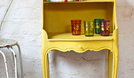
PAINTINGWhat to Know About Milk Paint and Chalk Paint — and How to Use Them
Learn the pros, cons, cost and more for these two easy-to-use paints that are great for giving furniture a vintage look
Full Story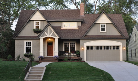
Houzz Call: Show Us Your Paint Makeovers
Let your newly repainted house or room do the "How d'ya like me now?" strut right here — it might just be featured in an upcoming ideabook
Full Story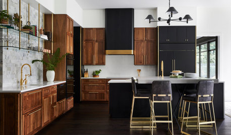
KITCHEN DESIGNNew This Week: 3 Kitchens That Stylishly Mix Dark and Light
Combining dark painted cabinets with wood cabinets and other warm tones creates a sophisticated kitchen color palette
Full Story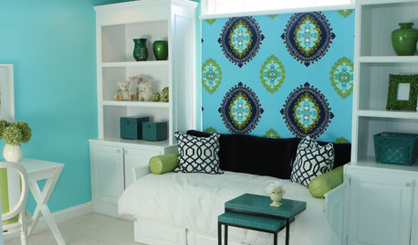
COLOR8 Daring Paint Palettes for Fearless Color Lovers
Dial up the volume on your home's color by nixing the neutrals and mixing in bold, beautiful colors that speak to your soul
Full Story
WHITEHow to Pick the Right White Paint
White is white, right? Not quite. See 8 white paint picks for 8 very different effects
Full Story
COLORMore Top Paint Picks for 2014: New Greens, Blues and Neutrals
Valspar’s new colors aim to lift spirits and express creativity. Here’s how to use 9 of them in lively ways
Full Story


JudyG Designs