


8 Daring Paint Palettes for Fearless Color Lovers
Dial up the volume on your home's color by nixing the neutrals and mixing in bold, beautiful colors that speak to your soul

With so many gorgeous paint colors available, why stick to what's safe and common? Now that's not to knock neutrals, as a quick browse on Houzz reveals numerous eye-catching, beautiful interiors with toned-down color palettes. However, many of you are clamoring for more color — and some of you want extreme color.
If this describes you, then my advice is to have fun with it! But don't just randomly pick three or four snappy colors and slap them on the walls — you may end up with the Skittles effect: a riot of screaming color that most will find too busy or garish. Check out these tips on how to mix bold colors in an interior space, as well as images and examples of paint palettes featuring bold color combinations.
If this describes you, then my advice is to have fun with it! But don't just randomly pick three or four snappy colors and slap them on the walls — you may end up with the Skittles effect: a riot of screaming color that most will find too busy or garish. Check out these tips on how to mix bold colors in an interior space, as well as images and examples of paint palettes featuring bold color combinations.
Example palette: From left to right, all from Kelly-Moore: Turquoise Treat, Jive Clive and Royal Wave.
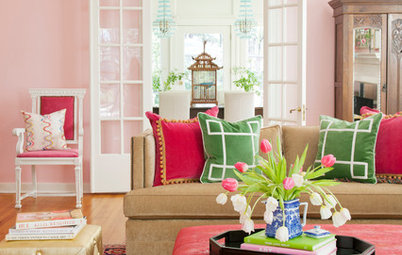
2. Carrot, Magenta and Plum
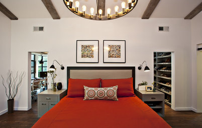
This palette sticks to the warm side of the color wheel and illustrates another strategy for working with bold colors: Have one of your predominant colors be less vibrant to act as a grounding color. This plum color has some black in it, which grays it out and turns it into a neutral backdrop for the intense orange and pink.
This palette sticks to the warm side of the color wheel and illustrates another strategy for working with bold colors: Have one of your predominant colors be less vibrant to act as a grounding color. This plum color has some black in it, which grays it out and turns it into a neutral backdrop for the intense orange and pink.
3. Neon Green, Hot Pink and Grape
This space features a mix of intense warm and cool colors, with accents of white, but the bulk of the color in the room is limited to shades of either green or purple-pink.
This space features a mix of intense warm and cool colors, with accents of white, but the bulk of the color in the room is limited to shades of either green or purple-pink.
Example palette: From left to right, all from Pittsburgh Paint: Bermuda Grass, Impatient Pink and Grape Juice.
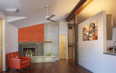
4. Bright Coral, Sky Blue and Dark Brown
Here's another room mixing a bold warm hue with a bold cool hue. Because all of the remaining colors are neutrals, the two bold colors play together nicely. I also think it works because the bold colors are used in fairly monolithic ways. Instead of little bits of red and blue here and there — which could appear busy — there are large isolated chunks of the colors. The red chairs really stand out and contrast nicely against the backdrop of blue.
Here's another room mixing a bold warm hue with a bold cool hue. Because all of the remaining colors are neutrals, the two bold colors play together nicely. I also think it works because the bold colors are used in fairly monolithic ways. Instead of little bits of red and blue here and there — which could appear busy — there are large isolated chunks of the colors. The red chairs really stand out and contrast nicely against the backdrop of blue.
Example palette: From left to right, all from Sherwin-Williams: Gladiola, Rapture Blue and French Roast.
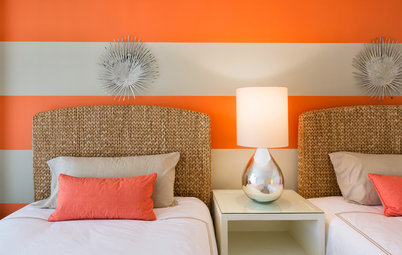
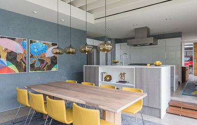
5. Sea Blue, Saffron and Tangerine
This is a very bold and energetic palette, but you can get away with such intensity in areas of your home where people just pass through, such as entries, hallways and stairwells. You may not want to paint your bedroom in electric shades of yellow and orange, but for your home's entry, go for it!
This is a very bold and energetic palette, but you can get away with such intensity in areas of your home where people just pass through, such as entries, hallways and stairwells. You may not want to paint your bedroom in electric shades of yellow and orange, but for your home's entry, go for it!
Example palette: From left to right, all from Benjamin Moore: Sailor's Sea Blue, Sunflower and Orange Nectar.
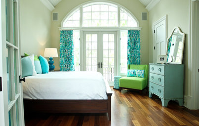
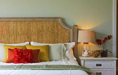
6. Grass Green, Watery Blue and Spring Green
These are zingy colors on their own, but they work in harmony together because they are analogous hues — near one another on the color wheel. Cool colors are soothing, making them the perfect choice for a relaxing bedroom or a spa-like bathroom.
These are zingy colors on their own, but they work in harmony together because they are analogous hues — near one another on the color wheel. Cool colors are soothing, making them the perfect choice for a relaxing bedroom or a spa-like bathroom.
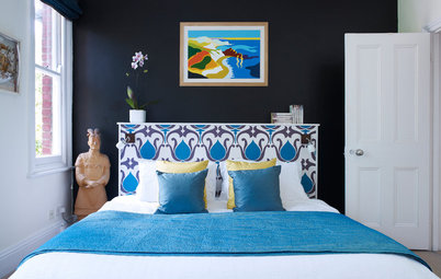
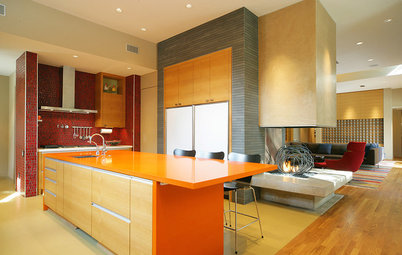
7. Chocolate, Fuchsia and Pumpkin
Here's another fun orange and hot pink room. This time the bold hues are grounded by a rich chocolate brown. This is a fun, youthful and contemporary palette.
Here's another fun orange and hot pink room. This time the bold hues are grounded by a rich chocolate brown. This is a fun, youthful and contemporary palette.
Example palette: From left to right, all from Dunn Edwards: Chocolate Chunk, Fiery Fuchsia and Exuberant Orange.
8. Emerald, Mint and Powder Blue
Another trick for a colorful space that doesn't overwhelm is to pick two colors you love and then use various shades of them with a light neutral, such as white, gray or beige. Here we have shades of soft blue and minty green working together with white.
Another trick for a colorful space that doesn't overwhelm is to pick two colors you love and then use various shades of them with a light neutral, such as white, gray or beige. Here we have shades of soft blue and minty green working together with white.
Example palette: From left to right, all from Pratt & Lambert: Jungle, Bezique and Bambino.
Tell us: Are you a lover of bright and bold color? What are some of your favorite combinations, and how do you make them work in your house?
More:
Guides to working with bold color
Get me out of here and take me to neutrals, quick!
Tell us: Are you a lover of bright and bold color? What are some of your favorite combinations, and how do you make them work in your house?
More:
Guides to working with bold color
Get me out of here and take me to neutrals, quick!
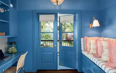
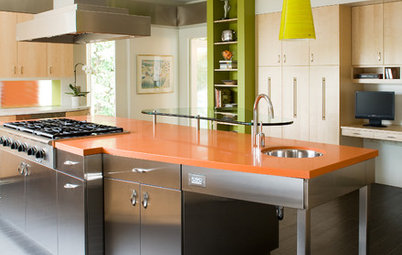


A good tip for working with multiple bold colors is to stick with either a cool or warm palette. It's less jarring than a mix of several intense cool and warm hues. Here we have a cooler palette of turquoise, dill and a dark inky blue, lightened with a dose of white furniture and accessories.