


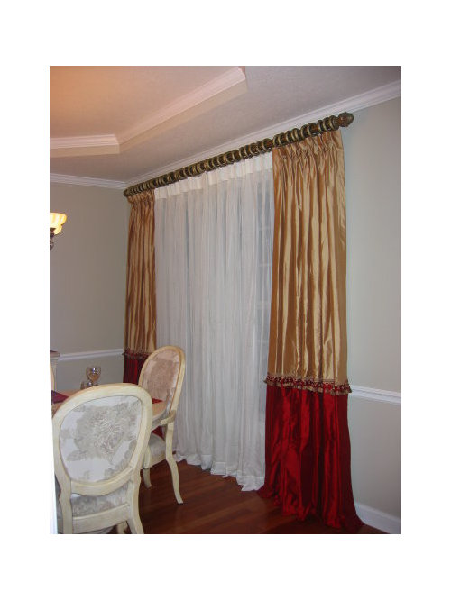
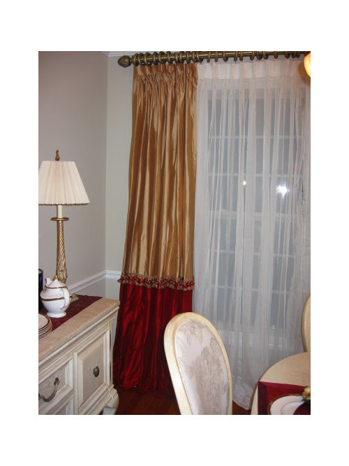
Photoshop Help - Pretty Please!
deborahnj
16 years ago
Sort by:Oldest
Comments (58)
Related Stories

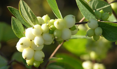
GARDENING GUIDESGreat Design Plant: Snowberry Pleases Year-Round
Bright spring foliage, pretty summer flowers, white berries in winter ... Symphoricarpos albus is a sight to behold in every season
Full Story
EXTERIORSHelp! What Color Should I Paint My House Exterior?
Real homeowners get real help in choosing paint palettes. Bonus: 3 tips for everyone on picking exterior colors
Full Story
HOME OFFICESQuiet, Please! How to Cut Noise Pollution at Home
Leaf blowers, trucks or noisy neighbors driving you berserk? These sound-reduction strategies can help you hush things up
Full Story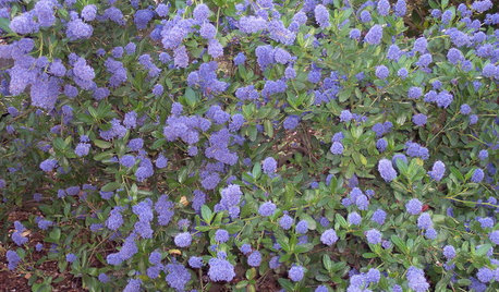
GARDENING GUIDESGreat Design Plant: Ceanothus Pleases With Nectar and Fragrant Blooms
West Coast natives: The blue flowers of drought-tolerant ceanothus draw the eye and help support local wildlife too
Full Story
ORGANIZINGHelpful Catch-Alls Keep Visual Clutter at Bay
What a difference it makes when you corral your stuff in pretty bowls, baskets or crates
Full Story
BEFORE AND AFTERSMore Room, Please: 5 Spectacularly Converted Garages
Design — and the desire for more space — turns humble garages into gracious living rooms
Full Story
BATHROOM DESIGNUpload of the Day: A Mini Fridge in the Master Bathroom? Yes, Please!
Talk about convenience. Better yet, get it yourself after being inspired by this Texas bath
Full Story
HOUZZ TOURSHouzz Tour: A Neutral Palette Pleases By the Sea
Designer Phoebe Howard creates earth-toned elegance for a family's Florida beach getaway
Full Story
LIVING ROOMSCurtains, Please: See Our Contest Winner's Finished Dream Living Room
Check out the gorgeously designed and furnished new space now that the paint is dry and all the pieces are in place
Full Story


msrose
deborahnjOriginal Author
Related Discussions
Photoshop help for Kitchen, Pretty Please?
Q
Photoshop help for fireplace pretty please?
Q
Photoshop Help Please - Painter Thinks We're Crazy
Q
Can someone please help my curb appeal. Photoshop my ideas please
Q
brutuses
magothyrivergirl
dorothy9_gw
deborahnjOriginal Author
lindybarts
hoyamom
magothyrivergirl
deborahnjOriginal Author
teeda_2006
annabellesangels
susanlynn2012
deborahnjOriginal Author
kiki_2007
msrose
deborahnjOriginal Author
johnatemp
lindybarts
karen_76
CaroleOH
squirrelheaven
deborahnjOriginal Author
lindybarts
squirrelheaven
squirrelheaven
deborahnjOriginal Author
deborahnjOriginal Author
squirrelheaven
squirrelheaven
deborahnjOriginal Author
oceanna
susanlynn2012
squirrelheaven
squirrelheaven
lindybarts
susanlynn2012
jerseygirl_1
squirrelheaven
deborahnjOriginal Author
susanlynn2012
deborahnjOriginal Author
squirrelheaven
deborahnjOriginal Author
squirrelheaven
deborahnjOriginal Author
teeda_2006
deborahnjOriginal Author
oceanna
johnatemp