


final pics- travertine masterbath!!!!!!!!!!
archnista
13 years ago
Featured Answer
Sort by:Oldest
Comments (42)

archnista
13 years agolast modified: 9 years agopeteinsonj
13 years agolast modified: 9 years agoRelated Discussions
finally...our completed masterbath! many pics
Comments (64)Thanks for your kind comments! Trish... I am so sorry that Sandy affected you and your home in such a major way. I hope that things are going as smoothly as possible as you try to put things back together. To deal with all of that with a busy two year old must be especially challenging. I absolutely love my tile and its warm somewhat rustic appearance so I'm glad that you like it too. I did some checking for you and have some info which I hope will be helpful. I sourced my tile from my local Virginia Tile store in Michigan. They would ship to NY but that would be hugely expensive, of course. I googled Edimax distributors in NY and came up with a couple who told me that they don't carry Material Forte and Westchester Tile in Scarsdale which told me that the Materia Forte was being discontinued(!) I quickly called my Virginia Tile rep who had not heard anything about that and was still expecting shipments within the next month. Checking further, I found the AllStone Boston Design Center that carries Edimax tile. The good news is they ship from a warehouse in New Jersey so that might be reasonable to consider. I spoke with Lauren Maggio who was very helpful and suggested that you contact her (lauren@allstone.net) with details about the sizes and quantity that you'd be interested in and that she could order a tile sample for you. Their phone number is 617-737-2200. Depending on the size tiles that you're considering, I wouldn't be too hesitant to order tile in this way. We found that, by doing the usual mixing of boxes, we were happy with all of the large tiles and how they blended together. The 4 x 4's were a different story however because they had much more variation in tones and because they were a tumbled tile with uneven edges... some of them were very, very uneven. We ordered way more than we needed and picked out the best ones to use. I hope that helps... please feel free to let me know if you have any other questions that I might be able to answer. I'd love to hear what you decide to do and look forward to seeing pictures of your room....See MoreFinally! A Decent Vanity Reveal Pic 1 of 2
Comments (12)Thanks Nancy! The colors were inspired by the Caribbean sea and beaches we've been lucky enough to be able to cruise to. If you're referring to picture # 2 in this thread, it's just a closeup of the sink. The vanity area is all we've done so far. I've been whining about this last room (house is 33 years old) being stuck in the early 80. So he finally agreed to do it in stages as we bought the material and paid for each stage. Well the most expensive part has been done. And he will do most of the other work (entire bathroom gut) but nothing more will be done until hunting season is over. I MIGHT get the light fixture and mirror before the end of the year (g) Here's the light fixture we're using. You can't see the drawer pulls but they have Texas stars on them. Found a light with the same. pbase. I've been with them for probably 14 years. I never got a renewal notice last fall. Then early 2014 they said my acct would be removed if I didn't renew. I had been considering letting it go anyway so I looked for a way to easily download all my pictures. There isn't one. They used to offer a tool but not anymore :o I'm not going to the trouble to download all those pictures one by one when I'm sure I have 99% of them anyway. They still haven't removed my pictures!...See MoreFinal Pool Pic
Comments (4)@andi_k We’re building a pool in Ashburn this Feb/Mar and thinking about having a Paradise slide installed as part of the project. After having it for 6+ years, are you still happy with the slide? Would you have done anything different in regards to the slide? Just trying to decide if the spend is worth it, once the novelty of the slide wears off for our boys. Thanks in advance for your inputs and thoughts. Love the whole project btw....See MoreHelp me decide on color of travertine base molding - PICS
Comments (9)Of the two, I guess I would go with the lighter, as it connectes well with the paint color and will feel like a trim color would in any room. If you go with the lighter one, you might also go that color with the narrow 1/2 round on the top and bottom of the decorative trim area, as you mentioned. That would give another link with the lighter base. FWIW, I would skip the accent tiles on the floor. I think they add some interest on the trim in the shower, but I think they will be too much everywhere on the floor....See Morewi-sailorgirl
13 years agolast modified: 9 years agoarchnista
13 years agolast modified: 9 years agosusanelewis
13 years agolast modified: 9 years ago
monicakm_gw
13 years agolast modified: 9 years agoUser
13 years agolast modified: 9 years agodianalo
13 years agolast modified: 9 years agopbishop
13 years agolast modified: 9 years agojoyce_6333
13 years agolast modified: 9 years agoarchnista
13 years agolast modified: 9 years agodianalo
13 years agolast modified: 9 years agodianalo
13 years agolast modified: 9 years agobusybee3
13 years agolast modified: 9 years agosusanelewis
13 years agolast modified: 9 years agosevrm
13 years agolast modified: 9 years agoMongoCT
13 years agolast modified: 9 years agoarchnista
13 years agolast modified: 9 years agoarchnista
13 years agolast modified: 9 years agoMongoCT
13 years agolast modified: 9 years agobusybee3
13 years agolast modified: 9 years ago
donna murphy
13 years agolast modified: 9 years agoarchnista
13 years agolast modified: 9 years agodianalo
13 years agolast modified: 9 years agoarchnista
13 years agolast modified: 9 years agopeytonroad
13 years agolast modified: 9 years agoarchnista
13 years agolast modified: 9 years agopeytonroad
13 years agolast modified: 9 years agoarchnista
13 years agolast modified: 9 years agopeytonroad
13 years agolast modified: 9 years agokarena_2009
13 years agolast modified: 9 years agojjaazzy
13 years agolast modified: 9 years agoarchnista
13 years agolast modified: 9 years agokiana-2010
13 years agolast modified: 9 years agojjaazzy
13 years agolast modified: 9 years agoarchnista
13 years agolast modified: 9 years agoclassicalone
13 years agolast modified: 9 years agojjaazzy
13 years agolast modified: 9 years agotateland
13 years agolast modified: 9 years agoarchnista
13 years agolast modified: 9 years agoblondelle
13 years agolast modified: 9 years ago
Related Stories
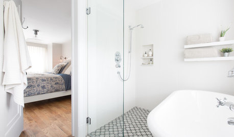
BATHROOM DESIGNSweet Retreats: The Latest Looks for the Bath
You asked for it; you got it: Here’s how designers are incorporating the latest looks into smaller master-bath designs
Full Story
COLORColor of the Week: Spring Green
Spring has finally sprung for many of you — and here's how to bring some of that green inside
Full Story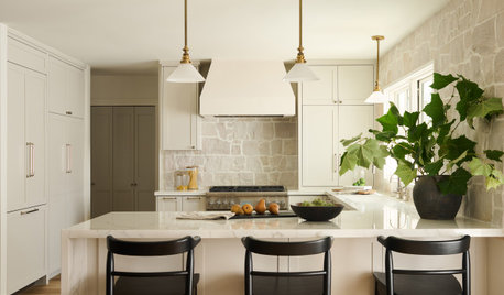
KITCHEN WORKBOOKHow to Remodel Your Kitchen
Follow these start-to-finish steps to achieve a successful kitchen remodel
Full Story
KITCHEN MAKEOVERSKitchen of the Week: Rich Materials, Better Flow and a Garden View
Adding an island and bumping out a bay window improve this kitchen’s layout and outdoor connection
Full Story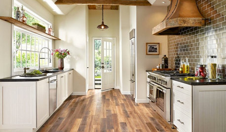
MOST POPULARPros and Cons of 5 Popular Kitchen Flooring Materials
Which kitchen flooring is right for you? An expert gives us the rundown
Full Story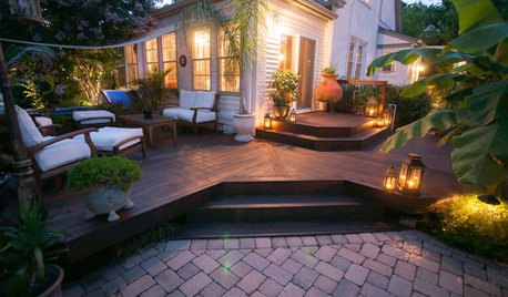
MOST POPULARWhat to Know About Adding a Deck
Want to increase your living space outside? Learn the requirements, costs and other considerations for building a deck
Full Story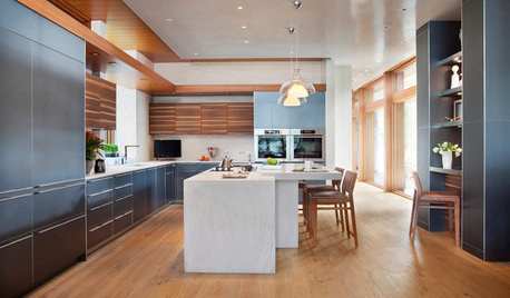
KITCHEN STORAGECabinets 101: How to Get the Storage You Want
Combine beauty and function in all of your cabinetry by keeping these basics in mind
Full Story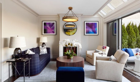
DECORATING GUIDESDecorating 101: How to Start a Decorating Project
Before you grab that first paint chip, figure out your needs, your decorating style and what to get rid of
Full Story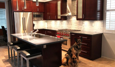
BEFORE AND AFTERSReader Project: California Kitchen Joins the Dark Side
Dark cabinets and countertops replace peeling and cracking all-white versions in this sleek update
Full Story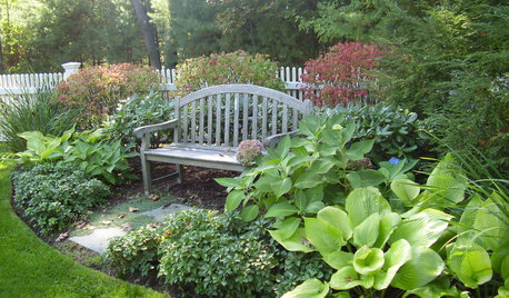
GARDENING AND LANDSCAPINGLandscape Design: A Secret Garden
Create a sense of discovery in your garden with an unexpected clearing, a shady arbor or a secluded nook
Full Story

archnistaOriginal Author