


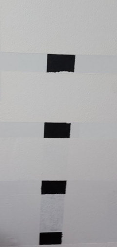
Benjamin Moore Simply White not Covering
Cris Morrow
2 years ago
Featured Answer
Sort by:Oldest
Comments (62)

eld6161
2 years agolast modified: 2 years ago
Faron79
2 years agoRelated Discussions
Need fabric for roller shade to match Benjamin Moore Simply white
Comments (3)Hunter Douglas is where I would start looking. Have your simply white chip with you. Keep in mind that the color of the shade will change if it is light filtering fabric. I would think the only way you will get a consistent white is if you choose black-out shades. Maybe white light filtering bamboo shades would be more consistent than fabric... JPPenny...See MoreBenjamin Moore’s white opulence paint color
Comments (75)It has been a while since the last activity on this thread, and I felt it might be beneficial to give my updated perspective on White Opulence #879 from Benjamin Moore as a paint color for main areas. Having lived with this color for a bit longer now since my last comment, I am beginning to understand how tightly it regulates what other colors can be placed with it for anyone who cares about a homogeneous scheme and also how undeniable the pink tone can be when applied over large surface areas. White Opulence is a tint of red, but it is so light that in ample daylight or under bright white lighting it can "read" as white. In average daylight, it produces a whisper-light pink hue. The effect of this is magnified the larger the area that is covered by it. Using this color on the walls in the main space of a large, open-plan layout with high ceilings, for example, will imbue the area with a light, yet undeniable, pale pink cast in average lighting. It would be a good idea to prepare not only yourself but also any other significant users of the space of the pink tinge before selecting this color because some people truly dislike pink, and it is courteous to work with all regular users of spaces during design planning to try to ensure no one will be overly uncomfortable with the final effect. One thing that hasn't been discussed is how White Opulence can cast a peach tone under warmer lighting colors, especially in the absence of any compensating daylight, meaning nighttime in most home spaces. If peach is a color you want to avoid and you utilize warm lighting -- that is, progressively orange-tinged the further under a 4000K color temperature you go -- then this is a paint color to avoid. The general recommendation is that 4000K is quite cool for home environments, so if you don't know what color temperature your home lighting is, you can probably assume it is warmer than 4000K if you selected average bulbs from your home supplies provider. White Opulence as a red-based white was an attractive choice for my main space because I already had a red accent in a permanent finish and personally prefer the fresh look that a red-white lends versus common alternate choices for main area wall colors like yellow-based beiges or blue-based grays. The problem is that so many home goods available are manufactured in colors that go with beige and gray wall colors rather than the faint red-white of White Opulence that color coordination requires more work than may be expected. Of course, you could decorate using pure white items, but what you really need are options for whisper pink basics which are hard to find. Adding stronger pink or red items is not always the solution either because you cannot feasibly fill the room with accents; you need some basics that blend with the wall tone. Then there is the issue of coordinating White Opulence with colors for auxiliary rooms if you wish to have some variety throughout the home while still maintaining the feel that all of the home's colors work together. Most blues coordinate with White Opulence, but if you have already used red accents in rooms painted with White Opulence, then red is challenging to pair with blue in most instances unless it is a dark, cool blue like navy. Where this has been a dilemma for me has been my hallway colors connecting the main open space to the bedrooms which are all different pastels. The color plan I have will work, and I'll enjoy the variety of colors that I have been able to make flow together, but to be honest, at times I have wondered how much easier the design process might have been if I had picked plain white for the main space. White is the ultimate neutral some might say. At the very least, a basic white for the main area would have given me more freedom in selecting fabrics and other home products for the main space as well as coordinating colors for other rooms. It is all too easy to second-guess decisions that will affect your life long-term. I am using Benjamin Moore's durable Aura formula in a satin finish, so I expect the new White Opulence paint will last decades. Had I selected a plain white or yellow- or blue-based off white, I might be back on this very forum wishing I had gone with White Opulence to add appeal beyond the standard choices. I hope this is helpful to anyone still considering this color....See MoreBruce flooring? White oak? Resale? Benjamin Moore Simply White?
Comments (8)Bruce is now owned by Armstrong as is Robbins and Hartco. Between all of the offerings there's a wide range of products and looks with quality ranging from low to medium high. The comment about limited selection is the opposite of reality. They have a bunch of products. When I peruse their price list it's sometimes hard to figure out the difference between multiple items that sound the same on paper. The challenge is finding somewhere that might show the full product line. Big box stores generally have a limited selection. Many multi-surface flooring stores have Shaw or Mohawk since the sell carpet and tile. You'll get design opinions in the flooring forum but questions generally slants toward technical issues. Perhaps your cross-posts will work or you could inquire in Design Dilemma. First you need to set a direction, then you can set about executing a plan....See MoreSherwin Williams Pure White? Benjamin Moore Simply White?
Comments (0)<?xml version="1.0" encoding="UTF-8"?><md>Long story long our current trim is a discontinued paint line that cannot be color matched. Whatever I paint the trim colorwise will eventually go on our bathroom and kitchen cabinets. I have tried what is locally available. Benjamin Moore, Sherwin Williams, PPG. I need something that will brush and spray well. PPG Delicate White Satin- dried to quickly and went on streaky due to the drying factor. Sherwin Williams Pure White in Emerald Urethane Semi for trim is awesome, paints and levels like a dream, however tactically the trim feels chalky not silky....See More PRO
PROLori A. Sawaya
2 years ago
Jennifer Hogan
2 years agoFaron79
2 years ago- PRO
Lori A. Sawaya
2 years ago Marie Schatz
2 years agotelesaps
2 years agoJennifer Hogan
2 years agoJennifer Hogan
2 years agotelesaps
2 years agochispa
2 years agoJennifer Hogan
2 years ago
hamfast
2 years ago
Lindsay K
2 years agolast modified: 2 years agoJennifer Hogan
2 years ago PRO
PRORockin' Fine Finish
2 years agoJennifer Hogan
2 years agoFaron79
2 years agoJennifer Hogan
2 years agoCris Morrow
2 years ago
Lori Sawaya
2 years agoJennifer Hogan
2 years agoFaron79
2 years agoKat Loop
2 years agolast modified: 2 years agoCris Morrow
2 years agoFaron79
2 years ago- PRO
Lori A. Sawaya
2 years ago Cris Morrow
2 years agoJennifer Hogan
2 years ago- PRO
Lori A. Sawaya
2 years ago HU-363861344
2 years agolast modified: 2 years ago
Michael Bedell
last yearrockinrobin68
last yearchispa
last yearlast modified: last yearrockinrobin68
last yearJennifer Hogan
last yearmcarroll16
last yearchispa
last year- PRO
Lori A. Sawaya
last year Jennifer Hogan
last yearmxk3 z5b_MI
last yearlast modified: last yearloobab
last yearHU-598869390
last yearJennifer Hogan
last yearChessie
last yearlast modified: last yearchispa
last yearLori Sawaya
last yearlast modified: last yearmxk3 z5b_MI
last year
Teri Jo
6 months ago
Related Stories
KITCHEN DESIGNWhat to Do if Your Kitchen Is Simply Too White for You
Does your all-white kitchen have you craving a little color? Here are some ways to introduce it
Full Story
MOST POPULARMust-Try Color Combo: White With Warm Off-White
Avoid going too traditional and too clean by introducing an off-white palette that brings a touch of warmth and elegance
Full Story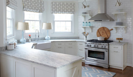
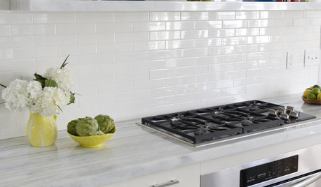
KITCHEN DESIGNHow to Keep Your White Kitchen White
Sure, white kitchens are beautiful — when they’re sparkling clean. Here’s how to keep them that way
Full Story
COLORDiscover White’s Surprising Power to Energize Every Room
Using white in different ways gives you limitless options for light, color and creativity
Full Story
DECORATING GUIDES10 Reasons to Embrace White Walls
Do they strike you as even more boring than watching white paint dry? Consider what makes them the darling of so many
Full Story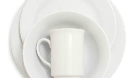
PRODUCT PICKSGuest Picks: Give Your Kitchen a Quick Facelift With White
Keep the sledgehammer in storage — update your kitchen's look with white and clear dinnerware and accessories instead
Full Story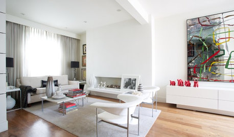
COLOR9 Decorating Ideas for White Living Rooms
These inspiring living rooms show how good an (almost) all-white room can look
Full Story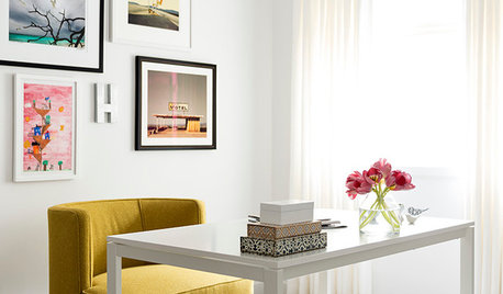
DECORATING GUIDESDesigner Secrets: 10 Pros Share Their Favorite White Paints
Decorating experts look to these hues when they want a go-to white they can count on
Full Story
COLORColor of the Year: Off-White Is On Trend for 2016
See why four paint brands have chosen a shade of white as their hot hue for the new year
Full Story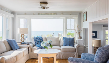
WHITEWhat to Know Before You Paint Your Walls White
A coat of white paint can do wonders in one room and wreak havoc in another. Here are tips for using the popular hue
Full Story


BeverlyFLADeziner