SHOP PRODUCTS
Houzz Logo Print
cristiec

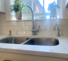
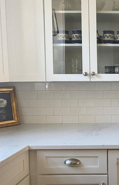
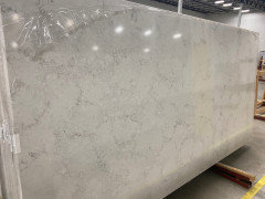
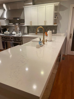
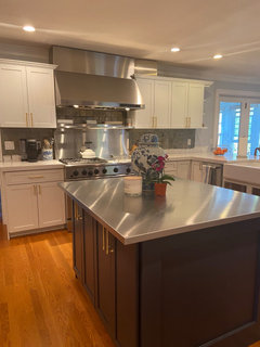
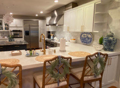
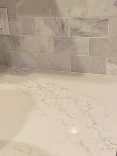
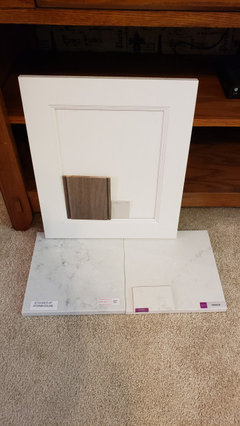
Hanstone Paros or Montauk Quartz?

cristiec
2 years ago

Has anyone seen a slab of Hanstone Paros? It was just released this year (2021) and I’m having a really hard time finding a place that has a slab. I’m renovating my kitchen and was 99% sure I was going with Montauk but then I saw a sample of the Paros and I’m having serious doubts. The Paros is a light grey with smaller more uniform veining whereas the Montauk is whiter with random waves of larger soft veining throughout. I’m painting my cabinets SW Pure white so both Quartz options would work. I’m so torn…and it’s driving me crazy not being able to see the Paros in a full (or even partial) slab. If anyone has seen the Paros slab I would love to hear your thoughts. Thank you!!!

Comments (58)

  • Laura Bowling
    2 years ago
    last modified: 2 years ago

    @cristiecI actaully have cabinet door samples in the color so that helps. It looks pretty good with the Montauk, I think. I am anxious to see yours installed and big! The sample of Montauk that I have doesn't have much color patterning in it...it's nearly all white so that makes it hard too! Can't find a better sample of Montauk to bring home and see in our kitchen lighting.

  • George
    2 years ago

    @Laura Bowling I think you will be fine. Montauk is definitely an off white (not quite gray more a taupe/cream off white) when it is placed next to a very white quartz. But it looks white when it is not next to anything that is a more true white.. My Montauk sample is the same with not much movement even though it has veins.

  • Laura Bowling
    2 years ago

    @Georgedo you have it installed already? If so, will you post pictures including one that is a pretty close up picture? I'd love to see it!

  • George
    2 years ago

    @Laura Bowling I apologize for the confusion. I didn't go with Montauk because I wanted a more white quartz to match Ben Moore Chantilly Lace painted cabinets. Although, I am still not convinced if Montauk would have looked better. :-)

  • cristiec
    Original Author
    2 years ago

    @george what Quartz counter did you choose? I’m already committed to Montauk but would love to know!

  • cristiec
    Original Author
    2 years ago

    Laura- my Montauk sample is the same…no veins. It really sounds like you’ve done all you can do to make sure counters complement your cabinet color. My final two Quartz favs were LG Karis (whiter base with cooler undertones) and Hanstone Montauk (off-white base with warmer undertones). In the end I had to force myself to make a choice so I wouldn’t go completely batty. You have two beautiful options. Go with the one you love!! I will post pics as soon as I can…and yes….I’m anxious to see them installed as well!

  • George
    2 years ago

    @cristiec I ended up using Ceaserstone Empira White. I had 10 year old yellow-ish shaker cabinets with a nice layout in a small , dark kitchen. In order to brighten up the kitchen I had the cabinets painted white, and added white subway tile. I didn't want the counter to clash with anything and I wanted to keep a classic look. In a perfect world I would have put in marble :-)

  • Laura Bowling
    2 years ago

    @George I'd love to see a photo if you'd like to share! The only thing ordered for us so far is the cabinets so I'm still tormenting myself over the counter and backsplash selection!


  • George
    2 years ago
    last modified: 2 years ago

    @Laura Bowling Sure! Although I need to caution that the camera just doesn't capture the veining and nuances even though in person you can see them. I have noticed that from afar , phone cameras don't seem to capture the veining when the slab is laid like a counter. I included an up close picture. I don't have much sun coming in so everything is a little muted and the counter looks a little more gray then in person.


  • Jackie Lutz
    2 years ago

    I just busted a place that has the slabs and the Paros caught my eye. I’m trying to decide between that, Monterey and Montauk with bright white cabinets. This is the photo I took of Paros.

  • Jackie Lutz
    2 years ago

    Visited not busted 😊

  • Laura Bowling
    2 years ago

    @Jackie Lutzthank you! Does the Paros have any fleks of sparkles in it? I can't tell from this photo. @GeorgeThank you for the photos! It looks GREAT!


  • cristiec
    Original Author
    2 years ago

    Thank you Jackie!!! The Paros looks gorgeous…but I think I still would have chosen Montauk in the end. Phew! I saw Paros online literally days after I told my DH I had finally made my decision to go with Montauk 😬….needless to say he wasn’t so enthused. 😂 Hanstone has such great patterns. Keep us posted on which one you pick!! Thanks so much for posting a pic!

  • cristiec
    Original Author
    2 years ago

    George, I love your kitchen. The cesearstone empire white goes beautifully with the cabinets and backsplash.

  • Jackie Lutz
    2 years ago

    No I didn’t notice any sparkle on Paros

  • Laura Bowling
    2 years ago

    @cristiec, I just went to see a slab of Paros after reading this thread I was curious, and it was too grey for my kitchen. I am still leaning toward Montauk. What sort of tile will you use with it?

    cristiec thanked Laura Bowling
  • cristiec
    Original Author
    2 years ago

    @Laura Bowling Honestly I am still in the process of choosing a backsplash. I like the look of Thassos marble tiles but they will need to be sealed and resealed (I think). I've also thought about continuing the Montauk up the walls as a backsplash but my DH isn't a fan of that idea. My fabricator said he could bring a leftover piece of Montauk for me to see if I like that look. What are you thinking in terms of backsplash?

  • cristiec
    Original Author
    2 years ago

    Montauk counters were installed yesterday! Omgee!! After all the stress and anxiety spent choosing a Quartz countertop I’m beyond thrilled with how they turned out. They are stunning & I’m smitten!! Now I have to figure out pendants and a backsplash. Any thoughts? Please excuse the mess and partially demo’d backsplash.

  • Rachel
    2 years ago
    last modified: 2 years ago

    The photos look so good . . . I think you made the right choice! I'm one of those people that tends to favor natural stone but I think Hanstone does a really good job with their patterns and of course Montauk is one of their most successful. I needed to go with a quieter counter in my master bath and I used Hanstone Metropolis and I'm very happy with it.


    Congratulation in reaching the final stages of your project.

    cristiec thanked Rachel
  • Laura Bowling
    2 years ago
    last modified: 2 years ago

    @cristiec It looks great! Thank you so much for posting photos! This is a huge help! My cabinets will be a slightly creamy white (SW White Flour) so thats my dilemna but I think Montauk works with both creamy whites and bright whites. Take a pic with your navy island for us too!

  • George
    2 years ago
    last modified: 2 years ago

    @cristiec It looks great! Keep things simple with the backsplash. A white subway tile that matches the counter or the cabinets will always look classic. I like what Maria Killam says about backsplashes if you look at her blog. One post here --> https://mariakillam.com/which-backsplash-tile-goes-with-granite/

  • cristiec
    Original Author
    2 years ago

    @Rachel Thank you!! It's so hard to know how everything will come out full scale when you piece it together using small samples. I really am happy with the way it turned out. I totally agree- Hanstone has some amazing options for Quartz. Thank you again for you kind words.

  • cristiec
    Original Author
    2 years ago

    @Laura Bowling Thank you! I wanted SW Pure White for my cabinets which is a soft neutral white because I didn't want a sterile white kitchen. When the painter matched the SW color to the paint he uses for the cabinets (don't know what brand) the color came out brighter than I wanted- closer to BM Chantilly Lace. Fast forward after a slight freak out...it all worked out in the end. The satin brass hardware and wood floors toned the bright white down so it has a that warmer feeling that I wanted. The Montauk counters have a VERY subtle light brown/tan vein within the larger gray veining so I think it will work really nicely with the SW White Flour!

  • cristiec
    Original Author
    2 years ago

    Still under construction….but here’s the BM Hale Navy island. I kept the stainless steel counter on the island just because it’s so dang practical aka indestructible. Gotta see how the quartz counters hold up before I decide whether to do same quartz counters on island too….

  • cristiec
    Original Author
    2 years ago

    Thank you George! You always have such great resources! I think you’re right…keeping it simple is the way to go.

  • Laura Bowling
    2 years ago

    @cristiec, once you pick your backsplash will you take a picture of the sample tile next to your Montauk and share? I am still deciding but leaning toward the Montauk!


  • Jacqueline Woodruff
    2 years ago

    @cristiec can you let me know what paint you used here on cabinets? Did I see SW Pure White? Thank you!

  • Jacqueline Woodruff
    2 years ago

    I have selected Montauk as well! Finding the right paint is so stressful though!

  • cristiec
    Original Author
    2 years ago

    @Jacqueline Woodruff I did choose SW Pure White...but when the painter matched the color to a different brand it came out closer to BM Oxford White & BM Chantilly Lace. I'll post more pictures once backsplash is in.

  • cristiec
    Original Author
    2 years ago

    @Molly H. Thank you! You have such a beautiful kitchen!! I LOVE it!! I JUST had the backsplash installed this week. I went with an oriental marble....I know...mixing marble with quartz...not everyone loves it. But i like how it brings a little dimension to the white cabinets and Montauk counters. I agree....so so hard to capture true colors with pictures. My pictures show more contrast than IRL as well. What color did you paint your walls? That's my next big decision to make...

  • cristiec
    Original Author
    2 years ago

    Pictures

  • Molly H.
    2 years ago

    @cristiec Lovely! Thanks for sharing, congratulations.


    Our kitchen walls are BM Horizon at 25%. It is a chameleon grey that depending on the time of day and light can have undertones of blue-green-brown. It is very similar to Grey Owl, but somehow softer and more interesting. We have TONS of natural light and an open concept main floor. Very tricky. We tried 50 samples and painted twice before landing on paint color that I loved. I have the BM fan deck memorized at this point. We have a big house, with exposures on all sides and went through so many whites and greys to get it all right. Sample large areas and look at it throughout the day. It is worth the extra time.


    We also have a blue island, btw, BM New York State of Mind, yours looks like Hale Navy if I had to guess. We live by the beach and style is transitional/coastal (lots of warm and neutral whites, soft greys and pops of blue. Furniture is mostly Serena and Lily).


    Montauk has veins of warm and cool, blues and browns - so you can go a lot of directions with paint. Your marble backsplash/stainless is cool, but hardware is warm. I can't see where the paint will go from the photo and if you have natural light. Happy to suggest a few paints to try if you tell me what you love.

  • cristiec
    Original Author
    2 years ago

    Thank you! And oh my…you’re good! Our island IS Hale Navy.

    I was aiming for an overall warmer feel and prefer that look but I feel like the navy island, stainless appliances and backsplash are pulling it in a cooler direction.

    Horizon is such a beautiful color. We have it on our front porch ceiling. It really is a chameleon.

    We get very limited natural light in our kitchen so paint colors are tricky. I’ve looked at BM classic gray but I’m afraid it will be too cool. The rest of our home is painted BM ballet white (another chameleon color) and it’s open concept so whatever I paint the kitchen will have to complement ballet white.

    I love Serena & Lily. I want to put 2 pendants over the peninsula and I’m leaning toward the S&L Goodman pendants.

    Thank you! This process is so overwhelming.

  • Molly H.
    2 years ago

    @cristiec Classic grey is definitely cooler than Ballet, which has a lot of yellow undertones in most light (sometimes it can go green or even orange). But it is a really nice warm beigey neutral.


    Is there separation between kitchen and living area walls? The trick will be finding a color that ties the cool marble and stainless with the warmth in your other surfaces.


    Collingwood immediately comes to mind. I'd also try Gray Owl if you want a little cooler but not as cool as Classic grey. Since you don't get a lot of light, I would suggest 25-50% of formula for either of those. It would still be plenty of contrast against white cabinets but won't suck light from the room. Silver Satin may work as well. Going with Chantilly Lace (or whatever you cabinets are) is an option to keep it clean and no fuss. There will still be some contrast due to different finishes (lacquer vs satin) and it will read slightly warmer with less shine. It will look layered and everything should blend.


  • Molly H.
    2 years ago

    @cristiec

    I forgot about Seapearl. A lot of fans out there. Didn't work for our space, but might in yours. Another flexible paint color, similar to classic gray but warmer.

  • Molly H.
    2 years ago

    @cristiec ^ ditto with Pale Oak

  • cristiec
    Original Author
    2 years ago

    @Molly H. Thank you! So many good suggestions.

    Yes, there is a division between the kitchen and rest of the house painted ballet so the wall color just needs to complement, not match.

    Thank you again. I'll be painting lots of samples on the wall this weekend.


  • Marie Milz
    2 years ago

    Pale oak with montauk is it good!

  • Bryan Johnson
    2 years ago
    last modified: 2 years ago

    @cristiec I love your kitchen!! I am planning on using Montauk quartz for my renovation. I have a question about your faucet and hardware. Is that a Moen faucet? Also, would you mind telling me the name and manufacturer of the satin brass hardware? I’m having trouble finding the right color and design and yours looks beautiful.

  • cristiec
    Original Author
    2 years ago

    Thank you Bryan! Our faucet is from kohler and cabinet pulls are from signature hardware. I believe they are the strasbourg pulls in satin brass. Montauk is such a lovely counter choice!! Please post pics when you’re done with your reno!!

  • Bryan Johnson
    2 years ago

    @cristiec Thanks so much for the information. I'll post pictures when we finish the renovation.


  • heleneo1974
    last year

    I am doing Montauk with glacier white cabinets. I really want a dolomite white subway tile, but not sure if this will work because it is bringing out the tan color in the Montauk. Do your Montauk counters lean tan or grey? I feel like the color changes depending on the lighting. Thoughts? Please share pics of backspash with Montauk!

  • skhinia
    last year

    Wow! So happy I found this feed! We are doing Dura Supreme painted oak cabinets in Dove on our perimeter. The island cabinets will be hickory stained in morel. Originally picked Corian Ashen Grey quartz but then found Hanstone Montauk at a huge stone fabricator. Now I'm conflicted because the Montauk will be $3200 more! Yikes! Went back to my designer today and got the samples. Sitting here looking at all my samples, I'm stuck on the Montauk. I'm doing a matte black faucet and hardware. and a white Kohler cadt iron sink.

  • skhinia
    last year

    Open to opinions and suggestions! Our backsplash will be Zellige Pearl White from Floor and Decor, laid in a herringbone pattern. Here are some pics:

  • skhinia
    last year

    In the 2nd pic, the little sink sample is the color Dune but I've decided to do white instead.

  • cristiec
    Original Author
    last year

    @skhinia it looks like you have 2 solid options! So hard...I know! I can only speak to the Montauk counters as those are the ones I have. They really are incredible and clean up like a dream! The Corian Ashen Grey is on the cooler side which will give you more contrast whereas the Montauk can either pull cooler or warmer depending on what finishes and accessories you choose.

  • Laura Meushaw
    last year

    Has anyone used Paros and could upload a photo of their kitchen counter? Love both Montauk and Paros!

  • Andre Segura
    last year

    reviving this thread to see if anyone with Hanstone montauk quartz has any extra to sell? Trying to avoid buying a second slab.

  • heleneo1974
    last year

    @skhinia - do you happen to have pictures of your backsplash with your counter? I have Montauk by Hanstone and I am doing white Zellige tiles. I would love to see your kitchen for inspiration! Thank you!!