


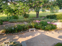
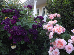
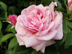
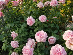
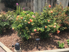
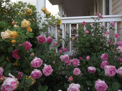
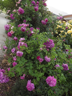
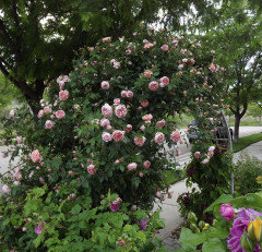
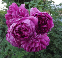
How restrained is your color palette?
Markay MD-Zone 7A (8A on new map)
2 years ago
Featured Answer
Sort by:Oldest
Comments (58)

Nola z5aWI
2 years agolast modified: 2 years ago
Markay MD-Zone 7A (8A on new map)
2 years agoRelated Discussions
SW Restrained Gold? Mannered Gold? Suggestions?
Comments (13)Thanks teacats, I'll go check out the Ivoire tomorrow. I have a black framed pic planned for the foyer - but lots of golds/fall colors in it. Trim is pure white, fixtures are silver metal. For now I used the Restrained, but after all the rooms are done I want to explore some other ideas - lighter colors, especially since I think I'll paint the ceiling, too....See MoreHow do you apply a Design Seed palette to a room?
Comments (108)I would think it would be very hard to balance color equally in a room. Just naturally each room has different areas of different sizes that will break up a color scheme into component parts. A pillow is smaller than a sofa which is smaller than a wall. Each item also has a different visual plane...we see the tops of tables, but the sides of chairs. Purposely select a main color, a secondary color and then an accent color to use in the room. Main color can be floors or walls, secondary can be furnishings and drapes, accent can be lamps, art, pillows. This is not strict, but as a first step to help you think purposely about where and how to use color in a room. You can practice yourself by, for example, looking at the design seeds up thread where I posted the kitchen that could use more color...what color would you add, and where would you put it? Or up thread is a gray and pink color scheme where I posted the walls only. Think about how you would finish that room...how and where would you use more color and in what shades? Would you add an accent color? If so, what color and on what items. Another exercise would be to look at a room where you like the main color but dislike the accent color. What color would you select, then look at all the things you'd have to change in the room to eliminate the bad and replace it with the good. That will give you a sense of how that decorator used the color. Also, a lot of the rooms that I coordinate with the design seeds don't have all the colors or aren't in exactly the right shades. Think about swapping out some colors in the room with others in the seed palette...what would you have to change in the room to accomplish that? It's really just a matter of turning your attention to the issue and training your eye to see the detail. Also Stacy & Clinton's outfit advice applies to a room as well. You need color, pattern, texture and shine....See MoreOK, PICS of Restrained Gold and Latte....not very happy!
Comments (54)Les - Thank you for the encouragement in your previous post. I really have been beating myself up about this, mainly b/c I'm such a perfectionist and it kills me that I made such a big, costly mistake. But you're right, at least I am doing something and in the end it will look great. Polkadots - Yes the banisters were a LOT of work. It took 3 guys an entire day just to do the banisters. First they taped off everything around them very carefully, then they stripped them, then sanded them, then stained them, then sealed them, then put a veneer on. It was a ton of work! But I absolutely love the result and I'm glad we did it. It had bugged me, the light oak color that they were before, ever since we moved in a few months ago (this was a spec home so we didn't get to pick them). I appreciate the pp's cautions about the art niche. I do agree that it will be limiting in what kind of artwork we can put there, but I think we plan to put a large iron scrollwork of some sort there, so the color won't matter and will set off the iron that much more. Also, we are just doing the back wall of the niche in red, not pulling it onto the sides of the niche, so it won't be as overpowering. At least I hope so. OK everyone...so now I'm wondering - do y'all think that pulling the Latte through to the LR will make everything too dark? Also, do you feel that Latte is too dark for the entryway or is it OK? I am thinking that having everything one color, since the floor plan is SO open, would make things flow better and look bigger. At least that's what I hear on all the design shows LOL. So we were just going to do Latte throughout, but now I am questioning whether I should pull the Latte through or do a lighter coordinating color, Nomadic Desert or Kilim Beige, in the LR... Is the Latte too dark for my big open LR?...See MoreHow to start color palette in a space with wood and brick elements?
Comments (3)Everything you mention is very neutral, so you can select any color palette you like. What room is this? Is there anything you need to keep--upholstery, rugs, curtains? Maybe post some photos or ideas so you can get some useful opinions....See Morehugogurll
2 years agoMarkay MD-Zone 7A (8A on new map)
2 years agobart bart
2 years ago
Kristine LeGault 8a pnw
2 years ago
joeywyomingzone4
2 years agoerasmus_gw
2 years agobart bart
2 years ago
Mischievous Magpie (CO 5b)
2 years agoNola z5aWI
2 years agoerasmus_gw
2 years ago
mmmm12COzone5
2 years agolast modified: 2 years agoKristine LeGault 8a pnw
2 years ago
strawchicago z5
2 years agonoseometer...(7A, SZ10, Albuquerque)
2 years agolast modified: 2 years agoMarkay MD-Zone 7A (8A on new map)
2 years agoMarkay MD-Zone 7A (8A on new map)
2 years agostrawchicago z5
2 years agoerasmus_gw
2 years agoNola z5aWI
2 years agostrawchicago z5
2 years agolast modified: 2 years agoNola z5aWI
2 years ago
Diane Brakefield
2 years agoDiane Brakefield
2 years agoDiane Brakefield
2 years agoKristine LeGault 8a pnw
2 years agoMarkay MD-Zone 7A (8A on new map)
2 years agolast modified: 2 years agoNola z5aWI
2 years agoDiane Brakefield
2 years agoMarkay MD-Zone 7A (8A on new map)
2 years agommmm12COzone5
2 years agoKristine LeGault 8a pnw
2 years agolast modified: 2 years agoDiane Brakefield
2 years agoDiane Brakefield
2 years agoDiane Brakefield
2 years agobart bart
2 years agoNola z5aWI
2 years agoDiane Brakefield
2 years ago
oursteelers 8B PNW
2 years agoDiane Brakefield
2 years agoDiane Brakefield
2 years agoDiane Brakefield
2 years agoDiane Brakefield
2 years agoflowersaremusic z5 Eastern WA
2 years agolast modified: 2 years agooursteelers 8B PNW
2 years ago


Related Stories
CURB APPEAL5 Bright Palettes for Front Doors
Splash bold green, blue, orange or red on your front door, then balance it with a more restrained hue on the rest of the house
Full Story
HOUZZ TOURSHouzz Tour: Nature Suggests a Toronto Home’s Palette
Birch forests and rocks inspire the colors and materials of a Canadian designer’s townhouse space
Full Story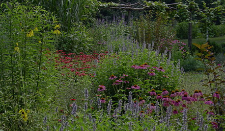
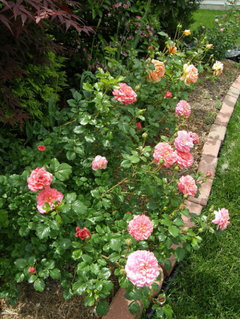
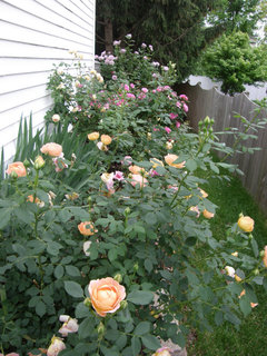
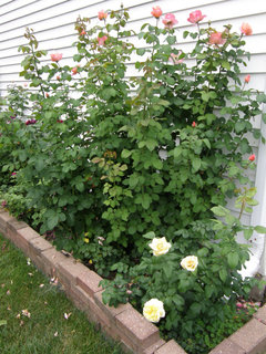
GARDENING AND LANDSCAPINGFocus Your Garden Palette
Restrict your garden's color scheme to create maximum impact in landscape beds and borders
Full Story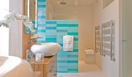
DECORATING GUIDESPalatable Palettes: 9 Bold Bathroom Color Schemes
Give your bathroom or powder room a bright new look with beautiful colors that energize the space and please the eye
Full Story
BOLD COLORPoppin' Color Palettes Reminiscent of Bubblicious Gum
13 Rooms Take Color Cues from Bubble Gum Flavors
Full Story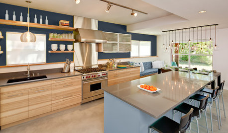
MOST POPULARChoosing Color: See How 3 Bold Palettes Change 1 Kitchen
Designed to be flexible when it comes to color, this kitchen easily handles different color schemes
Full Story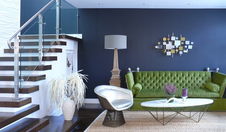
DECORATING GUIDESCool Color Palettes: Enviable Green and Blue Spaces
Freshen up tired interiors with dewy to inky hues that harmonize even as they help each other stand out
Full Story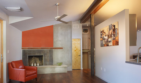
ORANGE7 Spicy Hot Color Palettes to Fire Up a Living Room
Hues on the fiery end of the spectrum can add spark and intensity to living room walls, furniture and accent pieces
Full Story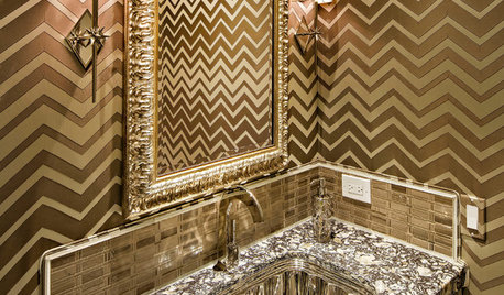
BATHROOM COLORPowder Room Palettes: 10 Glorious Golds
See how paint, tile and wallpaper in shades of radiant gold bring the bling to these powder rooms
Full Story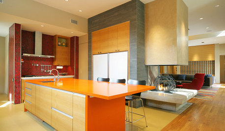
KITCHEN DESIGNPalatable Palettes: 8 Great Kitchen Color Schemes
Warm and appetizing or cool and relaxing? These 8 paint palettes can help you choose the best colors for your kitchen
Full Story


Markay MD-Zone 7A (8A on new map)Original Author