
7 Spicy Hot Color Palettes to Fire Up a Living Room
Hues on the fiery end of the spectrum can add spark and intensity to living room walls, furniture and accent pieces

Consider cranking up the heat in your living or family room by painting your walls in spicy shades of red, yellow or orange. Keep in mind that pure, high-intensity versions of these hues can feel overwhelming — especially in a small space that gets little to no natural light. If you have a small living room or lack ample windows, try keeping the majority of the space white or bathed in a light neutral, then turn up the volume by adding splashes of a more vibrant color.
If you are flirting with the idea of painting your walls a bold color, consider painting one accent wall or a section of one wall. You'll get a nice dose of color that feels fun instead of stress inducing. Another option is to use toned-down versions of your favorite warm hue. This doesn't have to mean pink for red or pastel peach for orange — instead find a lighter shade that has some gray or taupe in it. It will look sophisticated and still give you a touch of the color you crave.
These seven living rooms feature warm to hot hues, followed by color and material palettes inspired by each design.
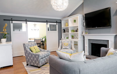
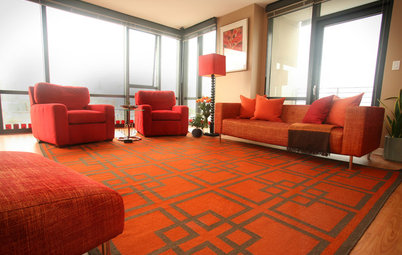
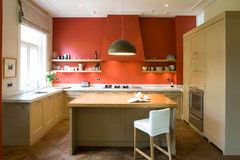
Color is used well here to emphasize the interesting architecture. Small bits of eye-popping orange and red look great against the white walls and ceiling, the rich wood floor and the shades of gray on the fireplace wall. This is a very cheerful, modern palette.
Example palette: Clockwise from top left (all from Behr): Dragon Fire S-G-240, Gentle Rain 790E-2, Wild Sage 700F-5 and Fire Island 190B-7.
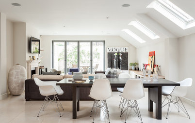
You can get away with pretty much any color in a space with tall ceilings and this much natural light. One downside to a wall of windows, though, is a lack of wall space on which to hang art. Color is an easy fix — paint a small section of a wall a dramatic color.
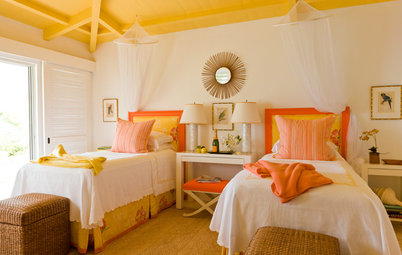
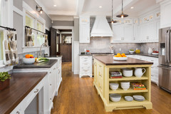
Proceed with caution when using bright primary colors. Overdo them and your space will resemble your child's favorite fast-food joint. This living room features bold red and yellow hues the right way. The majority of the room is clad in wood tones and white, so the red and yellow offer nice pops of color.
Proceed with caution when using bright primary colors. Overdo them and your space will resemble your child's favorite fast-food joint. This living room features bold red and yellow hues the right way. The majority of the room is clad in wood tones and white, so the red and yellow offer nice pops of color.
Example palette: Clockwise from top left (all from Mythic Paint): Yellow Sass 093-5, Fading Frost 132-2 and Sunburst Nose 114-6 would work nicely with a white oak floor.
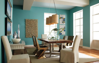
Here's another fantastic wall of windows but with dark, almost black wood floors and a mixture of gray and white hues as the predominant colors. This living room is the epitome of cool, clean and modern. The small bits of red give just the right amount of pep and life.
Example palette: Clockwise from top left (all from Valspar): Rising Tide 4008-3A, Coastal Dusk 5002-2B and Porcelain Red WV37015, with a deep, dark ebony stained wood floor.
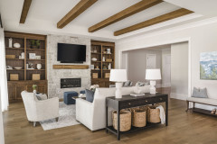
Open-concept floor plans will be around for some time, but one complaint people have about them is that it's a challenge integrating the different spaces that serve different functions. One strategy to get a cohesive look is to pick a neutral background palette — say, shades of tan or gray — and then punctuate here and there with one or two more vibrant hues. The copper on the lights and the happy yellow pillows and accessories make this space eye catching but fairly restrained colorwise.
Example palette: Clockwise from top left (all from Dunn Edwards): Lace Veil DE6372, Fallen Rock DE6389 and Fuzzy Duckling DE5936 look fantastic with a dramatic dark gray-black concrete floor.
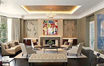
If you opt to paint entire walls in dark or bold colors, be sure to balance out the strong hues with light and neutral accents. The gray, sage and beige furniture and accessories don't try to compete with the peppery wall color here. It's a beautiful living room with bold color that feels warm, comfortable and inviting.
Example palette: Clockwise from top left (all from Benjamin Moore): Ionic Column 1016, Graystone 1475 and Habanero Pepper 1306 would be striking against a strand-woven bamboo floor in a honey stain.
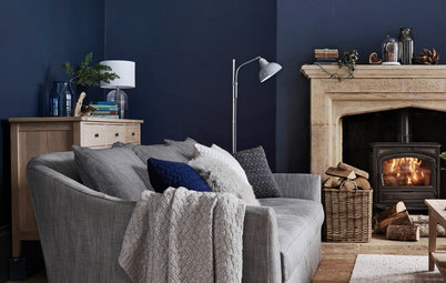
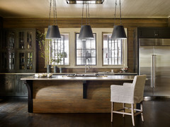
With fall approaching, you may find yourself drawn to richer, deeper colors. I am currently loving the look of darker floors, such as the handsome wood floors in this colorful contemporary space.
Dark floors tend to suck a lot of light, though, so they work best in spaces that are well lit and open — like this loft. The small punches of yellow are offset nicely with the tan and taupe shades of the furniture, the rug and the wall tile.
Dark floors tend to suck a lot of light, though, so they work best in spaces that are well lit and open — like this loft. The small punches of yellow are offset nicely with the tan and taupe shades of the furniture, the rug and the wall tile.
Example palette: Clockwise from top left (all from Martha Stewart Living): Whetstone Gray MSL258, Fledgling MSL198 and Egg Yolk MSL064 would be slick paired with a black floor.
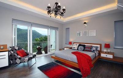
This living room is calm and quiet colorwise. I like the soothing quality created from using multiple shades of one color. Here we have light and dark browns and taupes mixed with some small hits of rich red-orange hues. You could easily pump up the color by using one of the bolder hues for an accent wall or painted furniture.
Example palette: Clockwise from top left (all from Sherwin-Williams): Nacre SW6154, Chrysanthemum SW6347, Flower Pot SW6334 and Silver Gray SW0049.