


Palatable Palettes: 9 Bold Bathroom Color Schemes
Give your bathroom or powder room a bright new look with beautiful colors that energize the space and please the eye

Looking to inject some fun color in your home but feeling anxious about taking it too far? I say be fearless when it comes to spicing up the spaces in your home that are used only occasionally or for limited amounts of time. For example, a tangerine-orange bedroom might not be optimal for a midafternoon nap or a relaxing read before bedtime, but that same color in your powder room will provide a boost to an oft-overlooked part of your house. Of course if you are a fan of long, relaxing baths, you might want to stay away from a few of the more bright, exuberant palettes shown here, but you can still use color in an interesting way to enhance your bathroom.
Here is a small sample of the many bold and beautiful bathrooms that can be found on Houzz, along with examples of color and material palettes that take inspiration from each fabulous bathroom.
Here is a small sample of the many bold and beautiful bathrooms that can be found on Houzz, along with examples of color and material palettes that take inspiration from each fabulous bathroom.
Example palette: Use several different shades of soft blues and greens to give your bathroom the look and feel of a spa. Clockwise from top left (all from Benjamin Moore): Caribbean Cool, Crystal Springs and Paradise View, with zebra wood.
Small Bursts of Big Colors
A good tip to keep in mind when selecting colors and materials for your home is to limit bold colors to things that can be changed quickly, easily and inexpensively — usually via paint and accessories. This cheery children's bathroom has a very neutral foundation: the flooring, vanity, vanity countertop and shower tile are all materials that would be expensive to change out with each new color trend, but the paint on the exposed ductwork, towels and various accessories can be tweaked regularly without breaking the bank.
A good tip to keep in mind when selecting colors and materials for your home is to limit bold colors to things that can be changed quickly, easily and inexpensively — usually via paint and accessories. This cheery children's bathroom has a very neutral foundation: the flooring, vanity, vanity countertop and shower tile are all materials that would be expensive to change out with each new color trend, but the paint on the exposed ductwork, towels and various accessories can be tweaked regularly without breaking the bank.
Example palette: Saturated oranges and bright turquoises are popular colors right now; use them sparingly for a nice unexpected burst of color. Clockwise from top left (all from Valspar): Trolley, La Fonda Fiesta Blue and Relaxed Navy, with vertical-grain carbonized bamboo.
Pick Two
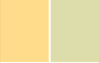
For those who are not fully onboard with a bright and bold-colored bathroom, here's an example of a colorful yet more restrained palette. Placing two very deep, vibrant colors — teal green and golden yellow — against a backdrop of soft white gives the space a cozy and inviting feel.
For those who are not fully onboard with a bright and bold-colored bathroom, here's an example of a colorful yet more restrained palette. Placing two very deep, vibrant colors — teal green and golden yellow — against a backdrop of soft white gives the space a cozy and inviting feel.
Example palette: By limiting the palette to just two colors (plus a neutral) your bathroom will have a nice dash of color without being too jarring. Two different palette options featuring golden yellow and deep teal, clockwise from top left: Sunbeam and Teal Lake, both from Glidden, and Shell Creek and Yellow Sass, both from Mythic Paint.
The Perfect Shade of Red
Sometimes you have to break your own rules. While this bathroom features bold color in a way that is not so easy to change out, I think it is an excellent example of another great piece of advice: Pick one thing and make it the star of the show. In this case the gorgeous, rich, deep red tile is set off beautifully in an otherwise white, minimalist-style bathroom.
Sometimes you have to break your own rules. While this bathroom features bold color in a way that is not so easy to change out, I think it is an excellent example of another great piece of advice: Pick one thing and make it the star of the show. In this case the gorgeous, rich, deep red tile is set off beautifully in an otherwise white, minimalist-style bathroom.
Example palette: The red tile here is gorgeous, but if you are looking for a more affordable or easy-to-change option, you could paint a red accent wall in your bathroom. Some lush reds to consider, clockwise from top left: My Valentine from Benjamin Moore, Rectory Red from Farrow & Ball, High Drama from Behr and Heartthrob from Sherwin-Williams.
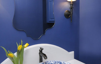
Elegant in Blue
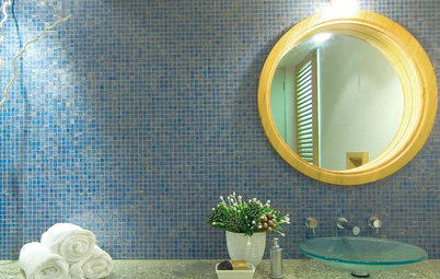
For the bathers out there, here's a way to do a colorful bathroom that is also soothing and relaxing. It helps to have such a large, luxurious tub, of course, but you can turn any bathroom into a sanctuary by using tonal blues (blues that have some gray mixed in, making them less bright and more subdued) along with white or other light neutrals.
For the bathers out there, here's a way to do a colorful bathroom that is also soothing and relaxing. It helps to have such a large, luxurious tub, of course, but you can turn any bathroom into a sanctuary by using tonal blues (blues that have some gray mixed in, making them less bright and more subdued) along with white or other light neutrals.
Example palette: Select tones of your favorite hue to create an elegant and sophisticated bathroom. Clockwise from top left (all from Sherwin-Williams): Cloudburst, Raindrop and Great Falls, with a soft white floor tile such as this Veranda porcelain tile in Pearl from Dal Tile.
A Shower Worth Waking For
As a self-proclaimed nonmorning person, I have to say that even I would happily jump out of bed in the morning to get into this shower. Such an exhilarating shade of lemon-lime is definitely a wake-me-up color if there ever was one. I like that the rest of the bathroom walls are kept light and the flooring is neutral, making the large walk-in shower the highlight.
As a self-proclaimed nonmorning person, I have to say that even I would happily jump out of bed in the morning to get into this shower. Such an exhilarating shade of lemon-lime is definitely a wake-me-up color if there ever was one. I like that the rest of the bathroom walls are kept light and the flooring is neutral, making the large walk-in shower the highlight.
Example palette: Dark neutrals help ground a large swath of a more vibrant hue. Clockwise from top left: Citron from Behr would be set off nicely by a charcoal gray floor tile and ipe floorboards in the shower.
Subtly Bold
Don't overlook the color of the wood cabinetry in your bathroom. The deep, rich walnut color of this vanity grounds the space and contrasts nicely with the soft gray and blue colors of the vanity mirror and the tile backsplash wall. This is another elegant bathroom that's perfect for a long, relaxing bath.
Don't overlook the color of the wood cabinetry in your bathroom. The deep, rich walnut color of this vanity grounds the space and contrasts nicely with the soft gray and blue colors of the vanity mirror and the tile backsplash wall. This is another elegant bathroom that's perfect for a long, relaxing bath.
Example palette: Light blues and grays with dark woods give a very upscale, modern look. Clockwise from top left (all from Mythic Paint): All's Quiet, Bedford Blues and Shiny Nickel, with walnut-stained oak.
Fun Floor
Another often-overlooked opportunity for injecting color in a room is via the floor. In this delightful bathroom the majority of the elements are clean and white, but the vibrant mango and mandarin-orange floor and the orange-yellow accent wall add warmth and character.
Another often-overlooked opportunity for injecting color in a room is via the floor. In this delightful bathroom the majority of the elements are clean and white, but the vibrant mango and mandarin-orange floor and the orange-yellow accent wall add warmth and character.
Gorgeous, Colorful Tile
Anyone who has browsed tile options lately knows there is a seemingly endless number of colors, styles and materials to choose from. It can be overwhelming trying to pick something that works with all of your other selections. I often advise frustrated clients to take a step back and pick the one single material they absolutely love. Start with that one material as your building block and pick the remaining materials and colors to support it. This exquisite tile can stand on its own in a room. The rich wood and neutral flooring and wall color allow it to take center stage.
Anyone who has browsed tile options lately knows there is a seemingly endless number of colors, styles and materials to choose from. It can be overwhelming trying to pick something that works with all of your other selections. I often advise frustrated clients to take a step back and pick the one single material they absolutely love. Start with that one material as your building block and pick the remaining materials and colors to support it. This exquisite tile can stand on its own in a room. The rich wood and neutral flooring and wall color allow it to take center stage.
Example palette: If you are leaning toward a tile or a wallpaper that has a busier pattern but are concerned that it will be overwhelming, try selecting one that is available in analogous colors. Analogous colors are colors that are adjacent to each other on the color wheel, such as warm shades of reds and oranges, or cool shades of blues and greens.
This tile in harmonious shades of blues and greens is simply stunning. Similar colors, all from Farrow & Ball, are shown in this example palette. Clockwise from top left: Blue Ground, Stone Blue and Folly Green, with walnut.
More: 8 Great Kitchen Color Schemes
This tile in harmonious shades of blues and greens is simply stunning. Similar colors, all from Farrow & Ball, are shown in this example palette. Clockwise from top left: Blue Ground, Stone Blue and Folly Green, with walnut.
More: 8 Great Kitchen Color Schemes

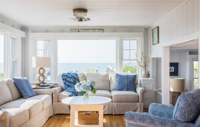


Who doesn't enjoy relaxing by the water, preferably with a cool drink in hand? Inject that vacation vibe into your bathroom by using colors inspired by the sea. This tranquil, spa-like bathroom with its palette of sand and sea would provide relief after even the most stressful day.