


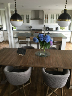
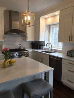
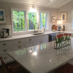
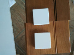
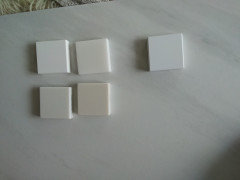
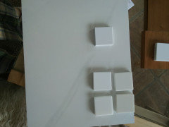
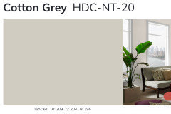
Follow my heart or follow my designer?
bondia
3 years ago
Featured Answer
Sort by:Oldest
Comments (99)
Related Discussions
I went to my 'follow up' and it was cancer :o(
Comments (32)Lucinda, you have misunderstood what Nicki is saying. The doctor said that there were "pre-cancerous" cells there and they needed removed. So she had the procedure done and the cells were removed. Once they were removed, the doctor discovered that the cells had already turned into full blown cancer. I am so so sorry that you have had to go through this. :( PLEASE make sure that you keep up on your follow up checks. I know its easy to cancel them and wait a bit too long to reschedule, after all, its surely not the funnest thing in the world to do. Seeing this post ripped my heart out. Even though things are bad right now, I seriously can't imagine this world without you in it. I really do love you, even if it doesn't seem like I do. (((((((((((((((HUGS)))))))))))))))...See MoreDo I listen to everyone else....or follow my heart?
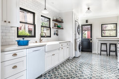
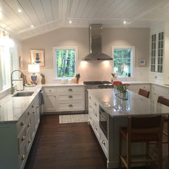
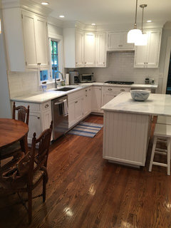
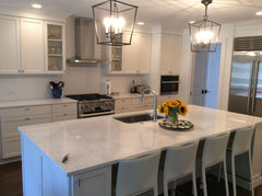
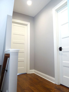
Comments (43)That's such a hard question to answer. Of course, you are the person who will use the kitchen most and you are the person who has the vision. But you want your family to enjoy it too. You just have to balance that out in your own mind. ....which, of course, is not an answer. Maddening, I know. Are they understanding your vision and rejecting it? Or are they not seeing it in their mind's eye and rejecting what they think it will be? Have you shown them the pictures that sold you on the idea? I had one of those esoteric visions in my head for my kitchen. It's small and narrow and I wanted two different colors -- one on one side and one on the other. And I wanted a different color for the breakfast area and pantry. Every single person to whom I described it said, "Isn't 3 colors too much?". Without exception. The cabinet maker had to do 5 sets of drawings to get it all right and then still was only willing to do one color and door option at a time. My GC confessed to me when it was all over that he thought I was nuts and creating a disaster until he saw it come together. Now that it's done, everyone really likes it. My family is crazy about it. They just couldn't see it when I described it. OTOH, even though my husband was supportive all along and said it was my choice, if it hadn't worked, I would have been miserable knowing I was the only one who wanted it that way. Take pictures of your layout and use tracing paper to draw your modifications. Go get several large-size copies made. Color them in so everyone has a clear idea what you're talking about, what they want, what compromises are possible. It just comes down to the painful process of decisions and consequence. The more concrete you can make abstract ideas now, the more the consequences will be wonderful and comfortable for all. Good luck!...See MoreThis foul smell in my house followed me from my apartment.
Comments (7)We're not going to be much help with a generic 'foul smell'. It could be a lot of things. If you think it's your sofa, consider this for a test: get some cheap plastic paint drop cloths and wrap the whole sofa in its own bubble. Seal it with tape. Leave it for a couple days then open it an stick your head in. If it stinks to high heaven, that's your answer. There are some funky foam, rubber and plastic products coming out of Asia. Just yesterday I used a piece of scientific instrumentation in a plastic road case (like a suitcase) with form fitting dark gray foam inside. It smells like coal tar (or asphalt driveway sealer). Ever been in a Harbor Freight Tools store? Same thing. Good luck and report back....See MoreFramers didn't follow the plan for my staircase
Comments (85)"No, they have to build to code. When it comes to stairs, approved drawings are more like suggestions." Well, they should be accurate, but I really do not see many architect drawn plans that are. Case in point, ILoveRed's plan is only accurate on the 2nd floor plan. Appearantly, you are allowed to loose a tread for each lower level you draw. It also bugs me that they tend to spec stairs at code minimums. I have never drawn plans with less than a 10.5 inch tread run, 10.75 or 11 when convenient. I am also almost always able to stay under a 7" rise because I simply figure out how much room is necessary before I draw the rest of the house. If I were actually involved with this plan as a GC, I would have made sure the plan was corrected to a max 7" rise, and min 10.5 run before it was finalized. If I was not involved until after the plans were approved, I would have drawn out a few alternatives before construction started to explain what can be done at that point to fix the steep stairs, and most of them would have proper winders that feel good, not that 45° corner nonsense....See More
bondia
3 years agoeverdebz
3 years agolast modified: 3 years agoeverdebz
3 years agobondia
3 years agobondia
3 years agobondia
3 years agobondia
3 years agobondia
3 years ago
Tina
3 years agobondia
3 years agobondia
3 years agobondia
3 years agobondia
3 years ago


Related Stories

MOST POPULARCustom Closets: 7 Design Rules to Follow
Have room for a walk-in closet? Lucky you. Here’s how you and your designer can make it the storage area of your dreams
Full Story
HOUZZ PRODUCT NEWSHow Houzz Pro Helps Designers Follow Up With Project Leads
Effectively track, manage and communicate with potential clients to keep your pipeline active and land more projects
Full Story0
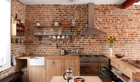
INDUSTRIAL STYLEFollow This Recipe for an Industrial-Style Kitchen
Durable materials and fixtures favored by chefs combine for a hardworking space full of aesthetic appeal
Full Story
LANDSCAPE DESIGNFollow Nature’s Lead for Artful Stacked Stones
Surprise and delight in the landscape with rock formations resembling wildland hoodoos and cairns
Full StoryHOUZZ PRODUCT NEWSVideo: Follow Up Effectively With Project Leads Using Houzz Pro
See how to track and communicate with potential design clients to keep your pipeline active and land more work
Full Story0

HOUZZ PRODUCT NEWS5 Strategies for Effective Follow-Up Emails to Clients and Leads
Design professionals share advice on how to follow up with clients through email
Full Story
APARTMENTSHouzz Tour: Apartment Follows the Architects’ Plans to the Letter
Thrilled with the pros’ drawings, this Moscow couple makes every detail a reality, right down to the lion sculpture
Full Story
HOUZZ TOURSHouzz Tour: Retirees Follow Vineyard Dreams With a Hillside Farmhouse
Being closer to family and growing grapes for wine drove this 5-bedroom new build in the Virginia countryside
Full Story
PRODUCT PICKSGuest Picks: Follow a Modern Farmhouse Path
These clean-lined furniture pieces and accessories in natural materials will put your home on the road to country chic
Full Story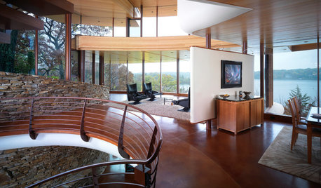
ARCHITECTUREFeel-Good Home: Curves Follow Nature’s Lead
See what happens when you leave straight lines behind
Full Story

Jennifer Hogan