


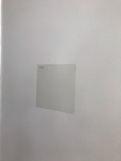
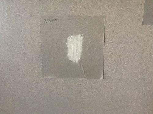
Samplize samples differ from painted walls
3 years ago
Featured Answer
Sort by:Oldest
Comments (12)
 3 years ago
 3 years ago
Related Discussions
Wall painted an accent color different from other walls in kitche
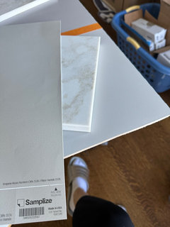
Comments (4)Sounds lovely. I don't think it's unusual to do different wall colors in the same room anymore. Especially with open floor plans where morning or familyrooms join or share a kitchen wall. I had to do the same in my kitchen and actually love the contrast. Good luck with your build. I'm going to have to look up Rosewood granite. I don't believe I've seen it before. Sounds beautiful....See MoreHave you used Samplize paint samples?
Comments (5)I used them and repositioned a couple times, which worked great as long as I had properly cleaned the wall beforehand. Then I impulsively moved them to a wall that I hadn’t cleaned, and they fell off after a day or so. But they were so much more convenient than buying actual paint (especially for Benjamin Moore—where you have to get such huge quantities!). I would absolutely use them again....See MoreSamplize vs paint samples vs chips
Comments (9)You are not losing your mind. The paint companies create the samples and fan decks as printed materials, not from real paint. They are not 100% accurate and simply can't be 100% accurate. Painted samples also vary slightly from one another. The cans are mixed one can at a time by a different machine in every store. Those machines may be more or less accurate then the next machine, may be new or old, may have been calibrated recently or may not have been calibrated for months. On top of that paint colors change slightly as they dry. The faster paint dries the lighter it gets, so spraying paint will give you a lighter color than rolling paint and color will dry lighter when it is hot and dry then when it is cool and humid. Don't expect perfection. It will drive you crazy, and the small amount of change is only noticeable when you are looking at two samples right beside each other. You are not going to have these different whites painted in stripes on your wall, so you won't see any of these small nuances. Quite frankly, most people won't be able to tell what white you have painted on your walls and it will only look bad if it doesn't work with other whites and neutrals that you already have in your home. Chantilly Lace can be beautiful with grays or can look cold and stark with warmer tones. Oxford White has been the 'go to' white for decades. It works with most other colors, but will look dirty/dingy next to a bright white. Dove White is the newer 'go to' white, but same as Oxford White it can feel somewhat dingy in some homes, depending on how clean and bright their other colors are. SW Pure White is a very neutral white which does lean gray. It isn't you, it is the color. It is beautiful with blue and violet grays, but is often too gray with warmer tones. Simply White looks yellow when compared to these other whites or when painted next to pastel blue or violet grays, but with most green grays, greige, beige neutrals it is generally clean and warm. If you have cleaner pastel yellows it can sometime look a bit green. With each of these whites you will find 100 people who love the color on their walls and another 50 who have a problem with the color. Too gray, too yellow, flashes green, looks blue, too stark, not bright enough . . . My very favorite white is available through Benjamin Moore. They have a formula in their computer for Devine Color Icing (V0101W). It is similar to Simply White in LRV, but it is cleaner and has a slightly orange or peach undertone. Won't ever scream peach or yellow and because there is no gray or black in the formula you will never find it turning green.. The only time I don't care for Icing is when someone is using it with dark, muddy colors. It is too white, and too high contrast when paired with dark neutrals or when a home simply does not have enough natural daylight to pull off white well. Instead of looking at your samples next to each other or next to your wall, look at them next to the things that will be staying in your home. The flooring, cabinets, countertops, furniture. Have someone else set the samples down, one at a time and you choose one over the next - kind of like when you go to the eye doctor and they ask you which is clearer 1 or 2). This will give you a much clearer understanding of what you like and don't like with your belongings instead of which you like compared to something that won't be there once you paint. Please keep in mind that the white walls you see in magazines and many of the pictures on the internet are taken with high intensity lighting or have been photoshopped with a filter to make them look lighter, brighter, better. In our homes white can be a lot trickier. If you don't have a lot of natural daylight any white can go gray and dingy. Corners and shadowed spaces go gray. Sometimes a light neutral is better than a white and sometimes we need more color to combat low light levels. This room would be better if it were painted a light or mid toned neutral. Just not enough light to make the white look wonderful. Examples of spaces where they mixed warm and cool whites and got not so great results. Both whites may be beautiful in the right setting, but don't work with the other whites they were paired with. Hope this helped some....See MoreTrying out the Samplize!
Comments (2)@fori they've been very helpful. I've changed my mind about a green that I liked as a chip, but not as much in Samplize. I compared the chip to the Samplize and color match is great but I know the pots are slightly different and then there's the real deal. $6 each, even with the eighth one free, is steep but has been helpful nonetheless. I have a paint perks discount but I don't do my own painting; I pass that on to the contractor....See More 3 years ago
- 3 years ago
 PRO3 years ago
 3 years ago
 3 years ago
- 3 years agolast modified: 3 years ago
- PRO3 years ago
- 10 months ago
 10 months ago
Related Stories
DECORATING GUIDESFrom the Pros: How to Paint Interior Walls
A slapdash approach can lower a room's entire look, so open your eyes to this wise advice before you open a single paint can
Full Story
COLORPaint-Picking Help and Secrets From a Color Expert
Advice for wall and trim colors, what to always do before committing and the one paint feature you should completely ignore
Full Story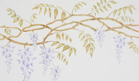
DIY PROJECTSDIY: How to Paint a Wall Stencil
Getting the Stencil Right: Planning, Prep and a Light Hand with the Brush
Full Story
PAINTINGHow to Get a Half-Painted Wall Right
See the easy painting technique that’s giving rooms a crisp and colorful edge
Full Story
COLOR12 Tried-and-True Paint Colors for Your Walls
Discover one pro designer's time-tested favorite paint colors for kitchens, baths, bedrooms and more
Full Story
KITCHEN DESIGNKitchen of the Week: What a Difference Paint Can Make
A bold move gives a generic Portland kitchen personality without a major overhaul
Full Story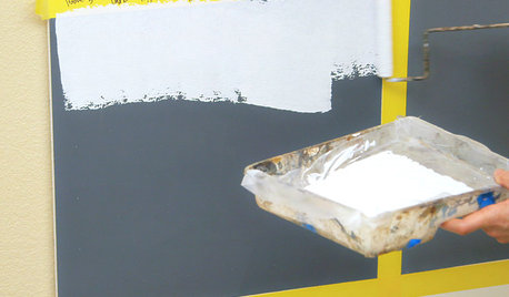
PAINTINGHouzz TV: How to Prime a Wall Before You Paint
Learn how to apply primer in 4 wall scenarios — covering scribbles, painting a light color over a dark one and more
Full Story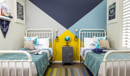
COLORWhy You Should Paint Your Walls More Than One Color
Using multiple colors can define zones, highlight features or just add that special something
Full StoryDIY PROJECTSHouzz TV: How to Paint Perfect Wall Stripes
Watch this video to see how to paint clean, professional-looking stripes wherever you want some pizazz
Full Story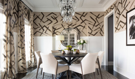
DINING ROOMSRoom of the Day: Hand-Painted Walls Set This Dining Room Apart
A bold design and small accents make this square room the perfect place to have fun
Full Story


Diana Bier Interiors, LLC