


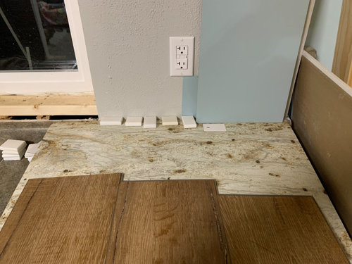
Paint color/counters/sink-don't trust my taste
Missi (4b IA)
3 years ago
last modified: 3 years ago


Featured Answer
Sort by:Oldest
Comments (24)

itsourcasa
3 years ago
eam44
3 years agoRelated Discussions
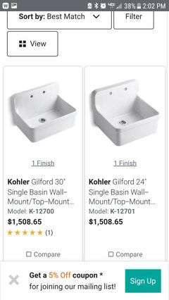
Plastic sink: am I losing my taste?
Comments (19)I hate Corian on principle but I've been living with a PINK Corian sink for a little over a year and it WILL go when I remodel but it makes for a really nice sensible sink. You need to see it in person and feel it and see how it hits you. It does look good in the picture. It's only slightly harder to see stains on pink than white. They scrub out with Comet. I let it get really bad between scrubbings (yes I do wipe it with dish soap between scrubbings). I drop heavy cast iron into it (and sometimes it rusts in there). I pour boiling water into it. I am not nice to it. It maintains heat if you fill a basin with hot water. It's quiet. Things don't get broken in it if you are clumsy (which we are). Scratches buff out with a Scotchbrite. (And if you put your 20 lb rough cast iron pans on the middle divider to scrub them, you'll be getting scratches.) Anyway, much as I wanted to hate my pink plastic sink, it's actually a great sink. I do think it'd look better in a wood counter than stainless. But if it's really the look you want, only you can say. I think I'd keep looking for a cast iron sink with a drainboard, preferably apron front (the fewer drips the better!), but this one would probably be OK....See MoreWaaah!! I don't like my counters!
Comments (19)In the light of a new day, perhaps they're not THAT bad. They're never going to be my favorite feature to LOOK at perhaps, but I think they'll be wonderful to live with. I considered waiting on the backsplash to see how I felt about them, but the backsplash might make everything look better, more pulled together. The lighting is not in either, so I'm sure that will make a difference. I'm looking at it as kind of : Sometimes the best looking guy can be a joy to look at but a pain to be around, and the more average looking fella might not be as much eye candy, but he's solid and hard working and loyal, etc., etc. This is not to say those lucky enough to have beautiful granite that it's a pain to be around, it just makes me feel better ;) Plllog- Thank you for reminding me that super blingy countertops have to be kept free of all the normal kitchen "clutter" to be shown to their best advantage. Rhome- Yes, the countertops, at least in my case, were to be secondary to the island and the backsplash, and yeah, I'm second guessing myself. I'm pretty good at that! Rmkitchen- Agree with everything you said. If everything was done to the nines, instead of everything having that "wow" factor, none of it would. Pharaoh- Yeah, that's "bling"! I'm going to continue on course and have faith that once everything is done, it will be fabulous. If it's not, it will be d**n close, and I can live with that....See MoreThis is why you don't pick paint colours off the internet
Comments (56)Or because you trusted what you saw online vs. a chip in your hand and a sample in your own space, you missed out on a legitimate contender for a pretty gold. Because you have zero information about the quality of the actual photo, the camera used, the lighting or how the file was saved for the web - or even if the paint color was correctly identified. I can't say it enough, that there is absolutely nothing about viewing color on a monitor that is trustworthy or useful. Anything's possible of course but I think tell ten or so photos I looked at that all told the same story...were likely telling a similar story. I need all the help I can get and online research is the second tool in the toolbox after my fandecks. I look for multiple photos of any color I'm considering and use them to help me narrow down my options, since I'm not inclined to put up a million samples, especially since I'm now paying $10 a sample (!!!) Once my options are a bit narrower, I go to tool 3, start sampling. Unfortunately I can't commit to every chip... I'm now on my fourth gold sample...$40 down the drain already, and I haven't even lifted up a roller, all from small chips I thought looked perfectly nice in the space. I have an unfortunate combo of good color sensitivity and pickiness with low prediction of how a paint chip will translate to an entire room. And laziness over painting, which I detest....See MoreI don't think I'm happy with my backsplash :/
Comments (72)Have to agree with the above - it looks on my monitor that all of the backsplash tiles read green/blue and the countertop reads grey/brown and none of them seem to work together. The fireclay tiles posted by eam44 would look to be a much better match. I disagree above that you need some kind of focal point. I think it's a smallish kitchen and has lovely pendants, and windows and island and a bold backsplash is just competing with that. Keep it simple! In fact, i was the above writer who earlier said they pretty much always dislike the inset backsplash and i think your current BS is a perfect example of how those insets rarely look good. Even when the underlying colors are similar, as yours are, there's just something "off" about them. I think the only exception is when they are using almost the same tile (like, carerra subway tile BS with a carerra herringbone pattern inset). I still think this is busier than i like, but isn't an eyesore as so many other insets are. I think this inset mistake is actually a good opportunity to replace the whole thing!...See Moreitsourcasa
3 years agoeam44
3 years agolast modified: 3 years ago
Missi (4b IA)
3 years agoMissi (4b IA)
3 years ago
User
3 years agolast modified: 3 years agoMissi (4b IA)
3 years agoUser
3 years agoMissi (4b IA)
3 years agoMissi (4b IA)
3 years agoMissi (4b IA)
3 years agolast modified: 3 years agoheatheron40
3 years agoMissi (4b IA)
3 years agoUser
3 years agolast modified: 3 years agoMissi (4b IA)
3 years agoUser
3 years agolast modified: 3 years agoheatheron40
3 years agoMissi (4b IA)
3 years agoheatheron40
3 years agomaggieq
3 years agoUser
3 years agolast modified: 3 years agoMissi (4b IA)
3 years ago


Related Stories
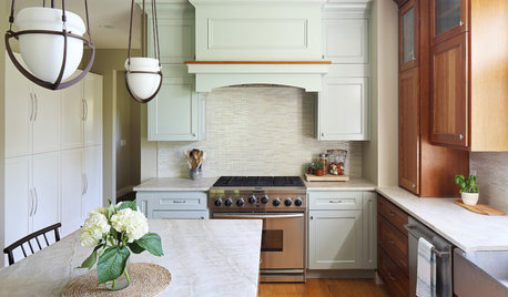
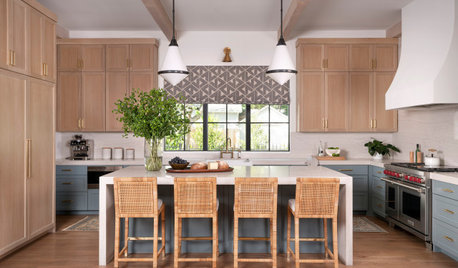
BEFORE AND AFTERSBefore and After: New Paint, Counter and Tile Refresh a Kitchen
A former restaurant owner chooses a new palette inspired by her beloved Lake Michigan
Full Story
PRODUCT PICKSGuest Picks: Extravagant Sinks for Luxurious Bathrooms
Make a statement with a sink that celebrates artistry and individuality — just be prepared for the price tag
Full Story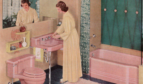
MOST POPULARHomeowners Give the Pink Sink Some Love
When it comes to pastel sinks in a vintage bath, some people love ’em and leave ’em. Would you?
Full Story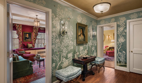
TRADITIONAL HOMESHouzz Tour: Park Avenue Pied-à-Terre Paints a Pretty Picture
Gilded ceilings, a custom bar nook and exuberant color add flair to this traditional New York City apartment
Full Story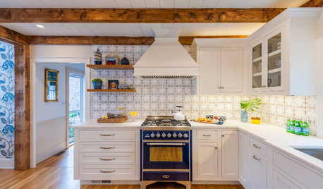
KITCHEN MAKEOVERSHand-Painted Tile Inspires a Long-Awaited Kitchen Remodel
Houzz stories provide a Massachusetts couple with inspiration and lead them to designers who transform their kitchen
Full Story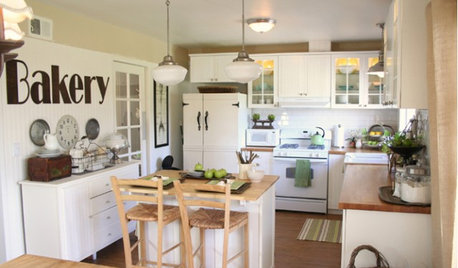
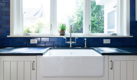
KITCHEN DESIGNKitchen Sinks: Fireclay Brims With Heavy-Duty Character
Cured at fiery temperatures, fireclay makes for farmhouse sinks that just say no to scratches and dents
Full Story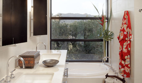
KITCHEN CABINETSPainted vs. Stained Kitchen Cabinets
Wondering whether to go for natural wood or a painted finish for your cabinets? These pros and cons can help
Full Story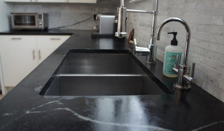
KITCHEN DESIGNSoapstone Counters: A Love Story
Love means accepting — maybe even celebrating — imperfections. See if soapstone’s assets and imperfections will work for you
Full Story


User