


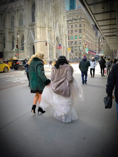
Choosing my entry for photo contest
User
4 years ago
last modified: 4 years ago


Featured Answer
Sort by:Oldest
Comments (72)

User
4 years agoUser
4 years agoRelated Discussions
Knock Out photo contest
Comments (8)Shall I send them the photos of my twisted, witches' broomy looking Rainbow Knockout with the caption, "So much for disease resistance"? *grins* They did say they were looking for creativity. :)...See MoreContest!!!!!!!!! Contest!!!
Comments (65)I'm off to the office- we open for half day on Saturdays, so I will be posting the list around noon for the runner-ups! Any last minute suggestions will be considered. I am having a hard time getting it down to 10 selections, and my hubby just added his own suggestions last night! When I post the list, I'm asking you to choose the top three you like, 1-2-3, , and email me your choices. And yes, you can vote for your own suggestion if they make the list!! LOL!! So, if you get a chance, check back after noon today, and vote! Thanks for all the help with choosing a name for this seedling!! Brenda...See MoreA question for the photo contest winners
Comments (14)I submitted a couple of pics of Luna Moth to Bob, just emailed him and they were up the same day. He sent back an email thanking me for the submission. Not sure what the photo contest is, per se, haven't really paid attention to that. Bob won't be running the hosta library much longer, he is training someone else to take it over, fyi. He was very open to posting pics of a hosta that, like Bkay said, the pics that were on there were very underwhelming and just didn't do it justice....See MorePlease help choose a new entry chandelier
Comments (11)Nice place! I like the idea of a portico. When you repaint, I would also paint the chimney. I was going to suggest replacing any wood on the house with painted cedar shake, but the board and batten leans to the beach/farm/lake look also. Have you decided on the color? I see you have a nice lake view. We just gave up ours. I am still somewhat sad about that! Your current DR chandelier will look nice in the foyer and start the vibe you want. Then add a chandelier with some crystals in the DR. This one is also in the same collection and has a few crystals. Depends on how matchy-matchy you want to be. I could also see one of Viola or Chappellet by Arteriors in your home - something with large beads, or even sea glass. DD1 has the small Viola in her walk-through-closet-turned-room. It has a little rope/twine on it, but I do worry about how dusty it will get over the years.... and don't think I would do a large chandelier or orb covered in rope. Same goes for the wicker/woven basket like fixtures - how do you keep those clean?! My handyman is about to arrive for the day. I will try to post a few more ideas later. I like the last photos you've posted. The only thing I worry about in your home is the traditional chair rail and wainscot, but painting the walls and trim the same color will help it fade away a bit. The flooring looks like red oak, and it will be a big job to even get it close to the flooring in your photos (which is what they are calling European or French White Oak). We just installed French White Oak in our new home, and love it. There is a thread about lighter flooring floating around - you can search for it, or click on my name/profile and see my activity, as I have posted on that thread. I also have a large thread and a few smaller ones on our current home/project, if you are interested....See More
Bunny
4 years ago
3katz4me
4 years agoUser
4 years ago
tartanmeup
4 years ago
Olychick
4 years agolast modified: 4 years ago3katz4me
4 years agoeandhl2
4 years ago
just_terrilynn
4 years ago
nutsaboutplants
4 years agolast modified: 4 years agoUser
4 years ago PRO
PROMDLN
4 years agolast modified: 4 years ago
bpath
4 years agolast modified: 4 years ago
OutsidePlaying
4 years agoglad2b
4 years agolascatx
4 years ago
Annie Deighnaugh
4 years agoUser
4 years agolast modified: 4 years agoBunny
4 years agolast modified: 4 years agoUser
4 years ago
Yayagal
4 years agoUser
4 years agoOlychick
4 years agoUser
4 years agotartanmeup
4 years ago
sas95
4 years agoUser
4 years agoblfenton
4 years agosas95
4 years agoUser
4 years ago
arkansas girl
4 years agoUser
4 years agolast modified: 4 years agoblfenton
4 years agorich69b
4 years ago
1929Spanish-GW
4 years agoUser
4 years ago
LynnNM
4 years ago
cyn427 (z. 7, N. VA)
4 years agoUser
4 years agolast modified: 4 years agoUser
4 years agolast modified: 4 years agoOlychick
4 years agoUser
4 years agolast modified: 4 years agolascatx
4 years agolascatx
4 years agolast modified: 4 years agomartinca_gw sunset zone 24
4 years agomartinca_gw sunset zone 24
4 years agoblfenton
4 years agohcbm
4 years ago


Related Stories

REMODELING GUIDESHouzz Planning: How to Choose a Front Door
Wood, Fiberglass or Steel? Find the Right Material for Your Entry Door
Full Story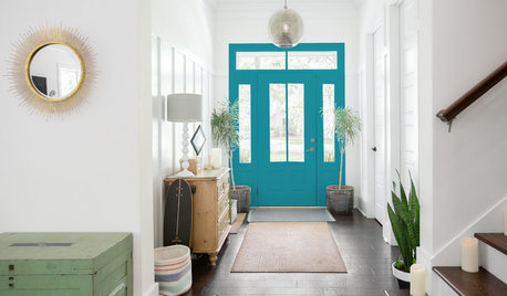
COLORChoosing Color: 5 Fun Options for 1 Sunny Entryway
See how adding a touch of uplifting paint to an all-white entry perks up the personality of a home
Full Story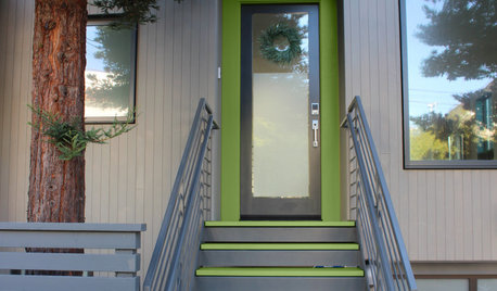
COLORYou Voted. She Painted. This Pro’s Entry Is Now Leafy Green
A designer recently invited Houzz users to choose the new color for her home’s entry. See how the new paint looks
Full Story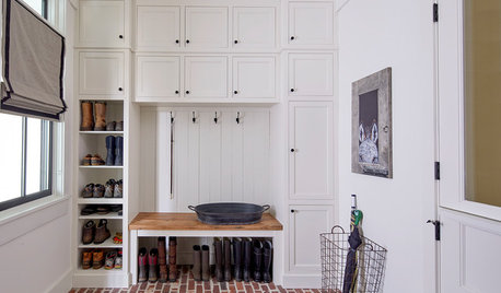
TRENDING NOWThe Most Popular New Entries
Houzzers’ favorite photos showcase entries that make a stunning first impression and mudrooms packed with storage
Full Story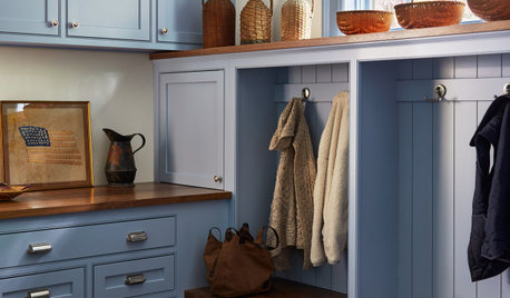
TRENDING NOW6 Mudroom Ideas From the Most Popular Entries So Far in 2021
Smart storage features, durable flooring and stylish details can create a hardworking entrance
Full Story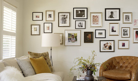
LIFEEdit Your Photo Collection and Display It Best — a Designer's Advice
Learn why formal shots may make better album fodder, unexpected display spaces are sometimes spot-on and much more
Full Story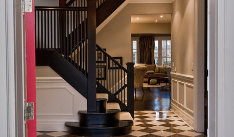
ENTRYWAYSHow to Choose the Right Rug for Your Entryway
Show your style and go big for the first rug you and your guests will see
Full Story
COLORChoosing Color: 6 Striking Options for 1 Fabulous Fireplace
A painted-brick fireplace gets a virtual wash of new color, turning it dark and dramatic or bold and bright
Full Story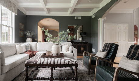
DECORATING 101How to Choose a Paint Color You Can Live With
See 8 tips and tricks that can help you commit to a color you’ll love
Full Story
MOST POPULARHow to Choose a Front Door Color
If choosing a door paint isn't an open-and-shut case for you, here's help
Full Story

nutsaboutplants