


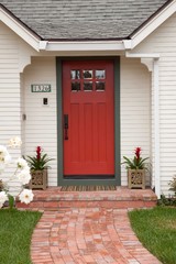
Choosing Color: 5 Fun Options for 1 Sunny Entryway
See how adding a touch of uplifting paint to an all-white entry perks up the personality of a home

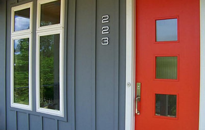
I’m a big proponent of putting a bold paint color on the exterior side of a home’s front door. But this often begs the question from homeowners: “What color do I paint the interior side?” The answer is, it depends. If the room just inside your front door is chock-full of bold color or covered wall to wall in artwork or decorative accessories, then perhaps white or another neutral hue is best, so as not to compete with everything else going on in the space. But if your entry area is fairly neutral, there’s no reason you can’t bring an eye-catching hue into the mix and onto the interior of the front door.
1. Organic, easy green. This rendering features a green grabbed from the trunk in the foreground of the photo.
It’s a pretty, earthy green that’s neither too soft and wispy nor too dark and intense.
It’s a great option if you live in a region with a climate that’s often cool and overcast, because it’s a fresh and comforting color. It also works as a near neutral in that it pairs well with many other colors, similar to how a verdant green serves as the foundation hue in a colorful garden.
For a similar look, try Banyan Serenity from Kelly-Moore Paints.
Find an interior designer to help with your colors
2. Pop of pink. Pink was an “it” color of 2017, especially the soft beige-pink hybrid Millennial Pink, and it appears to still be going strong well into 2018. I’m normally not a huge fan of petal pink, but I like it here at the entry.
It’s an unusual choice, and I’m always eager to bring unusual choices into a space whenever and wherever I can. It looks surprisingly sophisticated despite its sweetness and also serves as a nice color contrast to the green of the plants and furnishings, making those greens really stand out.
Rest assured too that should your desire for pink wane, on a door it’s relatively cheap and easy to change it out for another hue.
For a similar look, try Etiquette from Behr.
Rest assured too that should your desire for pink wane, on a door it’s relatively cheap and easy to change it out for another hue.
For a similar look, try Etiquette from Behr.
3. Elegant almost black. This option is for anyone I may have turned off by featuring a soft pink. I think this might be my favorite of the bunch, because I like how it emphasizes the architectural details of the entryway.
It’s the one color that really makes me notice the beautiful dark wood flooring, because it’s a similarly deep and rich hue. Because it’s not a true black, though, it provides contrast without appearing too harsh or somber. It’s a superchic and dramatic choice.
For a similar look, try Peppercorn from Sherwin-Williams.
11 Reasons to Paint Your Interior Doors Black
For a similar look, try Peppercorn from Sherwin-Williams.
11 Reasons to Paint Your Interior Doors Black
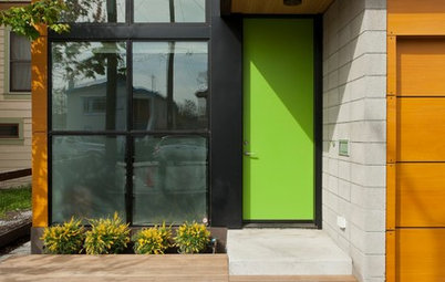
4. Bold blue-green. My long-running love of lime green has recently given way to a passion for peacock greenish blues, and I’ve been using them in any and every place I can get my hands on.
This option is definitely vibrant and eye-catching. I feel you can go a bit bolder with blue, because it’s a color most of us find desirable and soothing due to our association with blue skies and bodies of water.
If you too are a fan of greenish blue but find this hue a bit too bold, go for a shade that is lighter and has more gray in it. The gray will tone it down while still giving a refreshing, watery vibe.
For a similar look, try In the Tropics from Benjamin Moore.
Find a professional painter
If you too are a fan of greenish blue but find this hue a bit too bold, go for a shade that is lighter and has more gray in it. The gray will tone it down while still giving a refreshing, watery vibe.
For a similar look, try In the Tropics from Benjamin Moore.
Find a professional painter
5. Outgoing with orange. I have a weakness for bright orange front doors. I love this particular shade for the energetic and welcoming vibe it brings. I imagine it would put a smile on my face and a spring in my step every time I left the house.
Because of its vibrancy, bold orange is best used in small doses and surrounded by larger swaths of white or other light neutrals, such as in this entryway.
For a similar look, try Cajun Shrimp from PPG Pittsburgh Paints.
See more of the home featured in this article
Your turn: Tell us your favorite in the Comments, then show us a well-lit photo of the inside of your front door!
More
Houzz Quiz: What Color Should Your Front Door Be?
12 Tried-and-True Paint Colors for Your Walls
Front door color ideas
Browse front doors
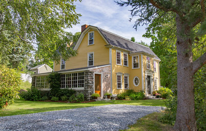
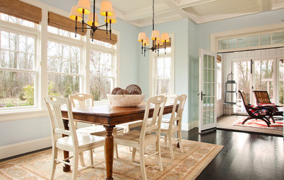

This sunny entry in Charleston, South Carolina, is lovely the way it is, with its trim details and interesting mix of exotic, elegant accessories with more casual, rustic elements. But I want to illustrate through renderings how a little touch of added color at the front door could make a big impact on the look and feel of the home.
So here are five fun color options for the interior side of this front door.