


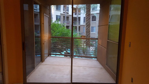
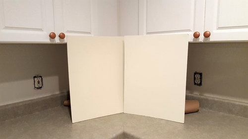
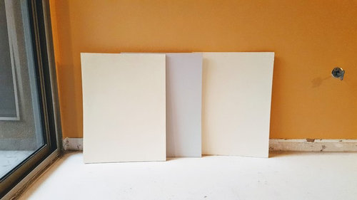
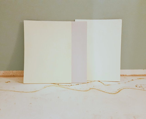
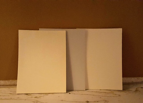
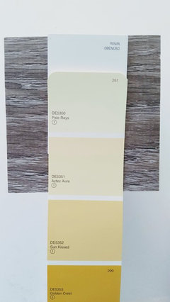
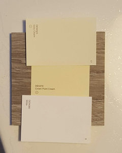
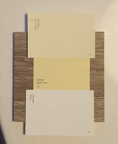
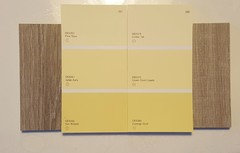
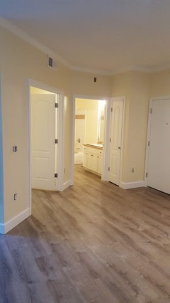
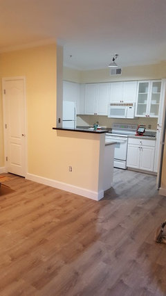
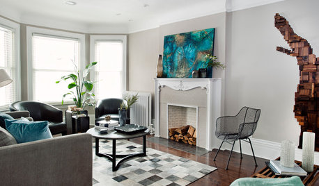
Please help me choose a yellow paint, pics provided
shelleyjr
5 years ago
last modified: 5 years ago
Featured Answer
Sort by:Oldest
Comments (74)

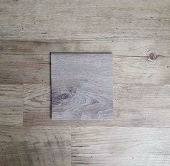
shelleyjr
5 years agolast modified: 5 years ago PRO
PROFlo Mangan
5 years agoRelated Discussions
Please help me choose exterior paint colors for Ocala block house
Comments (4)I'm in agreement with you that for your situation something of low contrast would be best. You could have the shutters more or less match the house color (or even go ligher, say a cream color) or a soft green with yellow tones to it. I would let the landscaping provide the color (and I'm so hoping you're not doing grass in your tropical environment) and let it be the lush counterpoint to your cool-looking light colored house. I think it would be beautiful....See MorePlease help me choose fabric for my curtains (Pics included)
Comments (10)Thanks kiko. I am not keeping the couch I am going to replace it with the goodwin sectional in dove grey from west elm when I get the chance. My built ins were built by a very talented friend and have been wonderful. It hides ALL of the Guitar Hero/Rock Band mess and provides storage for family board games, dvds, dvd equipment, and my endless supply of photo albums. Here is a link that might be useful: Goodwin Sectional...See Morelots of pics to help you help me with paint for kitchen- please
Comments (6)I did pick up a sample of Wyndham Cream, and also Hawthorne Yellow. The first coat of each is drying now. The cream color is so pretty but I'm afraid it will just look off-white. Have to give it another coat and look a few times.....I do think I am going in another direction compared to the colors I posted first...I think those will compete too much. Any others to consider? thanks again! J...See MoreLots of PICS of paint tests - please help me choose!
Comments (27)Don't even know how many homes I've put RG in at this point. I will tell you that I don't put RG and Blonde together much any more unless there is substantial natural light. Reason being you can hardly tell the difference between the two. In a couple of homes that's worked out well. Blonde was just a snidge lighter than RG so it all looked like the same color, but in the individual spaces the lightness of Blonde helped *lift* that area whereas the RG would have been too dark. If a definite difference between areas is desired, I pair RG with Believeable Buff. BB ended up being what several people thought Blonde would have/should have looked like next to RG. Had a couple clients repaint Blonde with BB because they thought there would be more of a difference. I suggested only partial repaints for them because RG worked out great just needed to tweak the contrast with BB. If you sample in your space and you can easily see a diff between Blonde and RG, it should be fine. Just be aware and really look before you decide. Don't assume RG and Blonde are a good pairing just because of how they are ordered on the strip....See Moreshelleyjr
5 years agolast modified: 5 years ago
everdebz
5 years agolast modified: 5 years agoeverdebz
5 years ago
tartanmeup
5 years agoshelleyjr
5 years agoshelleyjr
5 years agolast modified: 5 years agotartanmeup
5 years agolast modified: 5 years agoeverdebz
5 years agoeverdebz
5 years agoeverdebz
5 years agoeverdebz
5 years agoshelleyjr
5 years agolast modified: 5 years agotartanmeup
5 years ago
annied75
5 years agoshelleyjr
5 years agolast modified: 5 years ago- PRO
Flo Mangan
5 years ago shelleyjr
5 years ago
Samantha Peruto
5 years agoshelleyjr
5 years agotartanmeup
5 years agoshelleyjr
5 years agolast modified: 5 years agotartanmeup
5 years agoshelleyjr
5 years agolast modified: 5 years ago- PRO
Flo Mangan
5 years ago 
emmarene9
5 years agotartanmeup
5 years ago- PRO
Flo Mangan
5 years ago shelleyjr
5 years ago
CLC
5 years agoeverdebz
5 years ago
simmtalker
5 years agotartanmeup
5 years ago- PRO
Flo Mangan
5 years ago - PRO
Flo Mangan
5 years ago shelleyjr
5 years agotartanmeup
5 years agoshelleyjr
5 years agolast modified: 5 years agotartanmeup
5 years agoshelleyjr
5 years agolast modified: 5 years ago- PRO
Flo Mangan
5 years ago shelleyjr
5 years agotartanmeup
5 years agoshelleyjr
5 years ago PRO
PROLori A. Sawaya
5 years agoshelleyjr
5 years ago- PRO
Lori A. Sawaya
5 years ago shelleyjr
5 years ago- PRO
Lori A. Sawaya
5 years agolast modified: 5 years ago


Related Stories
MOST POPULARCrowd-Pleasing Paint Colors for Staging Your Home
Ignore the instinct to go with white. These colors can show your house in the best possible light
Full Story
DECORATING GUIDESPaint Color Ideas: 8 Uplifting Ways With Yellow and Green
Dial up the cheer with yellow and green paint combinations sure to cast off winter doldrums
Full Story
COLORPick-a-Paint Help: How to Quit Procrastinating on Color Choice
If you're up to your ears in paint chips but no further to pinning down a hue, our new 3-part series is for you
Full Story
COLORPick-a-Paint Help: How to Create a Whole-House Color Palette
Don't be daunted. With these strategies, building a cohesive palette for your entire home is less difficult than it seems
Full Story
COLORPaint-Picking Help and Secrets From a Color Expert
Advice for wall and trim colors, what to always do before committing and the one paint feature you should completely ignore
Full Story
EXTERIORSHelp! What Color Should I Paint My House Exterior?
Real homeowners get real help in choosing paint palettes. Bonus: 3 tips for everyone on picking exterior colors
Full Story
EXTERIOR COLORWhen to Paint Your Home Yellow
Be a cheer leader with this color that captures the sun and radiates a warm welcome
Full Story
COLORPick-a-Paint Help: 11 Ways to Mine Your World for Colors
Color, color everywhere. Discover the paint palettes that are there for the taking in nature, shops and anywhere else you roam
Full Story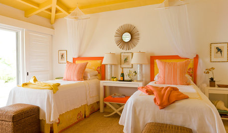
DECORATING GUIDESPaint Color Ideas: 7 Bright Ways With Yellow and Orange
Go with the glow. These sample palettes and room examples show you how to work with two of the happiest hues around
Full Story

D M PNW