


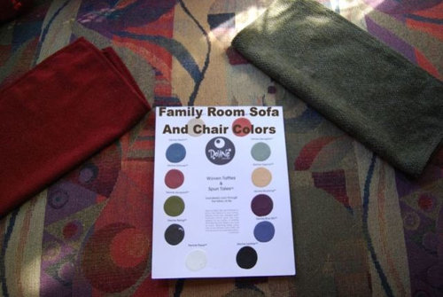
Colors Colors and more colors
Jennifer Hogan
5 years ago


Featured Answer
Sort by:Oldest
Comments (20)

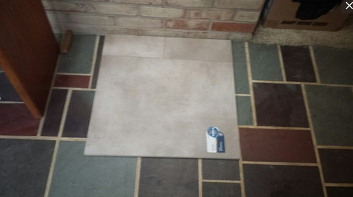
Jennifer Hogan
5 years agolast modified: 5 years agoRelated Discussions
Kimi's Plumeria Sale PIX !!!
Comments (7)Rodney, I was actually able to attend Kimi's sale. I took a leisurely drive out there on Sunday. When I walked into the back, I was like a kid in a candy store. So many plumies, and the quality of the plants, need I say more! Juan and Rick were such a great help. They both helped me find two plants that I've wanted, a "JL pink pansy" (4 tips) and a "Paul Weissich" (2 tips). The price was also quite reasonable. I know I've paid as much on E-bay for unrooted cuttings. This was my first time there and hopefully not my last. Two new additions to my plumie family: JL Pink Pansy Paul Weissich Happy growing everyone, Rick...See MoreGlider is HOME !! what color to paint her ??
Comments (35)Thank you Nicloe. I am so happy I got it before he trashed it !! I will post...gotta finish the porches 1st LOL> OK I Jgtbm : I had to read it 2x and then I GOT it. WOW you are a whiz. So where do I get clear contact paper...you can see I never get out ?? !! I have the perfect xacto ( I will borrow from DH haha ) and it will be so much better. Nope can't pay out anymore for this project so will be on my own. I have done it so much though that I think it will be OK> I will get started by the weekend.. this is exciting .>>THANK YOU !! c...See MorePaint color dilemma, more $ for a darker color?
Comments (14)Also, at least with Sherwin Williams paints, some darker colors require a different (darker) shade of primer. We used mostly lighter colors throughout the house but painted one room and a couple of accent walls in two other rooms with SW Spicy Hue (a deep cinnamony red brown hue). Those walls had to be primed with a dark grey primer AND it still took something like 4 or 5 coats of paint for the Spicy Hue to look exactly right. Final result is gorgeous but it took some work to get there. (p.s. I KNOW for a fact that the paint used was Sherwin Williams and not some cheaper knock-off tinted to match the SW color because I went to SW myself and bought both the paint and the primer myself and delivered it to the painters.) My painters did not charge extra but I chose to pay them a small bonus because I knew they wound up doing quite a bit more work than anticipated on those walls....See MoreCustom range knob colors (for KitchenAid but really more general)
Comments (11)I am 100% with bagofchips. I'm getting a 48" KitchenAid range. It is the highest rated on Consumer Reports and I love it! I still want some color knobs - not red. Why in the world is no one making after-market knobs for these ranges? Let us choose our colors. Kitchenaid! Are you listening? If anyone knows where I can get these knobs in color, please let me know. Thanks!...See MoreJennifer Hogan
5 years agoJennifer Hogan
5 years agoJennifer Hogan
5 years agoJennifer Hogan
5 years agoJennifer Hogan
5 years agoJennifer Hogan
5 years agoJennifer Hogan
5 years agoJennifer Hogan
5 years agoJennifer Hogan
5 years ago
Related Stories
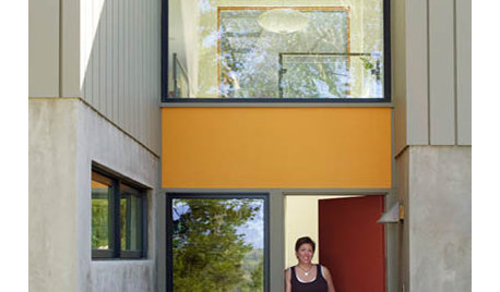
BOLD COLORColor Guide: How to Work With Primary Colors
Go beyond the ABCs with Mondrian-style renderings and eclectic takes using these notice-me color foundations
Full Story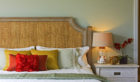
COLORHow to Add Color if You’re Color Shy
Here’s how to break into the world of color without breaking a sweat
Full Story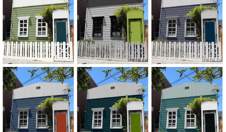
EXTERIOR COLORChoosing Color: 1 Cottage, 6 Striking New Color Schemes
See 6 color palettes for this sweet San Francisco home, vote for your favorite and then find out which one was chosen
Full Story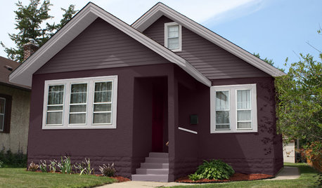
EXTERIOR COLORChoosing Color: 1 Home Has Fun With 5 Different Color Schemes
See a home’s potential for transformation with several new hues. Do you have a favorite?
Full Story
COLORColors of the Year: Look Back and Ahead for New Color Inspiration
See which color trends from 2014 are sticking, which ones struck out and which colors we’ll be watching for next year
Full Story
COLORColor Feast: 6 Deliciously Uncommon Dining Room Color Combos
Give your mealtime space a generous helping of hues paired in a most refreshing way
Full Story
COLORNature’s Color Wisdom: Lessons on Color From the Great Outdoors
Nature offers much inspiration for using color at home. Get some starting points and links to deeper guides for each hue
Full Story
DECORATING GUIDESGreat Color Palettes: 8 Hot Bedroom Color Schemes
Go spicy, mild or a mix of both with warm and cozy hues in your bedroom
Full Story
COLORColor Fix: Energize Your Room With a Colorful Club Chair
Less commitment than a sofa but making a major impact, club chairs in vivid hues can work wonders
Full Story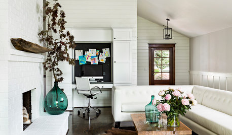
COLORYou Said It: ‘Adding Color Is About So Much More Than Shock’ and More
Highlights from the week include color advice, Houzzers helping Houzzers and architecture students building community housing
Full Story

cawaps