


Nature’s Color Wisdom: Lessons on Color From the Great Outdoors
Nature offers much inspiration for using color at home. Get some starting points and links to deeper guides for each hue

From the fiery red of a sunset to the aqua blue of the Caribbean Sea, nature’s color surrounds us. Drawing inspiration from this rich source of color wisdom, we’ll look at colors for our homes through the lens of nature, hue by glorious hue.
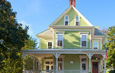
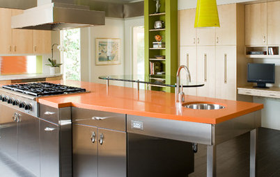
Yellow. From the pale gold of straw and honey to the bright yellow of lemons, daffodils and summer sunshine, this hue can be subtle, bold or anything in between. Yellow brings to mind cheerfulness and optimism, making it the color to use when you want a dash of positivity in your life.
Color pairing: Try bright yellow in the kitchen or breakfast nook paired with white, natural wood and black accents.
More of nature’s inspiration for using yellow in the home
Yellow color palettes for kitchens
Color pairing: Try bright yellow in the kitchen or breakfast nook paired with white, natural wood and black accents.
More of nature’s inspiration for using yellow in the home
Yellow color palettes for kitchens
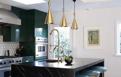
Green. The color of forests and fresh produce, green is a naturally soothing hue. In nature, endless variations of green can be found side by side, creating a rich backdrop for other colors both neutral (think of a herd of sheep on a verdant hillside) or bright, like flowers dotting an English garden.
Color pairing: Shades of green paired with natural wood make a particularly foolproof combo. And of course, adding fresh green plants is a welcome touch to any room, no matter the color scheme.
More of nature’s inspiration for using green in the home
Color pairing: Shades of green paired with natural wood make a particularly foolproof combo. And of course, adding fresh green plants is a welcome touch to any room, no matter the color scheme.
More of nature’s inspiration for using green in the home
Earth tones. From sand, clay and rocky cliffs to the loamy soil of a freshly turned garden, earth tones are all around us in the natural world. These hues, which range from the cool gray of smooth river stones to the warm, rich shades of red rock, are comfortable to be around and easy to work with.
Color pairing: Using a variety of earthy hues together in one space brings the focus to texture — play it up with live-edge wood, natural stone and nubby linen for a richly textural experience.
More of nature’s inspiration for using earth tones in the home
Color pairing: Using a variety of earthy hues together in one space brings the focus to texture — play it up with live-edge wood, natural stone and nubby linen for a richly textural experience.
More of nature’s inspiration for using earth tones in the home
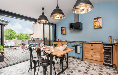
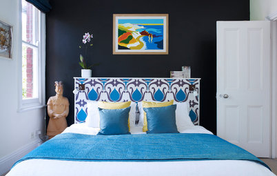
Blue. It’s no surprise that blue — the color of sea and sky (and our planet when viewed from space) — is such a well-loved hue. Calming and serene, blue is an easygoing color to live with.
Color pairing: Try a cheerful Caribbean blue in the living or dining room with green plants, clear glass and natural wood.
More of nature’s inspiration for using blue in the home
Blue color palettes for dining rooms
Color pairing: Try a cheerful Caribbean blue in the living or dining room with green plants, clear glass and natural wood.
More of nature’s inspiration for using blue in the home
Blue color palettes for dining rooms
Lavender. Think of fields of lavender in Provence, fragrant lilac bushes and baskets of papery onions in a market stall — lavender is charming, yet without being as flashy as pink or red.
Color pairing: Green makes a natural mate for lavender — try neutral walls with lavender and sage-green accents for a soothing yet uplifting space.
More of nature’s inspiration for using lavender in the home
Color pairing: Green makes a natural mate for lavender — try neutral walls with lavender and sage-green accents for a soothing yet uplifting space.
More of nature’s inspiration for using lavender in the home
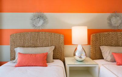
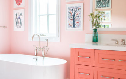
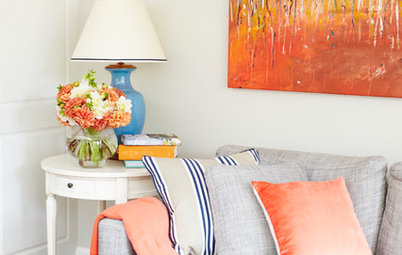
Pink. From the first flush of pink at sunrise to the vibrant pink of rhubarbs and raspberries, pink is a hue with far more range than the plastic pink of princesses and ponies in the toy aisle would have you believe. Usually found in smaller doses in nature, it is most easily used in the home as an accent.
Color pairing: Mixing shades of pink and lavender calls to mind the wild ramble of colors in a cottage garden. Try this pairing as accent hues in an otherwise neutral room.
More of nature’s inspiration for using pink in the home
Pink color palettes for the bath
Color pairing: Mixing shades of pink and lavender calls to mind the wild ramble of colors in a cottage garden. Try this pairing as accent hues in an otherwise neutral room.
More of nature’s inspiration for using pink in the home
Pink color palettes for the bath
White. As fresh and clean as new-fallen snow, or as mysterious as swans on a lake or mist hanging in a valley, white naturally brings attention to the shape and form of things. Without distraction of color, white offers clarity, though in nature, it’s rarely ever completely pure white, but rather tempered with a touch of gray, blue or yellow.
Color pairing: Go all-white for summer with fresh white slipcovers, gauzy white curtains and crisp white walls. Warm up the expanse of white with natural wood, smart black-framed photos and plenty of texture.
More of nature’s inspiration for using white at home
More
11 Top Decorating Colors and How to Use Them
Houzz Guides to Colors and Color Palettes


Color pairing: Try pairing a splash of vibrant red against a backdrop of blue or steely gray, like red leaves against a stormy sky.
More of nature’s inspiration for using red in the home