


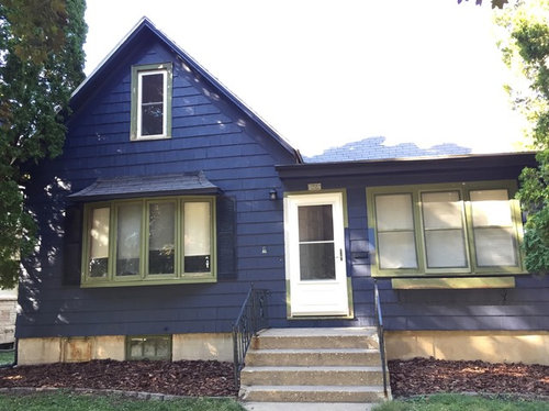
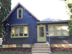
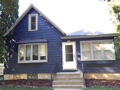
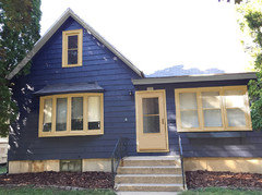
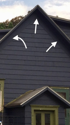
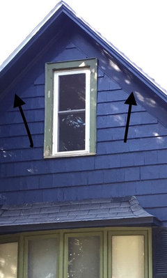
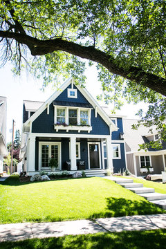
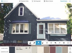
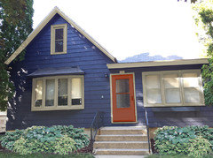
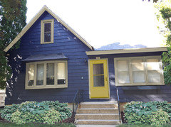
Wrong house color. Remedies? Trim color?
Jill
5 years ago


Featured Answer
Sort by:Oldest
Comments (42)

gracie01 zone5 SW of Chicago
5 years agoRelated Discussions
house paint color chosen-Trim color simply lighter shade?
Comments (2)I will try to post a picture. Problem is, it really does not "show" well in the pics I have taken thusfar. I thought there might be a rule of thumb or something about trim coordinating. No stone on the house, and no neighbors with anything similar anywhere near me....See MoreI am using wordly gray for my main house color what trim color?
Comments (3)I would also want my trim and my doors the same color....See MoreCabinet Painter Used Wrong Color... Proper Way to Remedy?
Comments (6)I agree with Owl and your painter. It's already been sanded and primed. Inspect everything when they return to be sure you can't see any brilliant blue in the cracks but I think you're good....See MoreHelp! Whole house paint color and trim color for remodel.
Comments (1)No one selects a paint color without seeing the rest of the finishes and furnishings....See Moresuezbell
5 years agolast modified: 5 years agosuezbell
5 years ago
Snaggy
5 years agosuezbell
5 years agoJill
5 years ago
sheloveslayouts
5 years ago
della70
5 years agohoussaon
5 years ago
gm_tx
5 years agochiflipper
5 years ago PRO
PROLion Windows and Doors
5 years agoJill
5 years agoJill
5 years agoJill
5 years agohoussaon
5 years ago
katinparadise
5 years ago
groveraxle
5 years agogroveraxle
5 years agoJill
5 years agogroveraxle
5 years agoJill
5 years ago
Pugga70
5 years agoJill
5 years agoJill
5 years agoPugga70
5 years agoJill
5 years agoJill
5 years agocat_ky
5 years agolast modified: 5 years agotqtqtbw
5 years agolast modified: 5 years agoJill
5 years agotatts
5 years agotqtqtbw
5 years agolast modified: 5 years agoUser
5 years agolast modified: 5 years agogroveraxle
5 years agocat_ky
5 years agoloobab
5 years agoredsilver
5 years agolast modified: 5 years agoJill
5 years agoJill
5 years agogroveraxle
5 years ago


Related Stories
LIFEThe Polite House: On Dogs at House Parties and Working With Relatives
Emily Post’s great-great-granddaughter gives advice on having dogs at parties and handling a family member’s offer to help with projects
Full Story
HOUSEKEEPING7 Chores You May Be Doing Wrong
Find out the best way to clean glass and change a duvet cover — and why you should remember to look up
Full Story
GREAT HOME PROJECTSHow to Bring Out Your Home’s Character With Trim
New project for a new year: Add moldings and baseboards to enhance architectural style and create visual interest
Full Story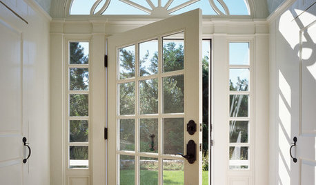
REMODELING GUIDESThe Good House: Little Design Details That Matter
Tailored trim, cool counters and a nice weighty door — such details add so much to how a home feels to the people inside
Full Story
ARCHITECTURERoots of Style: Do You Live in a Minimalist Traditional House?
Cottages, bungalows, farmhouses ... whatever you call them, houses in this style share several characteristics. See how many your house has
Full Story
HOUSEKEEPINGHow to Wash Your House
Avoid damage to siding and plants while getting your home's exterior shining clean, with this guide to using pressure washers and hoses
Full Story
HOUZZ QUIZHouzz Quiz: What Color Should You Paint Your House?
Is white right? Maybe dark blue-gray? Take our quiz to find out which color is best for you and your home
Full Story
TRIMWhat Color Should You Paint Your Trim?
Learn the benefits of painting your trim white, black, neutral, a bold color and more
Full Story
EXTERIORSHelp! What Color Should I Paint My House Exterior?
Real homeowners get real help in choosing paint palettes. Bonus: 3 tips for everyone on picking exterior colors
Full Story
WORKING WITH PROSHow to Work With a House Painter
A professional house painter may be your best friend for refreshing rooms. Here's what you need to know to get the best result
Full Story

Marci