


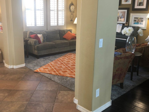
We picked the wrong carpet color to go with the warm tones of our hous
HU-471806854
5 years ago

Featured Answer
Sort by:Oldest
Comments (22)

HU-471806854
5 years ago
sheloveslayouts
5 years agoRelated Discussions
Help us pick our Finish our Basement project
Comments (13)We have a very similar berber carpet in our basement family room but it has small flecks of blue in it! We didn't go with blue paint because I couldn't find a blue that was light enough to be in the basement but had the look I wanted. Instead we have a beautiful Pratt and Lambert paint called Havana Cream on the walls, the ceiling is lighter and we have a blue paterned ottomon and lots of blue in our art and accessories. By the way we love the look and function of the carpet. It looks great after 5 years and lots of kid and pet abuse. Even survived a nasty orange soda experience!...See MoreWe painted the "wrong" color on our house. Help!
Comments (65)Seriously, I LOVE your blue house, and your house is why I would never ever move into a "community development". The Pink Hello Kitty house someone else has exhibited is too much, I'd agree -- but I'd basically tell new house guests -- if you reach Hello Kitty, you've gone too far, turn around and come back... Yes, a blue grey would work I'm sure. I don't have one to show you -- my current home is all grey with brown-red shutters and white trim. I like "Distance" and "Storm Cloud", in that order. PS: Your Boothbay Blue choice on your most recent post is also wonderful....See MoreHelp choose the counter colour to go with my two-tone kitchen
Comments (53)Jillius: hiya! Thank you, thank you, thank you for all the time you put in to pulling together those inspiration photos and the collages/mood boards (what do you call those?) While I'm not going to use Bianco Drift, London Grey is very similar to it in colour so your collages are really helpful for getting me started on visualizing what I want for the backsplash. I really like Faith's kitchen. It feels fresh, airy, contemporary, calm, and has a lovely natural feel to it too. She's got gorgeous marble on the counters and backsplash too. It's going into my favourite kitchens folder! Totally agree about the island - it would have looked so great had she kept it wood; but I gotta give her credit for being brave enough to bring in a pop of colour there. I do like having a warm-looking kitchen but I feel like going too warm leads me towards a more traditional look, which isn't what I'd like. The way Faith pulled it off suits me. Love the analysis you did comparing my Shitake collage to the Saint Paul Craftsman photo. I'm getting a better understanding of colour now. Still very mind boggling but I follow when you all help to spell it out for me! Ha ha... You might be expecting too much from the counter selection SO TRUE! I think that's why it's been so challenging. I realize now that I don't really want the counter to shine. It's the backsplash that I'd prefer to stand out. Many months ago, I wrote in my Sweeby Test: "The perfect backsplash will complement the cabinets and work harmoniously with the cabinets to create one well put together look, like they belong together. And possibly provide a pop of colour or visual interest in one section of it. The perfect countertop will be really easy and unfussy. Low maintenance. Just like backsplash, it will complement the cabinets and help connect and tie everything together" I think London Grey will be the right choice to help pull everything together. I do like the Craftsman colour scheme, but not for this kitchen or house. It is too dark and traditional for my 90s home. I was REALLY drawn to the light aqua subway tiles on the bottom right of that collage and the ones that have different shades ranging from light grey to bluey-grey. That just might be how I get in my pop of colour! I'm surprised that blues and greens can look warm - is it because they contrast well with my oak and the floors? I really want to stay away from orange and yellow tones for this reno simply because I don't want it to end up looking too similar to what I currently have....See MoreOk to mix warm/cool tones? Need countertop advice...
Comments (9)Mittens Cat, I also have light sensitivity due to migraines, chronic recurrent corneal erosion, and iritis (latter 2 cause scarring, vision loss, sometimes extreme sensitivity). I had to use 2700 k, but our kitchen has warm colors, and I actually wanted the warm light. 3000 k looks better with cooler colors IMO, but also can be used with warm shades. Still, my eyes couldn't tolerate it. I suggest you make very sure you can tolerate the 3000 k before making that commitment. DH put 3000 k in the utility room as they can be dimmed, and unless they are dimmed to the extent it's pretty dark, it's not tolerable for me. He had to change them to 2700 k. It is a warmer yellowish light as opposed to the cooler bluish light. Some people have a preference, others don't. Sorry if that adds to your spinning head : )...See MoreUser
5 years agoHU-471806854
5 years ago
beckysharp Reinstate SW Unconditionally
5 years agoHU-471806854
5 years agoHU-471806854
5 years agohoussaon
5 years agobeckysharp Reinstate SW Unconditionally
5 years agolast modified: 5 years agoHU-471806854 thanked beckysharp Reinstate SW Unconditionally
Olychick
5 years agolast modified: 5 years agoChessie
5 years agoHU-471806854
5 years agoHU-471806854
5 years agoChessie
5 years agolast modified: 5 years ago PRO
PROOpen House Home Staging & Redesign, LLC
5 years agoHU-471806854 thanked Open House Home Staging & Redesign, LLCHU-471806854
5 years ago


Related Stories

COLORPick-a-Paint Help: How to Create a Whole-House Color Palette
Don't be daunted. With these strategies, building a cohesive palette for your entire home is less difficult than it seems
Full Story
DECORATING GUIDESTry a Handmade Oushak Rug for Warm Spice Tones and Softness Underfoot
Lovely to look at and delightful to touch, these sumptuous Turkish rugs work with a range of room styles
Full Story
RUGSWelcome to the Dark Side: Decorating With Deep-Tone Carpets
Lay the foundation for a confident, comfortable room with richly colored carpeting
Full Story
ARCHITECTUREHouse-Hunting Help: If You Could Pick Your Home Style ...
Love an open layout? Steer clear of Victorians. Hate stairs? Sidle up to a ranch. Whatever home you're looking for, this guide can help
Full Story
PRODUCT PICKSGuest Picks: Warm Fall Finds for the Home
Whether warm in color or texture, these decorative pieces will help take the chill out of the air this season
Full Story
COLORWarm Up to White All Around the House
Explore the many ways to design a white kitchen, bathroom, dining room or bedroom that's far from stark and sterile
Full Story
LIFEThe Polite House: On Dogs at House Parties and Working With Relatives
Emily Post’s great-great-granddaughter gives advice on having dogs at parties and handling a family member’s offer to help with projects
Full Story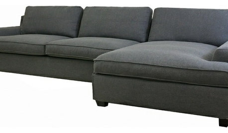
PRODUCT PICKSGuest Picks: A Fresh Take on the Modern Family Room
Kid-friendly furnishings, shots of color, playful patterns and warm wood tones make for one hip space
Full Story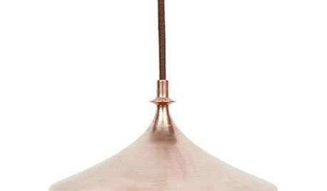
PRODUCT PICKSGuest Picks: Copper Craze
When gold and silver feel too expected, go for accessories and tableware in rosy-toned copper
Full Story
MOST POPULARMust-Try Color Combo: White With Warm Off-White
Avoid going too traditional and too clean by introducing an off-white palette that brings a touch of warmth and elegance
Full Story


beckysharp Reinstate SW Unconditionally