


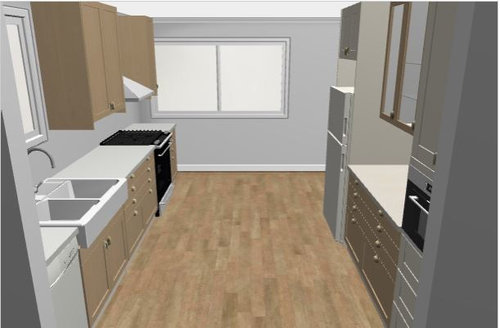
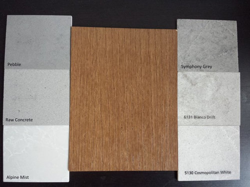
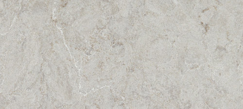
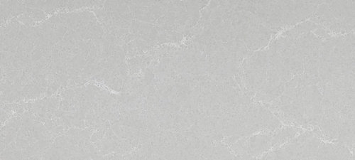
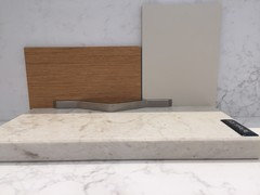
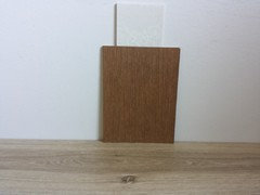
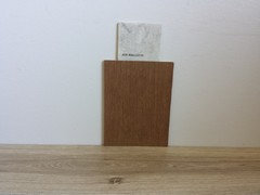
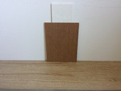
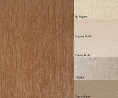
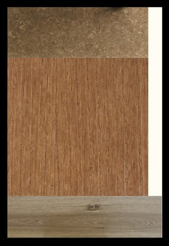
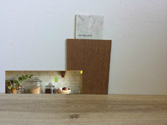
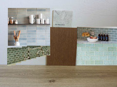
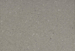
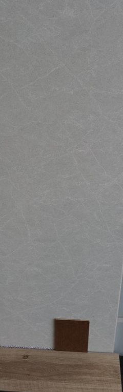
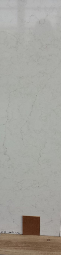
Help choose the counter colour to go with my two-tone kitchen
Pink Poppy
7 years ago
Featured Answer
Sort by:Oldest
Comments (53)
Related Discussions
Kitchen Design: Two-tone cabinets and countertops
Comments (5)Wow! Thanks everyone for the quick feedback. We actually don't own the house yet (we get keys tomorrow - yipee!) so the measurements are not exact. We'll have to have a pro designer make adjustments, but thanks for the tips things to keep in mind regarding dishwasher and reaching upper cabinets. Even the cabinet/drawer types in the rendering are just placeholders for now. We need to think more about what kind of storage functions we need. The slat wall and the angled corner cabinet are a function of me not knowing how to use the software! That's an exterior wall and for some reason I can't figure out how to change the defaults on those! You'll notice too that some of the cabinets have drawer pulls and some have knobs. That might be OK, but right now it's really random. I'm not sure why the software did that... I was thinking of having different door styles. Possibly doing something really shiny IKEA-eqsue in the white, and a dark wood for the dark. Sparklekitty - so funny you say that about the counter end. We call it the peninsula when talking about it, because it does seem like that. We've tried to see if we can open the layout by moving the fridge to the opposite side of the kitchen, and then turning the "peninsula" sideways into an island, but it seems too cramped on the cooktop side. Perhaps when we get the exact measurements and go to a designer we can exlpore that again, as it would be nice to have it opened up. Thanks everyone!...See MoreHelp...Choose Tile then Counters or Counters then Tile?!
Comments (11)I agree with Ranton, assuming I understand that you've already decided on the cabinet choice? If you have and you've got the style and stain/paint picked out, I'd do the counters 2nd. I'd do the floors 3rd. Flooring, unless "it's in your face" attention grabbing, tends to just be the anchor and gets relegated to almost being overlooked. If you only want the blaring floor to take center stage,(that's your main objective) then highlight that and let everything else just be a supporting role for the floor. That being said, if you have a lot of movement in the graining of the wood (cabinet), you don't want to fight "movement with movement". So let's say you have a really intense movement in the wood grain that will show through the stain, I'd quiet it down on the granite and/or pick a quartz that is quieter to the degree that the cabinets are already "speaking". ** One thing, are you looking for a certain look or style? Can you tell us that if you know? The reason I ask is that depending on what look you want to achieve be it for example, sleek/modern/minimalist, Tuscan/Mediterranean, French country, Craftsman/earthy colors etc., you get the idea. So write down some basic words that you think of when people say (your) XYZ style. From that, when you are looking at each material or pattern, what is the first word that comes to mind when you see that pattern/color/style in the granite yard or flooring? If what comes to mind belongs to another style/look, you may be about to combine things that don't belong in the same "box". Something to think about...... Oh, definitely choose the granite then choose the backsplash color/pattern/material after that. Regarding flooring, ask your DH the one thing that he wants to first be noticed in your kitchen. I.E. if someone where to come for a visit after it's completed and says they love XYZ about it. What element would be choose as the strongest thing that stands out when you walk into your kitchen? I know on some of these design shows when it comes to pattern be it fabric, upholstery, wallpaper, whatever, they suggest that the "scale" of each element not be the same. Like if you had a large print on a fabric in whatever color you'd want to choose a smaller scale on the other elements in the room so they don't compete. If you've got several large (busy) 'in your face' patterns in the room, they compete with each other. The result is that the eye bounces around constantly from large pattern (i.e. movement) to the next large/busy/heavy movement pattern. What happens is a feeling of vibration and competition between all the elements that is not restful to the eye or mind. I know I'm jumping around here. All these things are coming to mind that might help you so I'm just throwing it out there before I think of something else. Question: Are your and DH's style the same or different? If they are different, there was an HGTV show that integrated the two (sorry, can't think of it or the host's name) but there were some good points in how the host did it. Good luck and let us know how it goes. I don't know if I've helped here or not, but hopefully it will spark some thought processes that might help you....See MorePlease help me choose countertops for my kitchen!
Comments (51)bumping this back up because we have opted to go with granite- originally, we were going to get what we thought was a quartzite, but we think it is actually marble and the fabricator was selling it as "qualtcite" trying to pass it off. We tested the sample and it etched almost immediately. We looked at quartz options, and both of us like the patterns, but they are all very dull and lifeless and flat to us. Which led us to going with granite because that is most affordable. However, the granite I chose is, of course, one of the most expensive ones out there... Pitaya White. Husband wants me to consider Colonial White Granite as it was recommended as a cheaper option by the fabricator we are now going with. There is a $1200 difference so of course the husband wants me to consider it. We are also going to likely pull the mosaic backsplash and just do a super neutral grayish white backsplash that will have a little dimension (hopefully) We went to the Triton to look at slabs and that is where we chose the Pitaya. We both LOVED it. They didn't have any colonial white at the time so we haven't seen it in person. In all of the pictures I've seen online, there is a TON of variance in all of the different slabs!! Any suggestions? Thoughts? Anyone have colonial white?...See MoreI want to do two-tone countertops, but need help choosing the black,
Comments (6)@Patricia Colwell and @lucky998877 are right. You need to have one cabinet color to have two counters, or one counter to have two cabinets. Personally, I would rather see two cabinets with one counter, if you want that variety. If you aren't bound to the blue island, I'd do it in a stunning black with the counter you've selected....See More
chispa
7 years ago
Pink Poppy
7 years agolast modified: 7 years agoPink Poppy
7 years agoPink Poppy
7 years agolast modified: 7 years agoPink Poppy
7 years agoPink Poppy
7 years agoPink Poppy
7 years agoPink Poppy
7 years agoPink Poppy
7 years ago
aprilneverends
7 years agolast modified: 7 years agoPink Poppy
7 years agoPink Poppy
7 years agoPink Poppy
7 years agolast modified: 7 years agoPink Poppy
7 years agoPink Poppy
7 years agolast modified: 7 years agoPink Poppy
7 years agoPink Poppy
7 years agoPink Poppy
7 years agolast modified: 7 years agoPink Poppy
7 years agolast modified: 7 years ago
eam44
7 years agolast modified: 7 years ago
barncatz
7 years agolast modified: 7 years agobarncatz
7 years agolast modified: 7 years agomaries1120
7 years agoPink Poppy
7 years agolast modified: 7 years agoPink Poppy
7 years agoPink Poppy
7 years agolast modified: 7 years agoPink Poppy
7 years agolast modified: 7 years agoPink Poppy
7 years agoPink Poppy
7 years agolast modified: 7 years agoPink Poppy
7 years agoPink Poppy
7 years agoPink Poppy
7 years agoPink Poppy
7 years agolast modified: 7 years ago


Related Stories
KITCHEN DESIGNA Two-Tone Cabinet Scheme Gives Your Kitchen the Best of Both Worlds
Waffling between paint and stain or dark and light? Here’s how to mix and match colors and materials
Full Story
KITCHEN DESIGNTwo-Tone Cabinet Finishes Double Kitchen Style
Love 'em or not, two-tone kitchen cabinet treatments are still going strong. Try these strategies to change up the look of your space
Full Story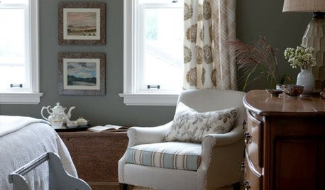
DECORATING GUIDESSplit Your Colors with Two-Toned Walls
There's no need to choose between two paint colors — use both to add dimension and interest to your walls
Full Story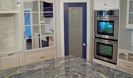
KITCHEN COUNTERTOPSKitchen Counters: Granite, Still a Go-to Surface Choice
Every slab of this natural stone is one of a kind — but there are things to watch for while you're admiring its unique beauty
Full Story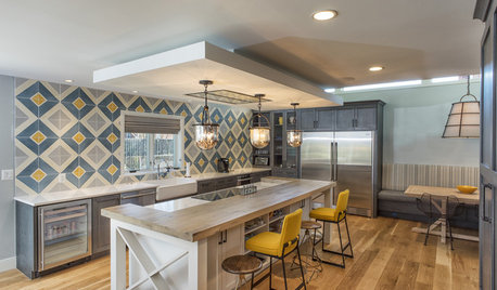
KITCHEN DESIGNKitchen of the Week: Tile Sets the Tone in a Modern Farmhouse Kitchen
A boldly graphic wall and soft blue cabinets create a colorful focal point in this spacious new Washington, D.C.-area kitchen
Full Story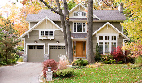
EXTERIOR COLORDynamic Duo: How to Pull Off a Two-Tone Exterior Color Scheme
Why stick to one main house color if you can easily and beautifully combine two?
Full Story
COLORPick-a-Paint Help: How to Create a Whole-House Color Palette
Don't be daunted. With these strategies, building a cohesive palette for your entire home is less difficult than it seems
Full Story
COLORPaint-Picking Help and Secrets From a Color Expert
Advice for wall and trim colors, what to always do before committing and the one paint feature you should completely ignore
Full Story
COLORPick-a-Paint Help: How to Quit Procrastinating on Color Choice
If you're up to your ears in paint chips but no further to pinning down a hue, our new 3-part series is for you
Full Story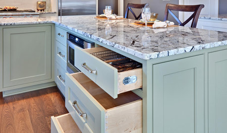
KITCHEN DESIGNWhat Goes With Granite Counters?
Coordinate your kitchen finishes beautifully by choosing colors that complement granite’s natural tones
Full StorySponsored
Columbus Area's Luxury Design Build Firm | 17x Best of Houzz Winner!

malabacat