


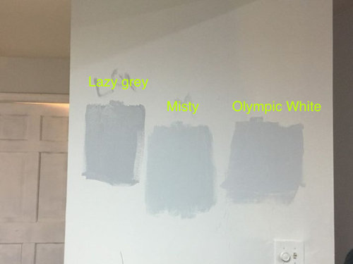
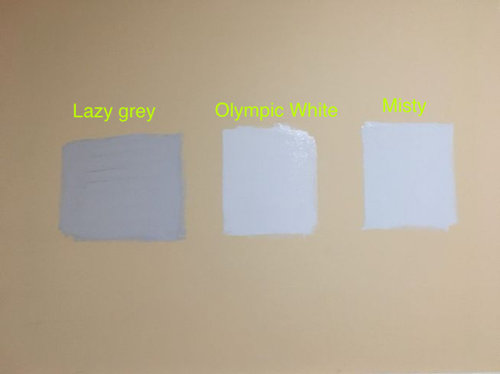
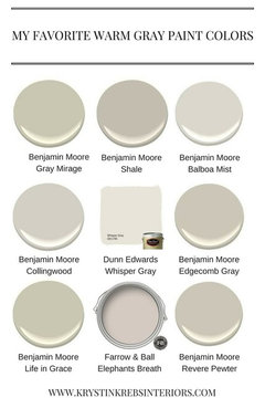
SW Grey color Dilemma
Neha
6 years ago
last modified: 6 years ago
Featured Answer
Sort by:Oldest
Comments (13)

Neha
6 years agoRelated Discussions
SW Agreeable Grey and SW Extra white together?
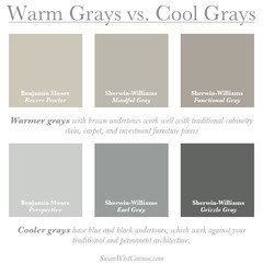
Comments (10)[extra white] cabinets may also look a little greenish against the agreeable grey as its such a large area? I doubt it. Anything can happen I suppose, but most 'just whites' are purposefully created from the yellow and green-yellow hue families because of the way we perceive certain wavelengths - the yellow/green-yellow region of the spectrum, low chroma whites will read as "just white" no strong overtones one way or the other on the color wheel. What about SW 7661 Reflection? I added it to the infographic so you can compare. I have color notations from SW, but I don't know to what standard they measured their colors. So, I always indicate that on images. I scanned Reflection with my colorimeter and did the conversion myself because the SW notation for Reflection put in too far in the green hue family, IMO. I mean it was within a reasonable range, but I trust my numbers more. The umber in the sample of Agreeable is 9 but in the Reflection it's only 1. Does that bring it over closer to the cool side on the wheel? I don't do the formula thing - reading the individual colorant components of a paint color is futile because of this thing called substance uncertainty. Substance uncertainty tells us that due to the physical make-up of colorants, it's impossible to know or predict what will happen when mixed together. Some colorants have big particles, some have small, some are more potently concentrated while others are thin and weaker. And these colorant characteristics vary from brand to brand. The only way to know is to mix the color and let it dry. So, could the factor of umber be the reason why Reflection is a green-yellow and Agreeable is a yellow? Maybe but there's no way to know that for sure. I am trying to find a greyish color that does not have the green or pink undertones. I don't subscribe to blogosphere's concept of undertone either. Undertones are about density of the paint film and how much, if any, of the substrate you can see thru the paint film. It goes masstone, midtone and undertone: Masstone is the thickest density and zero substrate shows thru. Midtone is the Goldilocks of paint film density. It's just right, zero substrate shows thru but the film is spread per manufacturer spread rate specification and is nice and even. Undertone is revealed when the paint (or other medium) is spread thinly so the substrate can be seen and light can reflect thru the thin film, off the substrate, and back up thru the thin film. You have to take some purposeful action to manipulate the paint (or other medium) to reveal undertone. How does one find out where in the wheel a color lives? Never, ever compare paint chips to a white background. White overpowers color swatches and makes them appear more grayed down, not so bright and intense. Underestimating a color’s brightness and intensity is the #1 mistake people make when choosing paint colors. “It’s too bright” is the #1 reason people give as to why they don’t like the color they chose. I use spectral data and math to calculate a color notation, hue family. If you don't know how to use spectral data to get a color notation, determine hue family, then you have to eyeball it. You have to visually assess your target color compared to a set of chromatic hue parents. If you want to discern what hue family a color belongs to sans color measurement data, then you compare it to hue family parents. Compare the uncategorized color to a big chip of red, blue, green, yellow, etc. Color responds to its context. Comparing one color to another is basic context. You do that because it is a that which is like unto itself is drawn kinda situation. Put the child color (your color) next to its hue parent and you can see the similarities and thus determine what hue parent/family a paint color belongs to. It is no different from human kids and parents. See a kid running around at the playground and he looks like any other kid. Put him in context with his family and suddenly you are able to recognize similar features and compare attributes, and it quickly becomes apparent that junior is a chip off the old block. Same thing happens with color. Through the process of comparison, you will see the hue family to which a color belongs. Here's a list from SW and BenM of saturated colors that can serve as hue parents for comparison purposes in order to determine a color's hue family. Download Hue Parents Infographic I think I got all you questions. Hope it helps....See MoreNeed gray SW paint color to go with Waypoint "stone" cabinets.
Comments (22)What furnishings and their colors will go in the space? What Lighting will be in the space. I realize you are under construction, but will you have recessed lighting? Under cabinet lighting? Pendants, etc. That floor tone will suck up color and with your covered porches that will greatly diminish natural light. I would consider BM Oxford White walls. It is a great white and will bring nice contrast without messing with more grays. You need sample boards that you take to the construction site and see what they do in what light you do have. I assume you are at least framed and closed in?...See MorePaint dilemma? Color to paint walls to go with SW Moderate White Trim
Comments (1)i say go with a white or a really light gray can pare nicely...See Moredesign dilemma. SW natural choice paint coordinating colors?
Comments (11)I am not a designer, but this article recommends Alabaster as a trim color with Natural Choice. “SW Natural Choice tends to look the best with white paint colors with a bit of warmth to them. My favorite color to use on the trim to complement it is Sherwin Williams Alabaster. It has a bit of warmth to it and it looks lovely paired with NC.” https://westmagnoliacharm.com/natural-choice-sw-7011/painting/...See More
mstender
6 years agoHU-131579937
2 years ago PRO
PROBeth H. :
2 years ago


Related Stories
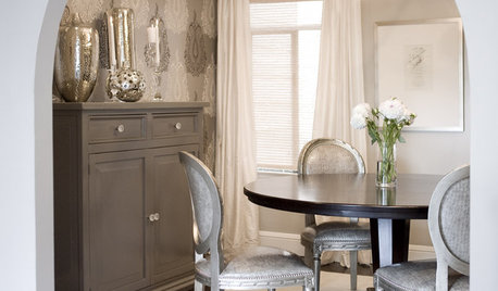
DINING ROOMSDesign Dilemma: I Need Ideas for a Gray Living/Dining Room!
See How to Have Your Gray and Fun Color, Too
Full Story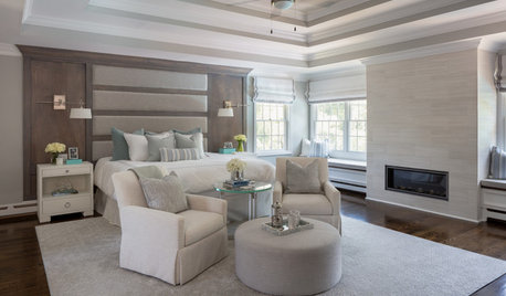
BEDROOMSSoothing Gray and Creamy White Bedroom With Coastal Style
A designer transforms a Long Island, New York, master bedroom into a light and airy space made for relaxation
Full Story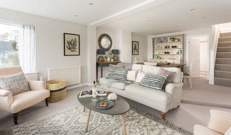
COLOR PALETTES7 Ideas for Using a Gray Carpet in Your Living Room
Soothing and often practical, gray carpeting can look elegant too, especially if you consider these ways to work with it
Full Story
GRAYDesigners Share Their Favorite Light Gray Paints
These versatile neutrals can help create a range of moods in any room
Full Story
MOST POPULAR50 Shades of Gray
Gray is hotter than ever, thanks to a hit novel full of risks and dark secrets. Tell us: Which paint shade possesses you?
Full Story
DECORATING GUIDESColor of the Week: Decorating With Warm Gray
Tired of tan? Getting gloomy from cool gray? Make warm gray your new go-to neutral
Full Story
MOST POPULARRethinking Beige in a World Gone Gray
Gray, the ‘it’ neutral of recent years, has left beige in the shade. But is it time to revisit this easy-on-the-eyes wall color?
Full Story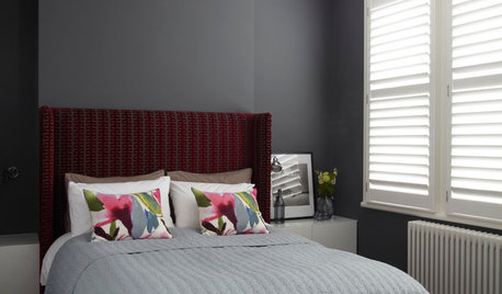
COLORDreaming in Color: 8 Gorgeous Gray Bedrooms
With this versatile hue, you can go dark and bold or slip into something more soothing
Full Story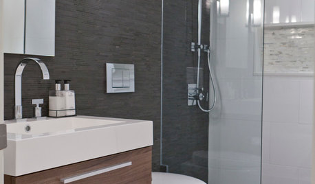
COLORBathed in Color: When to Use Gray in the Bath
Go for elegance and sophistication without going overboard on coolness, using these gray bathroom paint picks and inspirational photos
Full Story
DINING ROOMSColor Feast: When to Use Gray in the Dining Room
The right shade of gray pairs nicely with whites and woods to serve up elegance and sophistication
Full Story


Paige Justine