


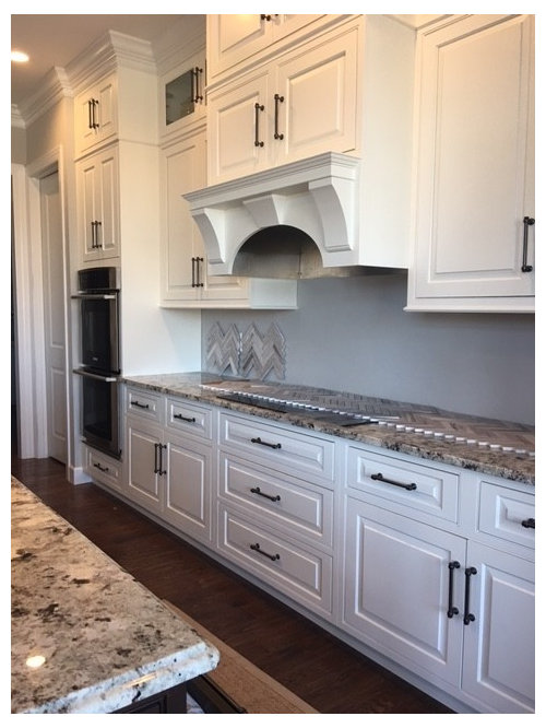
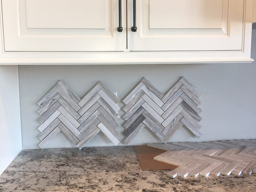
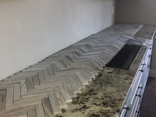
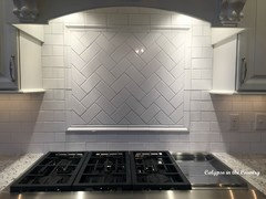
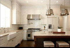
Herringbone backsplash?? center on wall or cut off bottom to sit flat
pitterpatter94
6 years ago
last modified: 6 years ago
Featured Answer
Sort by:Oldest
Comments (56)

lucky998877
6 years agolast modified: 6 years ago
pitterpatter94
6 years agolast modified: 6 years agoRelated Discussions
Extreme Backsplash Help Needed!!
Comments (18)Oh wow...those tiles sure are pretty. Like crackle tiles but even better, almost pearlescent. Sigh...I love living vicariously through other people's renos. And your kitchen is a stunner. I immediately think of mamadadapaige's kitchen when I hear "herringbone accent above the kitchen". She had 2x6s I believe, and did a thinnish pencil rail that's flush with the backsplash. I liked how she did hers. I think you should do a simple pencil liner because to me, the whole point of using the same tile for your herringbone accent is to do a subtle change, which calls for a subtle frame. If you did your thick picture frame it's like "look at me!! i'm different than the other tile" which makes sense if you did an accent with a totally different tile size. But you're doing the same 3x6s but in a herringbone pattern, instead of the subway pattern which goes everywhere else. So after my long explanation I say - do the thin one. For the backsplash on the peninsula/window wall, you know what I'd do? I would only put the backsplash on the three walls within the bay window cubby area and stop them there. I'd take them to just under the window trim. To the right of the bay window, carry it the same height (to the bottom of the window trim) on the little piece of wall under your outlet (the outlet to the left of your coffee maker), then pull the backsplash up to below your cabinets on that sliver of wall above the coffeemaker. That, to me, would accomplish several things: It would keep that nice blue paint showing on that window wall as I personally wouldn't want to cover it up, give you the backsplash you need to visually relate/connect that window wall to the range wall, and of course provide the protection you need above the sink from water splashage. To the left, I don't think you need to put any backsplash past that left bay window. Just keep it all bare and painted. I don't know if I explained that right...hopefully it makes sense....See MoreMy two tone kitchen reveal sans backsplash
Comments (28)I haven't been here in a while, I have missed seeing and hearing about all the new kitchens! I thought I would post an update, now that we have lived with our kitchen for over a year. I really love my two tone cabinets, the cherry base cabinets are warm and inviting and the mushroom wall cabinets keep the kitchen from being too dark. After all the angst of the decision, I am so glad I went with the solid wall of cabinets. And I am still in awe of my granite, do not for one single second regret the money spent on it! We ended up doing a stacked beige subway tile for the backsplash, with a herringbone pattern behind the range and I am very happy with my choice. As for appliances, I still love my microwave drawer, I use it every day and the only complaint I have is that the panel doesn't light up well. And I absolutely adore my fridge, love it so much we got the same one for my son! The produce drawer is still my favorite feature, and the ice maker my least favorite. We have never run out of ice, but we are a small family and when we have company, we always use bagged ice. But I can see this being an issue for a larger family without a second fridge with ice maker. I am very happy with my Bosch dishwasher, it does a great job and I've never had the goop issue some were having when I bought mine. The big miss in my kitchen is the range, I should have gone with induction. And I really dislike the surface of my range, it is a pain to keep clean, I miss the ease of my Thermador cooktop. And if I had it to do over again, I would have done drawers in the two base cabinets that don't have them. I still cannot believe how much more organized my kitchen is because of the drawer bases! I had a hard time wrapping my brain around how they would function for me, but after living with my kitchen for a year, I would do an all drawer kitchen in a heartbeat. Overall, I am so grateful to have a kitchen that is both functional and beautiful, and I so appreciate all the advice and encouragement I got from this forum!...See MoreSamples of grouted herringbone backsplash, please give feedback
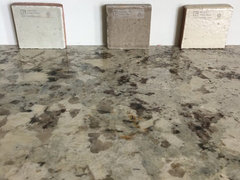
Comments (43)Good morning! I had a short shift in bed. Our DD called and woke us up. She's in Senegal, Africa helping with primate research for 6 months. It's broad daylight there! In my little microcosm of tile life, I've got my next test underway. This time with a 1:2 ratio, 1white:2gray. Hoping for a slight tone down from the dark. And, I'll have to remember to start getting the soft trowel out to smush the grout into place, instead of the putty knife I used to stir it up with. That explains the multitude of scratches on my samples, if anyone has noticed. Now there's and analogy I can use in the macrocosm of my life, always use a soft trowel so I don't leave scratches. Ellendi, The grouts at the tile store are all their standard colors. They didn't offer to mix up custom grout. I'm a DIY'er and never thought to ask for them to do it. Of course I ask them to give me all sorts of advise on what I come up with! I guess they are providing me with therapy. I thought about Ivory too yesterday, but as a blending color. I think I might pick some up for blending today and see if it warms the dark up a bit. Having an ever so slight peach, to the Ivory grout, it might mix with the dark gray and move it to a warmer tone. I'll reevaluate, it may be something I'd like straight and on the rocks, :) couldn't help it. BTW, my grout is sanded. This morning the dark gray looks a teeeny bit lighter, and the center has receded a bit so may not look as flush as it did yesterday. Yesterday was a rush job, using a hairdryer to dry the grouts. It must have dried even some more overnight. Don't strangle me if after all this I go with the dark gray. Getting the hairdryer out and another cup of coffee before I get ready for work......See MoreHerringbone tile kitchen backsplash - bullnose or schluter trim?
Comments (46)ajracine, after I thought about your question, are you saying to take the 2"x4" inch (that is on a 45 degree with the herringbone) but run them in a straight pattern along the edge to line it? That would work. You might sacrifice a sheet to see how it will look to you. As long as you are okay with a 2" wide line of tile running vertical. Those would not need to be "polished off/bull nosed" like I was talking about. In my earlier reply, I was envisioning "rounding off" the cut edge of your mosiac. Sorry about that. I think I now understand. I think I would still go with a shluter edge or a thin pencil liner tile (if it blended well with your mosaic herringbone.) The reason I say that is the border you would created with the 2x4 tiles will pull your eye to the trim line/herringbone joint line, and take away from your pretty herringbone pattern. (or that is what my mind is seeing.)...See MoreUser
6 years ago- PRO
User
6 years ago 
cpartist
6 years ago
barncatz
6 years agolast modified: 6 years ago
eam44
6 years agolast modified: 6 years agolucky998877
6 years ago
Hillside House
6 years agoHelen
6 years agoblondelle
6 years agocpartist
6 years agolast modified: 6 years agocpartist
6 years ago
goldblush
6 years agolucky998877
6 years agoHillside House
6 years agolast modified: 6 years ago
cluelessincolorado
6 years ago
sprtphntc7a
6 years agochispa
6 years agocpartist
6 years agocpartist
6 years agodan1888
6 years ago
rebeccamomof123
6 years ago
lazy_gardens
6 years ago
kariyava
6 years agopitterpatter94
6 years agolast modified: 6 years agocpartist
6 years ago
2ManyDiversions
6 years ago2ManyDiversions
6 years agokariyava
6 years agolast modified: 6 years ago2ManyDiversions
6 years ago
Stacey
6 years ago
Bunny
6 years agoblfenton
6 years agopitterpatter94
6 years agolast modified: 6 years agoblfenton
6 years agoeam44
6 years agolast modified: 6 years agochispa
6 years ago
amykath
6 years agopitterpatter94
6 years agolast modified: 6 years agoblfenton
6 years agokariyava
6 years ago
ILoveRed
6 years agoeam44
6 years agocpartist
6 years agopitterpatter94
6 years agolast modified: 6 years ago
mayflowers
6 years agolast modified: 6 years agoeam44
6 years ago
cookncarpenter
6 years ago
mom2sulu
6 years ago


Related Stories
INSIDE HOUZZWhat’s Popular for Kitchen Counters, Backsplashes and Walls
White is the top pick for counters and backsplashes, and gray is the most popular color for walls, a Houzz study reveals
Full Story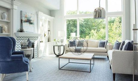
REMODELING GUIDES11 Reasons to Love Wall-to-Wall Carpeting Again
Is it time to kick the hard stuff? Your feet, wallet and downstairs neighbors may be nodding
Full Story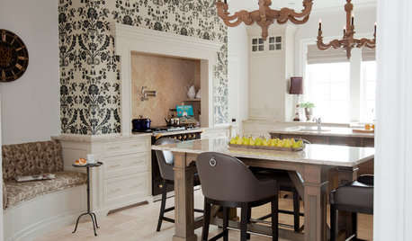
KITCHEN DESIGNKitchen of the Week: Updated French Country Style Centered on a Stove
What to do when you've got a beautiful Lacanche range? Make it the star of your kitchen renovation, for starters
Full Story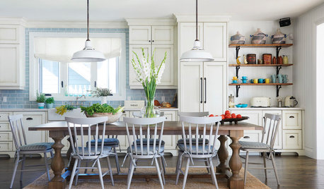
KITCHEN DESIGNNew This Week: 4 Kitchens Put Dining at the Center
Country-style tables and spacious islands create lively dining spots in these kitchens
Full Story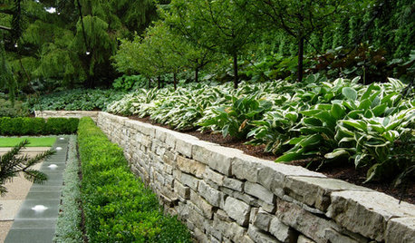
LANDSCAPE DESIGNGarden Walls: Dry-Stacked Stone Walls Keep Their Place in the Garden
See an ancient building technique that’s held stone walls together without mortar for centuries
Full Story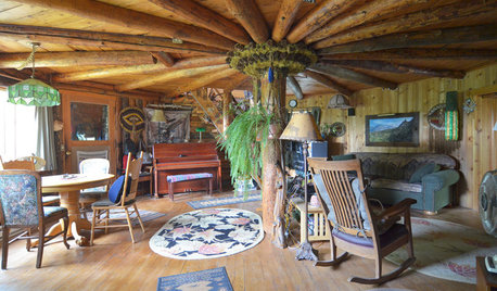
MY HOUZZMy Houzz: Nature Takes Center Stage in an Eastern Oregon Home
An eco-minded couple nurture a sustainable homestead on a pine-covered mountainside
Full Story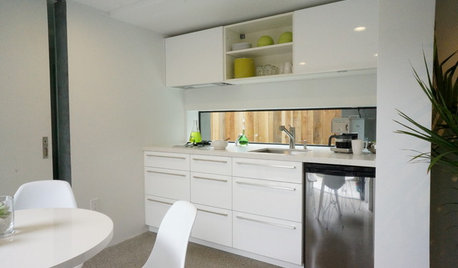
KITCHEN DESIGNPut Your Kitchen in a Good Light With a Window Backsplash
Get a view or just more sunshine while you're prepping and cooking, with a glass backsplash front and center
Full Story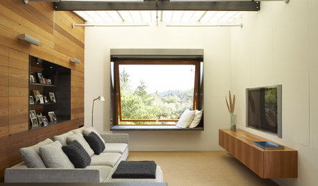
HOME TECHDesign Dilemma: Where to Put the Flat-Screen TV?
TV Placement: How to Get the Focus Off Your Technology and Back On Design
Full Story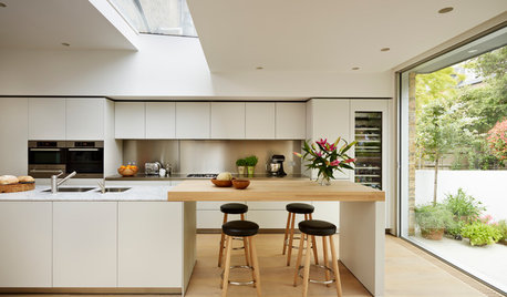
MATERIALSKitchen Ideas: How to Choose the Perfect Backsplash
Backsplashes not only protect your walls, they also add color, pattern and texture. Find out which material is right for you
Full Story
PAINTINGHouzz TV: How to Paint a Wall Faster
Should you roll your paint first or ‘cut in’ the edges with a brush first? This expert’s preference can save a lot of time
Full Story


mark_rachel