


need help changing livingroom, colour palettes
angel_scime
6 years ago

Featured Answer
Sort by:Oldest
Comments (12)
 PRO
PROThe Unusual Please Interiors
6 years ago
lynartist
6 years agoRelated Discussions
Need help with color palette for our first home!
Comments (24)Sorry - meant to post this earlier, but pesky work calls had to take priority. . . As for choosing a color pallet for your home, again you are looking for harmony. Step 1 - Use poster boards for each room. Add samples of the colors that have to stay. (Can't afford to change or love and won't be changing). This often includes cabinets, countertops, flooring, finishes, appliances, newer furniture that you don't want to replace at this time, art that you love, an area carpet that you love. May also include a fireplace surround or stained glass window. Step 2 - Figure out the colors that make your heart sing. We all have those few colors that just make us happy or sexy or romanic or relaxed when we see them. They bring us joy. Funny how this works - I have found that most people are drawn to colors that look really good on them. These are colors you want in your home. My sisters and I are great examples. Lisa - blond with big blue eyes - decor is country and primary colors are cornflower blue, cream and peach. Susie - olive tone skin, golden brown hair color, brown eyes - looks good in fall colors and muted colors. Home is sage greens, orange reds, muted golds and browns. Betty - light brown eyes, pale skin, hazel eyes - wears a lot of navy and pastels. Bright colors and black make her wash out. Her home colors are light blues, light greens, pastels and tans. Me - I have dark hair, dark eyes and ivory skin. I look great in Red, purple, teals - clear colors. My home decor is dark purples, teals, deep burgundy and taupe. We all picked home colors that look good on us. Didn't think about it when we selected the colors, but it was a natural process. You learn to love what makes you feel good about yourself. Step 3 - adding the colors that you love to the boards. With the colors that must stay, which of the colors that you love can work in each room. This is not your final paint color - it is the basis for your color design. Now think about walking through your home - You can't change the colors that must stay, but you can move the colors that you love around, narrow your selection down to 3 colors that work with what must stay and work with each other (I love purple burgundy and teal. I also love lime green - but eliminated it from my color selections for my house because it doesn't work so well with the other 3 colors.) The three colors that you have selected will be repeated throughout your home. Sometimes using a lighter shade or a slightly more subdued shade or a brighter or darker shade - but the same hue. Step 4 - Find a neutral - This is one of the hardest parts of the process. Finding a neutral that works with everything you have selected. Again, we are looking for a general choice, not the exact color. The basic families are nicely shown by Maria Killam: (Inside colors are the undertones) Hint - red and purple undertones can be much more difficult to work with than the other undertones. Green undertones are probably the easiest to work with. Step 5 - Pulling everthing together. This is where you begin exploring how you want the colors to flow from room to room in your home. Start with your entry - what colors are going to greet you and your guests. Do you want the room to be painted with your neutral or with a color? How bold do you want this first room. What do you want it to say to those who are coming into your home. Safe - paint it neutral and use your furnishings and accessories to add color. Bold - paint the walls orange and placing your sofa and area rug in this room: Now you move from one room to the next - do you want neutral walls or colored? How does it coordinate with the previous room. Will it feel harmoneous as you move from room to room. Using your 3 colors you can use more or less of each color in every room, but always bring a bit of the main color from one room into the next room so that they relate to one another. Think about each room and how you want it to make you and your guests feel. Energized, relaxed, thoughtful, hungry. (Most restaurants use a lot of red and orange colors because they stimulate the appetite. Orange also stimulates social interaction.) Most people use neutral in the main living spaces and hallways, colors in bedrooms, bathrooms, laundry rooms. Dining rooms and kitchens are sometimes color and sometimes neutral. Don't change wall color unless there is an architectural break (The wall ends at a corner or at a post or beam). (Don't try to draw a line down a wall and change colors if two rooms share one wall). Step 6 - Begin selecting wall colors. You really can't see wall color with a tiny sample. You need enough paint to see what it will really look like. I buy samples, but have seen a ton of samples and have a pretty good feel for what I want. If you haven't done this before it can get overwhelming and expensive to buy 100 samples to get to the perfect color. Walls are huge, so a little color goes a long way. It is easy to go too rich, too bright. What looks dull and very neutral on a 2" sample may look very blue or green or pink when you paint a 10'x10'x8' wall. The undertones come to life as we paint larger spaces. As you get to this stage ask more advice on Houzz to help get you close to the perfect color. If you love a color on the 2" sample go about 2 levels more subdued (greyer, muddier) I love the color reviews done by kylie m interiors. You may want to start looking at her blog and videos. https://www.kylieminteriors.ca/ Maria Killam also has some great advice. She is great at explaining undertones. https://www.mariakillam.com/ You can paint your own samples, but this company makes life simple: https://samplize.com/ Let us know how your color scheme is coming along....See MoreNeed help picking exterior color palette
Comments (6)I like the dark but really how can people live in a place where someone tells you waht to do with your house I live in Canada we have few of these areas and if we do the rules only apply for a finite amount of time not forever . The first thing I would do is get a new door with some glass but I guess everyone else would need to do that too.Such a cool looking house until you get to the cheap out siding on the back...See MoreNeed help with livingroom layout and colors
Comments (3)I have no idea without seeing the pieces you want to use and knowing how old the kids are a lot more info . I certainly would not advise a sectional and for sure not in linen fabric wth kids . IMO the drawing shows too much furniture in your LR and I would do a sofa and 2 chirs IMO all in leather with kids. I aslo do not think kids need to take over spaces and I guess if you never have guests then no DR is okay....See MoreNeed help creating color palette that compliments SW Agreeable Gray
Comments (3)Patricia is right, you choose the paint color last. But I imagine what you're trying to do is get a picture in your head of what the whole thing will look like when it's done. Given the information provided, I will say that Agreeable Gray is pretty neutral. It is a good color in a south facing room or a room that gets a lot of light. Of course one of my relatives painted almost her whole house that color and she loves it, so each to their own. And I don't think she is the only one - it is a very popular color. But it shouldn't drive the bus if she only has one room that color. If the other rooms you're talking about, like the kitchen, don't get as much light and the homeowner is thinking about green cabinets, she will probably be looking at warm off whites. There are dozens of them. One of them will work. She should design her kitchen and not worry about the paint color. She could also consider just having a green island and keeping the rest more neutral. See if you can get her to compile an Ideabook in Houzz of kitchens she likes....See More
mandy_moo_pants
6 years ago
hollybar
6 years ago
Yayagal
6 years ago
Rawketgrl
6 years ago
grapefruit1_ar
6 years agolynartist
6 years ago PRO
PROCelery. Visualization, Rendering images
6 years ago- PRO
Celery. Visualization, Rendering images
6 years ago User
6 years agolast modified: 6 years ago


Related Stories
COLORColor Palette Extravaganza: Room-by-Room Help for Your Paint Picks
Take the guesswork out of choosing paint colors with these conveniently collected links to well-considered interior palettes
Full Story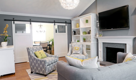
LIVING ROOMS9 Fashionably Cool Living Room Color Palettes
Chill out in a living room decked in cool-spectrum shades straight from the runway
Full Story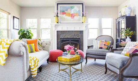
DECORATING GUIDESRoom of the Day: Color Cheers Up a California Living Room
A couple’s eclectic city style brightens a suburban bungalow
Full Story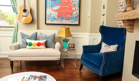
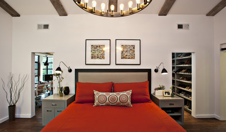
LIVING ROOMSRoom of the Day: Colorful Living Room Hums With New Energy
A Broadway poster inspires the makeover of a much-redecorated space, this time with vibrant new upholstery and a faux fireplace
Full StoryLIVING ROOMSRoom of the Day: Color Wakes Up a Living Room
A modern blue, gray and orange rug is at the center of a redesign that embraces the homeowners’ art collection
Full Story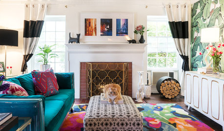
LIVING ROOMSNew This Week: 4 Colorful Living Rooms With Personality
See how designers mix creative color palettes with fashionable furnishings to make lively spaces full of character
Full Story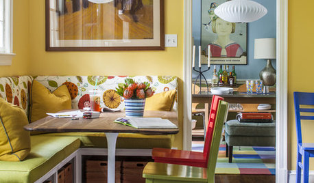
COLORColor Feast: 6 Deliciously Uncommon Dining Room Color Combos
Give your mealtime space a generous helping of hues paired in a most refreshing way
Full Story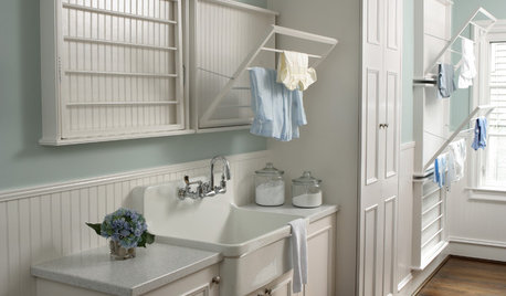
COLOR7 Laundry Room Color Palettes to Make Washday More Relaxing
Mix white with subtle colors or a dash of black to create a fresh, clean backdrop for doing laundry
Full Story
SMALL HOMESRoom of the Day: Living-Dining Room Redo Helps a Client Begin to Heal
After a tragic loss, a woman sets out on the road to recovery by improving her condo
Full Story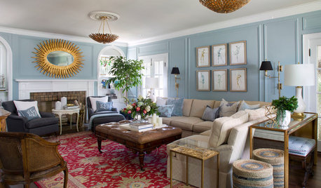
LIVING ROOMSTrending Now: 10 Great Living Room Color Combos to Try
These recent popular photos show examples of color combos that exude comfort and style
Full Story


Celery. Visualization, Rendering images